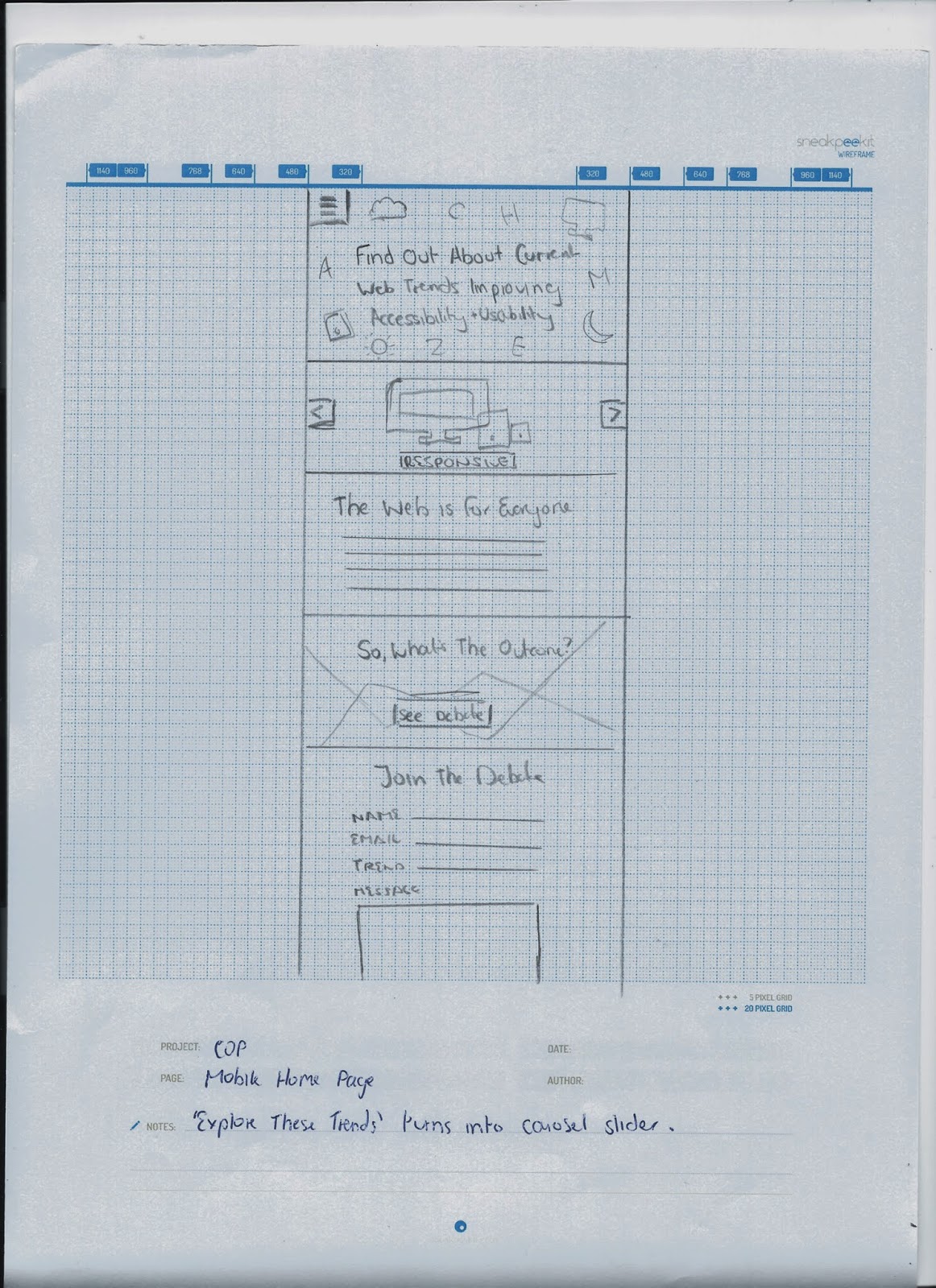
I wanted to do a mobile version to show a responsive site - I think this is necessary because it is afterall a website on current web trends, with a big focus on responsive web design.
Home Page
On the desktop version, the three trend icons are placed next to each other, but I decided that for the mobile version they would be turned into a carousel slider with one icon being shown, and arrows to click through the rest. This takes up less space, and isn't necessary to have them stacked because the links are available in the navigation anyway.
RWD (Flat/Type)

Here, rather than the navigation examples being stacked on top of each other, the images would turn into a slider to take up less space, with the information still being written underneath.
The links under What's Next would be stacked on top of each other rather than placed next to each other.

Leave your comment