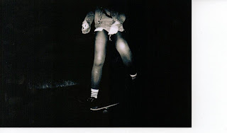
(Fred/Richard, my Beauty, Style and Taste task is on my Design Practice blog)
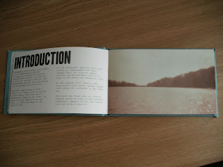
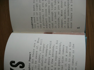
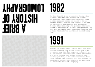
Here is the final resolution:
A complete guide to Lomography:
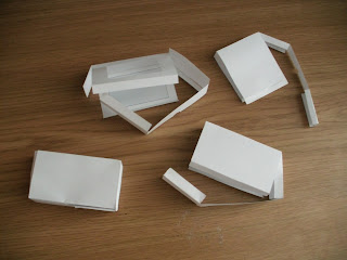
Make your own pinhole camera kit:
Context of Practice
Danielle Harrison
Showing posts with label OUGD401. Show all posts
Showing posts with label OUGD401. Show all posts
- Monday, 6 May 2013
- In OUGD401
- 0 Comments
OUGD401 - Essay
Could it be argued that fine art ought to
be assigned more 'value' than more popular forms of Visual Communication?
This essay
will consider five different aspects of the contemporary fine artist and graphic
designer to determine whether art should be assigned a higher value than
graphic design, and why it is perceived as being a higher regarded practise. The
artist and designer have a very different role in the media, and this essay
looks more closely at the group Young British Artist’s, who emerged towards the
end of the 1980s. Their careers begun with the recognition and sponsorship of
the art dealer Charles Saatchi, and because of that, artists such as Tracey
Emin and Damien Hirst are well recognised in the public eye, and have caused
much controversy over their work, possibly due to the fact that the ‘artists do
rather little to their material but nevertheless garner huge rewards’ (Stallabrass, 2006, p. 18) . They now have a
celebrity status, and their life is just as publicised as the work that they
produce, whereas the designer isn’t mentioned half as many times in the mass
media. The second point this essay will look at is the commercial value of fine
art and graphic design, and how this has an impact on dividing high and mass
culture. If it is commercial value what determines which practise should have a
higher value, then it is fine art, but if it is the social value that is the
most important factor, then the next point on the priorities of graphic design
and fine art, suggest that it is graphic design which is more significant. The
fourth point leads to the argument about the meaning and intention of fine art
and graphic design, as design has the intention of helping solve global
problems visually, while the young British artists have caused distress to
society in the past, most notably with the painting Myra by Marcus Harvey, who described her as someone ‘we all want to
shag’ (Stallabrass,
2006, p. 213) .
The final argument will discuss why art has a perceived higher value than graphic
design, and whether it deserves to be assigned more value, or whether this is a
misconception which has been fuelled by art dealers, art critics and
contemporary artists alike.
It could be
argued that one of the reasons why contemporary fine art is seen to be of a
higher value than graphic design is because of the attention that the Young
British Artist’s have gained in the mass media. The artists personality can sometimes
be ‘overshadowing their work’ (Stallabrass,
2006, p. 18) ,
and this has ‘greatly expanded’ (Stallabrass,
2006, p. 18)
during recent years, possibly due to the highly publicised and well documented
lifestyles of these artists and their work, which are often intertwined very
closely. However, the designer is
relatively unknown; packaging, logos, promotion or way-finding graphics aren’t
signed by the designer or presented in a gallery or have the publicity, and
therefore don’t have the celebrity status that many contemporary artists have.
Even though graphic design is placed everywhere – billboards, bus shelters,
television, shop signs etc – the designer is often overlooked, as they aren’t
being featured in tabloids and broadsheets, unlike these artists. This leads
onto the next point which discusses the value of the work, as opposed to the
artist.
One of the
things which distinguish fine art and graphic design apart is the high and mass
culture which surrounds them. There are two reasons why graphic design is seen
to have less ‘value’ than fine art; firstly because of the commercial value of
it, as design isn’t sold to one person, it is created for mass production so
that it is affordable for everybody, whereas the contemporary fine art discussed
in this essay is targeted at people part of an avant-garde group. Secondly,
graphic design communicates to everybody, making it a universal form, whereas
art only targets upper class people who can understand it. Tracey Emin supports
the idea that art is seen as high culture as she says ‘art is often meant for a
privileged class’ (Stallabrass,
2006, p. 36)
unlike her work which she says is ‘meant for everyone’ (Emin in Stallabrass, 2006, p. 36) . These statements can
be seen as hypocritical of her as one of her pieces sold for £130,000 and this
shows that her work is aimed at a specific elitist market, as this is not
affordable for the vast majority of the public. This can be supported by
Michael Findlay’s statement that is if people were to be given a large amount
of money, ‘the overwhelming majority would choose the house’ (Findlay, 2012, p. 13) rather than a piece
of artwork.
A lot of
modernist designers saw their work as a way of ‘eliminating aristocracies’ (McCoy, 2004,
p. 40)
and had a ‘fervent hope for a levelling’ (McCoy, 2004,
p. 40)
of the class division which engulfed Europe. Even though this statement was
written about designers in the mid twentieth century, the clash of high and
mass culture still exists today, as I discussed in the previous paragraph. This
also shows the difference between artists and designers as this is a high
priority for a designer, to create something which is aimed at people from all
different cultures and class. However, it can be suggested that artists just
create art for art’s sake, as Julian Stallabrass says the current Brit art has
a ‘fuck-you attitude’ (Stallabrass,
2006, p. 21) .
This suggests that the artist doesn’t care about the effect their art has on
people, and they will create anything they want to. This differs to designers who wanted to have
a ‘symbiotic agreement’ (McCoy, 2004,
p. 41)
amongst ‘mass societies’ (McCoy, 2004,
p. 41)
and create a design language which was understood by everybody, which leads
onto the next point about designs priority being problem solving and how this
can be seen as an uncreative process; which could suggest why fine art is seen
to be more highly regarded than design.
‘Design is first and foremost a process of
analysis and problem-solving and isn’t always tied to the making of artifacts’ (Nakaruma,
2004, p. 55) .
Terry Irwin suggests here in her essay ‘A Crisis in Perception’ that the design
solution doesn’t always involve an artefact. She considers the analytical side
of the problem-solving to be enough; not contemplating that the craft and the
‘making of artifacts’ is a fundamental part of the process, and is how the
solution communicates and informs the audience the message which is trying to
reach them. Her ignorance to the complete process and concept of design only
fuels the idea that fine art should have a higher value than graphic design.
This is supported as Nakamura wrote that ‘It always seems like design will be
the bastard child of the art school’ (Nakaruma,
2004, p. 57) ,
as though the practise is looked down upon by the people who regard fine art to
be superior.
However, part
of Irwin’s statement is true where she says that design is ‘first and foremost
… problem-solving’, as there are some problems which to be solved means the
aesthetic quality has to be compromised.
An example of ‘contemporary issues’ (Bilak, 2004,
p. 27)
are discussed in an interview with Peter Bilak, who discovered that when
designing type, he is now faced with several problems such as making the font
work in both high and low resolution, and how to work on both print and screen,
therefore supporting the idea that practicality and functionality come first,
and perhaps compromising on the design of his work. These are contemporary
problems as they only began when the computer was invented, and designers
started to use computers for design involving type.
It can then be
argued that contemporary fine artists, for example Tracey Emin who is part of
the visual group Young British Artist’s, can completely avoid any type of issue
within her work because it ‘takes no principle terribly seriously’ (Stallabrass, 2006, p. 21) and it can therefore
consist of whatever she thinks is creative without having to think of the
functionality of the practicality of whatever she creates. Although a recurring
theme in her work is her personal life which people can relate and respond to, she
doesn’t have a specific message directed at the audience. As the art dealer Charles
Saatchi collects her work, and other pieces from the YBA’s for an extremely
high price, this allows her to able to be in a financial position where she is
able to recreate similar pieces, without having to aim it at anyone, unlike
design, which isn’t featured in galleries or sold to a dealer, and has to solve
a public communication problem in order for the designer to earn money from it.
The idea that
artists are a lot more ‘creative’ than designers is also supported by this
statement that ‘fine artists enjoy much more artistic freedom and independence’ (Barnard,
2005, p. 164) .
The ‘freedom’ and ‘independence’ that Emin has could arguably come from her
financial security and celebrity status from being what is known as a ‘Saatchi
artist’ (Stallabrass,
2006, p. 207) ,
as he, and the work that he collects, is very well known in the art world and
in the media. Charles Saatchi collects contemporary art, which is often very
shocking, and because of the price which he buys and sells the art, he has
helped define the value of contemporary fine art. This doesn’t mean to say that
art has a higher value than graphic design though, as Stallabrass says that the
artists ‘produce half-hearted crap knowing he’ll take it off their hands. And
he does.’ (Stallabrass,
2006, p. 207) .
This suggests that the artists don’t value their own work, and it can be argued
that it doesn’t deserve to be a more respected practise than graphic design,
which leads onto the next point, which is about the differences between the
meaning and intention of graphic design and contemporary fine art.
Design for the
world is an organisation which aim is to help solve issues which include ‘health,
education, development and AIDS’ (Schmidt,
2004, p. 18) .
These topics affect a range of people, and this suggests that designers make a
conscious effort to communicate to the world, and produce design for a purpose
which can raise awareness of issues and help solve international problems. On
the other hand, Damien Hirst says of his work ‘I sometimes feel I have nothing
to say, I often want to communicate that’ (Stallabrass,
2006, p. 27) .
That statement can be seen as selfish here, as he isn’t using his influence in
the art world to contribute to worldly issues or communicate a message, which
shows a distinct difference in the recent times of the purpose of art and
design. It strengthens the argument that
fine art doesn’t have a meaning or message, which was discussed in the previous
paragraph that artists like Hirst create ‘half-hearted crap’ (Stallabrass,
2006, p. 207) .
To support the idea that Hirst is selfish, Stallabrass describes the
contemporary postmodernist movement as ‘obscene’ and ‘trivial’ (Stallabrass, 2006, p. 21) , as though it is
pointless. This suggests that fine art shouldn’t have a higher value than
graphic design because it serves no function, and from Schmidt and Stallabrass’
opinions, they seem to regard contemporary fine art with contempt and
abomination, which moves onto my next section as to why art has a perceived
higher value than graphic design.
One of the
arguments that suggest fine art deserves to have a higher value than graphic
design is ‘the perception that art has more to say about a culture’ (Barnard,
2005, p. 166) .
This could be because there is a permanency to fine art, as paintings and
exhibition pieces sit in a gallery or museum which are preserved and documented.
They are essential parts of the past so that people can gain historic knowledge
from them and learn about past cultures and eras. Although this essay has
discussed fine artists from the 21st century, there are a lot of
well-known artists from a different time and era such as Vincent Van Gogh who
is from the Netherlands, Leonardo Da Vinci from Italy and Pablo Picasso from Spain.
It could be argued that society sees fine art as a more culturally
comprehensive practise because these artists are more acclaimed and celebrated
than designers, who aren’t as well known with their work. Although visual communication
has always existed, the term graphic design wasn’t used until early in the 20th
century, and could be why it isn’t seen as permanent as fine art, or isn’t
thought to say as much about culture. Also, because ‘graphic production is not
long-lasting’ (Barnard,
2005, p. 166) ,
this could be why graphic design is valued less when compared to fine art is because
it suggests that artefacts such as packaging, magazines, signs, way-finding
graphics and advertisements aren’t permanent and therefore don’t say more about
culture because design is continuously changing and evolving. Although it is a
fast-paced industry, design can say a lot about culture because it has to
appeal to a variety of target audiences, there are designers from all over the
world and since the 20th century there have been many movements
which have since influenced modern design and other forms of visual
communication such as Constructivism, the Bauhaus and the International
Typographic Style. These are all contributing factors as to why the perceived
idea that fine art says more about culture than graphic design is false, and
they are both as significant as each other here. To support the idea that art
isn’t as significant culturally when compared to design, Steven Heller says
that ‘many objects of graphic design are preserved and studied’ (Heller, 2004,
p. 12)
suggesting it has just as much to say about a culture as art does, because of
the time and consideration that has goes into graphic design, even if the final
production isn’t always ‘long-lasting’.
Even for the
design which is ephemeral it can be argued that ‘graphic design is there to
perform various jobs or functions’ (Barnard,
2005, p. 172)
and if that is a transitory job, then it shouldn’t be valued less than art
which is permanent if it fulfils its purpose. Many design jobs are temporary
such as advertisements and launches of events or films, and if the designs
function is to inform, educate and persuade an audience, then it should hold
more value to society than fine art, which isn’t seen to serve a purpose. However,
Noel Carroll suggests that even art for art’s sake ‘is still functional’ (Barnard,
2005, p. 174)
because it hopes to engage and enthral the viewer and this can be considered as
a function. It can be supported that art does engage with the viewer, because
people buy and collect art, they post blogs on pieces, converse with each other
about art, and a career can even be made out of it – being an art critic. This
could suggest why ‘art critics never worry about the future of art’ (Siegel, 2004,
p. 168) ,
because there is a function to serve, and as long as contemporary artists are
producing, or rather getting their assistants to produce their
attention-seeking work for them, there will always be something to critique.
In conclusion,
there are different arguments on whether art or graphic design should be
assigned more value, and the answer depends on how people define the word
‘value’. If value means the commercial value of work, then it is contemporary
fine art which ought to be assigned more than graphic design, as the artists
discussed in this essay have a very high market price for their work, which
only an upper class group of people can afford, such as Tracey Emin’s piece ‘It’s The Way We Think’, which was an
appliqué blanket reaching £130,000 at auction. This differs with graphic design
which is targeted at everybody, and is mass produced to make communication
reachable and affordable to a large range of people. However, if value is based
on the social value of how it benefits people, then graphic design should be
assigned more value than fine art, as the designers’ priority is to educate,
persuade and inform people about everything. Design is a powerful tool in
making people aware of global issues, such as the NRDC campaign to make people
aware of global warming where the designers created a water dispenser sticker
of the world, and the slogan ‘World’s drinkable water supplies are running out.
Stop Global Warming’ (Abduzeedo,
2008) .
This shows the priority of design, whereas the purpose of Hirst’s work is to
communicate how he has ‘nothing to say’ (Stallabrass
J. , 2006, p. 27) ,
suggesting that his art doesn’t have a high social value. If historic value is
the most important factor, then it can be suggested that fine art has the
higher value, because artwork is displayed in galleries and exhibitions, and it
gives an insight to historical eras. However, since photography was introduced,
that started to document the world giving a more accurate insight to history,
and what life was like. Graphic design also comments and communicates history,
whether it is advertising exhibitions or publishing historical text, therefore
it can be argued that these forms of visual communication should also be
assigned historical value, even if it is a more recent form. The last point which
this essay discussed was about the value of function that fine art and graphic
design have, and how even though graphic design is known to serve a function to
people to communicate, it can be argued that the function of art is to
entertain and intrigue the viewer, meaning they both have a job to perform.
This is a contributing factor to the overall decision that art cannot be
assigned more value than graphic design because arguably, they both serve
function to society, even if they are extremely different.
Bibliography
Abduzeedo. (2008). 35
Creative Advertising Campaigns [online]. Avaiable at:
<http://abduzeedo.com/35-creative-advertising-campaigns>: [Accessed 23
January 2013].
Barnard, M. (2005). Graphic Design as Communication.
Great Britain: Routledge.
Bilak, P. (2004). Graphic design vs. style, globalism,
criticism, science, authenticity and humanism. (R. Vanderlans, Ed.)
Canada: Princeton Architectual Press.
Emin in Stallabrass, J. (2006). High Art Lite.
China: Verso.
Findlay, M. (2012). The Value of Art: Money, Power,
Beauty (1st English Edition ed.). London: Prestel Publishing.
Heller, S. (2004). Understanding Design Literacy
(2nd ed. ed.). Canada: Allworth Press.
McCoy, K. (2004). Graphic design vs. stlye, globalism,
criticism, science, authenticity and humanism. (R. VanderLans, Ed.)
Canada: Princeton Architectual Press.
Nakaruma, R. (2004). Graphic Design vs. style,
globalisation, criticism, science, authenticity and humanism (First ed.).
(R. VanderLans, Ed.) Canada: Princeton Architectual Press.
Schmidt, M. (2004). Graphic design vs. style, globalism,
criticism, science, authenticity and humanism. (R. VanderLans, Ed.)
Canada: Princeton Architectual Press.
Siegel, D. (2004). Graphic design vs. style, globalism,
criticism, science, authenticity and humanism. (R. VanderLans, Ed.)
Canada: Princeton Architectual Press.
Stallabrass, J. (2006). High Art Lite. China: Verso.
- Saturday, 27 April 2013
- In OUGD401
- 0 Comments
OUGD401 - From Theory Into Practice
Following the feedback I got in the critique, I have decided that I am going to create two books instead of one, to spread out the information more, and have a fold out poster of the history of lomography. This will be packaged in a cardbox box, similar to how the cameras of Lomography are packaged:
Here is the layout for the second book:
Here are the new nets for the pinhole camera:
I decided to do three so there was a variation, and based them on existing lomography cameras that are featured in the first book following feedback I received from the critique. They are in the same colours that they are in the first book. I decided on these particular cameras because the Diana Baby 100 is a different film format to the others, and Diana is arguably the most well known lomo camera. The Lomo LC-A is the original camera so it seemed right to include that, and the La Sardina already comes in lots of different patterns and variations, so this would just be another one to that collection.
I put the endpages on both of the books as the pattern I originally wanted to use on the pinhole camera net, and this is also what I want to use on the bellyband. I did this so that the inside and the outside will match. I decided it should be grey because these are two of the colours that are used on the website, and the least bold ones so that it won't distract from the content on the book.
I then went to print it, and as I have decided to do hardcover binding, I need to print it into sections. So I made postscript files for each sections in InDesign into Adobe Acrobat, and this is what I printed double sided.
Originally I started to print in the Digital Dungeon on A2, but they only printed four pieces of paper in an hour, and I had 26 to print so I wouldn't have had time. So I altered the paper size slightly, so that it would fit onto A3.
I also realised that cartridge paper didn't work that well with what I was doing, as there was a lot of photography and it dulled it down.
So I then printed on bulky newsprint in the studio. Some of the pages aren't in line with the other side, but nothing too major.
(cartridge)
As they are all printed now, I went to use the laser cutter to perforate the edges of the pinhole camera nets. I did try and scale them as much as I could on Illustrator, but they were still out of line. I'm not too bothered though as I got to try a new technique and on the test piece I did, it popped out really easily.
Here is the piece that I popped out of the page:
I organised the pages into sections, and creased them with a bone folder so that they were ready for when I went to bind at Vernon Street.
When I went there, I pierced four holes in the spine of the sections, and started sewing them together. Then I put PVA glue on the spine of them to secure it, and waited for it to dry.
Then I measured out the mountboard and the buckham material for the hardcover. I had to trim the buckham so that it would fold round the mountboard well, and then I went to stick the endpages on the cover. For the buckham, I decided to use a light blue, as I think that this will stand out well against the cardboard box, and work well with the grey pattern.
However, when I went to stick the end pages onto the cover, it didn't quite go to plan. I was doing it on my own, and as I haven't done it before I didn't really know what I was doing, and the PVA was drying really fast so I didn't have a lot of time to put it on properly. It ended up not being aligned properly so I had to rip the pages out, which cause a bit of a mess.
I then decided to use double sided tape instead as I could peel it back up if I wanted to, and pay a bit more time making sure it was on properly. It worked a lot better, but it still isn't perfect.
I found a net I liked in the Structural Packaging book, and then using Illustrator and mock-ups I adapted it so that it would be the right proportions for my books.
I now started to work on the box. As I have done the net, I wanted to cut it using the lasercutter. However, as the scale is A0, it wouldn't fit on the lasercutter, as it only cuts up to A1. So I got a copied out the measurements from the Illustrator file onto the cardboard and cut it using a scalpel, and scored it using the back of the scalpel.
I had to trim certain areas as it didn't quite fit, and I think im going to have to glue the tabs together as the bottom kept popping open.
I put a page from the book within the box so I could make sure it was the right size.
I got some acetate to cover where the window is, so that you can't just grab the books out of the top.
I decided to stick the tabs together with double sided tape as it seemed to work better with the book when I used that.
I then needed to make the insert, and I wanted it to be a little lower than the height of the two books together, so you can easily pick up the top book. I also wanted to cut out a little tab so you can get your fingers in it and pick out the bottom book. The corners also need to be cut at an angle so that it fits in.
(pic.drawing)
Here is the final box with the insert in it:
I also wanted to do a fold out poster with A Brief History of Lomography inside of it. I already had the bodycopy for it as I included it in the original book. I wanted it to fold out into A3 so that it would be big enough for someone to have on their wall as a poster. As I wanted it to be fold out, I wanted the order of the dates to be in the order that you would fold out the poster, so I made a mock up.
I went onto InDesign, and started seeing how the text would fit within the space that was available, and it was a really simple and quick thing to do but I think that it works. I used the same margins and font size that I did on the books to keep it consistent.
I then had some trouble when printing, as one side was printing landscape, rather than portrait. However, I soon fixed this by altering the document and print settings.
I then had to make the bellyband designs to go round the books and box. I wanted these as the box and books are plain, so you don't know what they contain right now. I used the same pattern as what is in the end pages to keep it consistent, and added a lomograph that I had taken to each one so that the viewer could see the kind of photos that would be featured. I tried to make them similar to the style of the Lomography bellybands on their own packaging.
The first book is going to be about the different cameras and films that are available, with examples of photography throughout which can be achieved with these. It will also tell people how to achieve the shots. The book will be aimed at lomographers (a 500,000 strong community) as well as people who are interested in photography and wanting to start lomography.
Here is the page layout for the first book.
Here is the layout for the second book:
Here are the new nets for the pinhole camera:
I decided to do three so there was a variation, and based them on existing lomography cameras that are featured in the first book following feedback I received from the critique. They are in the same colours that they are in the first book. I decided on these particular cameras because the Diana Baby 100 is a different film format to the others, and Diana is arguably the most well known lomo camera. The Lomo LC-A is the original camera so it seemed right to include that, and the La Sardina already comes in lots of different patterns and variations, so this would just be another one to that collection.
I put the endpages on both of the books as the pattern I originally wanted to use on the pinhole camera net, and this is also what I want to use on the bellyband. I did this so that the inside and the outside will match. I decided it should be grey because these are two of the colours that are used on the website, and the least bold ones so that it won't distract from the content on the book.
I then went to print it, and as I have decided to do hardcover binding, I need to print it into sections. So I made postscript files for each sections in InDesign into Adobe Acrobat, and this is what I printed double sided.
Originally I started to print in the Digital Dungeon on A2, but they only printed four pieces of paper in an hour, and I had 26 to print so I wouldn't have had time. So I altered the paper size slightly, so that it would fit onto A3.
I also realised that cartridge paper didn't work that well with what I was doing, as there was a lot of photography and it dulled it down.
So I then printed on bulky newsprint in the studio. Some of the pages aren't in line with the other side, but nothing too major.
(cartridge)
As they are all printed now, I went to use the laser cutter to perforate the edges of the pinhole camera nets. I did try and scale them as much as I could on Illustrator, but they were still out of line. I'm not too bothered though as I got to try a new technique and on the test piece I did, it popped out really easily.
Here is the piece that I popped out of the page:
I organised the pages into sections, and creased them with a bone folder so that they were ready for when I went to bind at Vernon Street.
When I went there, I pierced four holes in the spine of the sections, and started sewing them together. Then I put PVA glue on the spine of them to secure it, and waited for it to dry.
Then I measured out the mountboard and the buckham material for the hardcover. I had to trim the buckham so that it would fold round the mountboard well, and then I went to stick the endpages on the cover. For the buckham, I decided to use a light blue, as I think that this will stand out well against the cardboard box, and work well with the grey pattern.
A couple of the pages were cut off on the left, and where it hasn't printed aligned, some pages at the centre overlap from over pages.
However, when I went to stick the end pages onto the cover, it didn't quite go to plan. I was doing it on my own, and as I haven't done it before I didn't really know what I was doing, and the PVA was drying really fast so I didn't have a lot of time to put it on properly. It ended up not being aligned properly so I had to rip the pages out, which cause a bit of a mess.
I then decided to use double sided tape instead as I could peel it back up if I wanted to, and pay a bit more time making sure it was on properly. It worked a lot better, but it still isn't perfect.
I found a net I liked in the Structural Packaging book, and then using Illustrator and mock-ups I adapted it so that it would be the right proportions for my books.
I now started to work on the box. As I have done the net, I wanted to cut it using the lasercutter. However, as the scale is A0, it wouldn't fit on the lasercutter, as it only cuts up to A1. So I got a copied out the measurements from the Illustrator file onto the cardboard and cut it using a scalpel, and scored it using the back of the scalpel.
I put a page from the book within the box so I could make sure it was the right size.
I got some acetate to cover where the window is, so that you can't just grab the books out of the top.
I decided to stick the tabs together with double sided tape as it seemed to work better with the book when I used that.
I then needed to make the insert, and I wanted it to be a little lower than the height of the two books together, so you can easily pick up the top book. I also wanted to cut out a little tab so you can get your fingers in it and pick out the bottom book. The corners also need to be cut at an angle so that it fits in.
(pic.drawing)
Here is the final box with the insert in it:
I also wanted to do a fold out poster with A Brief History of Lomography inside of it. I already had the bodycopy for it as I included it in the original book. I wanted it to fold out into A3 so that it would be big enough for someone to have on their wall as a poster. As I wanted it to be fold out, I wanted the order of the dates to be in the order that you would fold out the poster, so I made a mock up.
I went onto InDesign, and started seeing how the text would fit within the space that was available, and it was a really simple and quick thing to do but I think that it works. I used the same margins and font size that I did on the books to keep it consistent.
I then had some trouble when printing, as one side was printing landscape, rather than portrait. However, I soon fixed this by altering the document and print settings.
Here is the final poster:
- Thursday, 18 April 2013
- In OUGD401
- 0 Comments
OUGD401 - From Theory Into Practice
Based on the research I have done, here is the bodycopy:
History of
Here is how it all started..
1982
The first Lomo LC-A was produced in Russia, when a general from the USSR Ministry of Defence and Industry, Igor Petrowitsch Kornitzky, found a little japanese camera and handed it to his comrade, Michail Panfilowitsch Panfiloff - who was the director of LOMO Russian Arms and Optical factory. After noticing it's qualities they gave orders to reproduce it. Millions were produced, and they were so popular other communist countries such as Cuba, Czechoslovkia and Vietnam started using them.
1991
However, it wasn't until a decade later when some Viennese students came across a Lomo LC-A in an old camera shop that Lomography as we know it now was introduced. They developed strange photographs with vivid colours, and people wanted to know how they got them, so they discovered more about these cameras. The following year they founded the Lomographic Society International, and published the Ten Golden Rules of Lomography:
- Take your camera everywhere you go
- Use it any time – day and night
- Lomography is not an interference in your life, but part of it
- Try the shot from the hip
- Approach the objects of your Lomographic desire as close as possible
- Don't think (William Firebrace)
- Be fast
- You don't have to know beforehand what you captured on film
- Afterwards either
- Don't worry about any rules
1994
Their website, lomo.com, is introduced, allowing lomographers across the globe to discuss and share their lomographs.
They also had their first exhibitions in New York and Moscow, showcasing lomowalls. Lomowalls are a collection of thousands of lomographs put together on a wall, creating an overwhelming experience for the viewer.
1997
The website is updated, renamed to Lomography.com, and boasts a shop to buy cameras and accessories; activities; forums; articles and much more, making lomography a thriving community.
Madrid also held the first Lomographic World Congress, with a Lomowall 120 metres long - featuing more than 35,000 lomographs.
1998
The Actionsampler is introduced by the Lomographic Society International, and has four lens. This is one of the cameras featured in this book with examples of photographs it can take.
2000
The Supersampler is introduced, a camera which takes four panoramic images in one photograph.
LomoHomes was introduced on Lomography.com so that people could showcase their own lomographs and make their very own lomowalls.
2001
In Vienna, the first Lomography store opened, with lomowalls covering the shop. It sold lomography products as well as holding workshops and activities for people to do.
2003
Along with photography products, a bag called The Sidekick TPE was introduced to the Lomography range. This kickstarted a further range of accessories to be brought in, such as clothing, camera bags and keychains.
2005
The fisheye camera is introduced this year, it pans nearly 180 degrees in 35mm. This is another camera that this book will be featuring photographic examples of.
2006
The production of the original Lomo LC-A is stopped, and replaced with the improved Lomo LC-A+. The camera is now made in China, and offers a more improved design featuring a multiple exposure button.
2007
The Diana+ is introduced by the Lomographic Society International. New stores also opened in Paris, Seoul and Hong Kong. A limited edition of the Holga and Diana+ cameras were introduced in collaboration with The White Stripes.
2008
A convention was held at Photnika in Germany, with a lomowall spanning across the walls and floor. A book about the Lomo LC-A was also launched at the convention, along with a montage of lomographs from around the world.
The Lubitel+ was also introduced, as a reproduction of the original two lens Lubitel.
The photographic techniques, cross-processing and redscaling, were made more accessible with the launch of two new films - the Lomography Redscale and Lomography X-Pro film.
2009
The website was updated further, with more scope for socialising within the community and more information about analogue photography.
A new shop was opened in New York City.
Dianalogues: Through A Woman's Lens was published, a book produced in collaboration with Lomography and colette - a Parisian boutique. It is told from a women's perspective, featuring lomographs taken by women.
The Lomo LC-A+ 25th Anniversary camera was released, celebrating 25 years since the original camera was introduced.
The Diana World Tour also began, exhibiting lomographs from around the world.
2010
Another lomography convention was held at Photnika in Cologne.
The award winning Spinner 360 was released, as well as the Sprocket Rocket, a camera which revolves around sprockets.
The Lomo LC-A+ White and Lomo LC-A+ Gold was introduced to tie in with the 25th anniversary.
Nine new gallery stores were opened worldwide, and the Diana World Tour was still in full swing.
Lomography introduced a new range of films, including 120 and 35mm formats and new X-Pro and Redscale films.
2011
Valentines Day Special cameras were introduced the 'I Love Lomo' Fisheye 2; the 'Take My Heart' Diana F+ and the 'Love Is In The Air' Diana Mini.
New T-shirt designs were introduced to the fashion range.
LomoLabs opened in the UK and the USA, so people could get their varied films developed more easily.
Three special camera editions were released, with proceeds going to The Red Cross of Japan: 'The Jiyu' Diana Mini; 'Kirameki' Diana F+ and the 'Shiawase' Fisheye 2.
In Hong Kong hundreds of thousands of people turned up to the Lomography Times Square Exhibition and witnessed a LomoWorldMap. A limited edition called the White Sprocket Rocket was introduced to celebrate the event.
The Lomo LC-Wide was also released this year, the widest lens compact camera in the Lomography range.
Two new films were released: the Lady Grey 120, Early Grey 35mm and Lomography X Tungsten 35mm film, meaning more choice for people using film.
There was also the launch of the LC-A+ Russia Day, a camera wrapped in red leather.
Several cameras got a colour makeover including the Sprocket Rocket, Diana F+, Diana Mini and Fisheye 2. The La Sardinia camera range expanded with the addition of four more editions.
2012
A new Fisheye camera and Lomokino Smart Phone Holder was released this year. The Spinner 360 was improved with a motorised spinner. A range of Animal Edition cameras were introduced, including the Diana F+ Zebra, Diana Mini Leopard, Fisheye 2 Python, La Sardina Orinoco Ochre and Sapphire Serpent.
Camera Families
LOMO LC-A
The camera that started it all, this has been improved over the decades since the original. You can change the aperture setting, create easy multiple exposures, change the ISO up to 1600 and it even has a cable release thread.
Effect: vignettes; saturation; vivid colours; 'signature 35mm lomographic look'
Lomo LC-W
This is the only wide angle compact camera in the Lomo family, with a 17mm wide lens. You can take photos in a half frame, square format or full format by using a 35mm film.
Effect: vignettes; exaggerated colours
Belair
This versatile medium format camera allows you to take photographs in three different formats, has interchangeable lenses, and a wide selection of ISO ranges. You can create panoramas, multiple exposures and have automatic shutter settings.
LomoKino
This is the first Lomo analogue video camera. With it's easy to use aperture controls and ability to focus fast you can create short movies on a 35mm film.
Effect: lo-fi sound effects
La Sardinia
This 35mm wide angle lens camera is shaped like a sardine tin. It comes in over 30 designs, and has had several limited edition specials.
Diana F+
A classic reproduction of the 1960s camera, the Diana F+ shoots in 120 format and has a light-weight plastic build making it easy to take anywhere. With different accessories you can have a flash; different lenses and an instant back to see your photos as soon as they happen. There are so many different variations and designs, such as the Diana Multi Pinhole Operator and the Diana F+ Glow in the Dark.
Effects: soft focus; vignette.
Diana Mini
A mini verson of the Diana F+, you can take photos in either half frames or square shots, producing interesting, whimsical images. They come in a variety of colours and designs, so there is plenty to choose from!
Effect: lo fi; bulb setting (for long exposures)
Sprocket Rocket
As the name implies, the panoramic photos you take with a 35mm include the sprockets of the film, due to the incredibly wide lens! Lomography introduced a range of SUPERPOP! Sprocket Rockets which come in an array of vivid colours.
Fisheye
There are three variations of the Fisheye camera. Fisheye One lets you take photos; Fisheye 2 allows this along with the ability to do multiple and long exposures; Fisheye Baby 110 is a smaller version taking 110 film, and they all do this with a 170 distortion.
Spinner 360
This camera allows you to take photos with s 360 panorama, just by pulling a cord which spins it round.
Multi Lens
Lomography have a range of multi lens cameras including the ActionSampler, SuperSampler and the Pop 9. Multiple lens allow for sequential photos with different shutter speeds, to get a sense of movement.
Lubitel
A Russian classic, this medium format camera has two lenses and are a collectible item.
Holga
One of the more popular lomography cameras, they range from medium format; twin lenses; stereo; pinhole and 35mm film editions.
Effects: lofi; soft focus; colour filiters; light leaks;
Pinhole Cameras
Lomography have a range of pinhole cameras, from DIY cardboard cameras to Diana and Holga versions. This way you can create images without using a lens, but with just a pinhole.
The Film
Choosing the film is an important part of lomography, as they can produce incredibly different effects.
Film Formats
35mm
This is the most common film you can buy, with supermarkets and shops selling them. You can use these in most cameras, and they come in either black and white or colour. They have holes on them to fit within the sprockets, and when you use them with a larger format camera, the image will reach past these edges creating an interesting effect.
120mm
This fits in medium format cameras like the Holga or the Belair, and because produce square images. As they are bigger than other formats, they have higher quality images, with great attention to detail.
110mm
Having been reintroduced in 2012 by Lomography, these are small films allowing the world to be seen in a new perspective. They work with cameras such as the Diana Mini or the Fisheye Baby.
Film Types
Colour negative
This is the most common type of film, and can be brought and processed in C-41 chemicals at pretty much any pharmacy or photography shop. Perfect for taking everday photos, capturing exactly what you see in front of you.
Slide film
Also a colour film, the effect of the images when developed are more saturated and vivid than regular colour negative film. Although usually developed in E6 chemicals, you can still use the C-41 chemical process to achieve surreal, random results.
Black and white
A great alternative to colour film if you want to go for the true analogue look, perfect for monochromatic contrasts and different tones.
Redscale
Lomographers first started this technique by loading film backwards so that images were shot onto the semi-transparent side of the film. This created warm tones of colour, in reds, oranges and yellows. Now Lomography has created a range of redscale films where the film is already loaded backwards.
Cross processing
This is a processing technique whereby you develop slide film using the same chemicals as you would for colour negative film. This creates vivid and saturated colours, with each time producing a different result which makes it so unique.
Expired film
Films have an expiry date, but once they have past it, they create effects that lomographers love. The reason films have an expiry date is because when they are in production, they are made to be a certain speed like ISO 400. However, certain conditions can affect this when making its way to the consumer like humidity, lighting or temperature. Meaning when it reaches you, the ISO might actually produce images as though it was a lower speed like ISO 200. When it reaches past the expiry date, the manufacturer can't be held responsible for any random effects which appear on the images once developed. The important thing to remember is to shoot on a sunny day, and the effects vary each time, which range from colour shifts to grainy images.
The Experiments
Here are some photographs that can be taken with a range of Lomography cameras: Holga; Holga Tim; Fisheye and ActionSampler.
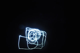
As I wanted to experiment with lightpainting, I decided to try it out digitally first to see how long to expose it for, what lighting I would need etc.
For the previous attempts I was using glowing cubes which produced a blurry effect, but then I started to use the flashlight on my phone which produced a sharper, brighter effect.
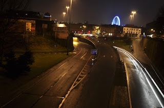
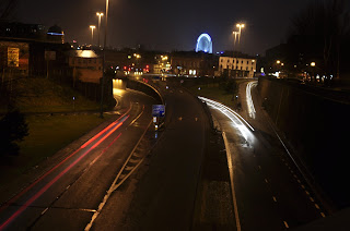
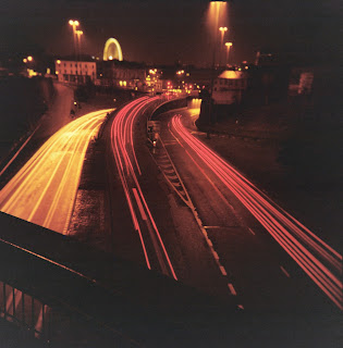
I then looked at long exposures with traffic:
I also experimented digitally with long exposures:
Here are the photos I took with the Holga:
Here are the photos I took with the Holga Tim:
Here are the photos I took with the Actionsampler:
Here are the photos I took with the Fisheye:
Illustrations
Here are the camera illustrations that I made:

I changed the colour of them to all the colours that are featured on the website.
Net
Here are some drawings of patterns. I wanted to incorporate the style of the La Sardina designs into it.
Here is the net for my pinhole camera:
Page Layout
Here are screenshots and development of when I went onto InDesign. I decided the paper size around how big the net will be.
Perforated Pages
I spoke to woodwork about making the wooden bookcovers, and he suggested having perforated pages instead so the net can be within the pages. I think that this is a better idea, so I am going to do this instead.
Presentation
We had to present our work so far to some peers and a tutor, so here it is:
The feedback I got was really constructive, Fred said that I should condense my work as it is too much to fit in one book, and think about what the interesting parts are.
As I think all the information is relevant, what I am going to do is create separate publications and package it, so each section is divided better. I want to have a book with the camera, film and photographs in so that you can see what you can do, and how to achieve it; a booklet of the make your own pinhole camera kit and a fold out poster with the timeline on it.
Here are some drawings of patterns. I wanted to incorporate the style of the La Sardina designs into it.
Here is the net for my pinhole camera:
Page Layout
Here are screenshots and development of when I went onto InDesign. I decided the paper size around how big the net will be.
Perforated Pages
I spoke to woodwork about making the wooden bookcovers, and he suggested having perforated pages instead so the net can be within the pages. I think that this is a better idea, so I am going to do this instead.
Presentation
We had to present our work so far to some peers and a tutor, so here it is:
I also needed to include three photographs that weren't my own because I didn't use an expired film, I don't have a 110mm format camera, or a instant film camera. I found them on lomography.com:
The feedback I got was really constructive, Fred said that I should condense my work as it is too much to fit in one book, and think about what the interesting parts are.
As I think all the information is relevant, what I am going to do is create separate publications and package it, so each section is divided better. I want to have a book with the camera, film and photographs in so that you can see what you can do, and how to achieve it; a booklet of the make your own pinhole camera kit and a fold out poster with the timeline on it.
Subscribe to:
Posts (Atom)
Blogs
Labels
- Air Up (1)
- Airports (6)
- BEAR (7)
- Collaborative (7)
- Companions Pet Shop (1)
- COP2 (46)
- COP3 (28)
- Cruise Ships (8)
- design for print (8)
- Design for Print and Web (5)
- Design for web (7)
- Design Production 2 (19)
- drink tea (3)
- essay (2)
- Futre of Bacon Packaging (7)
- Keith Baldock Artist (2)
- lecture notes (13)
- lecture notes 2 (2)
- Matthew Savage Photography (1)
- message and delivery (3)
- modernism (1)
- OUGD401 (25)
- OUGD403 (5)
- OUGD404 (2)
- OUGD405 (7)
- OUGD406 (8)
- OUGD501 (47)
- OUGD503 (23)
- OUGD504 (20)
- OUGD505 (19)
- OUGD601 (28)
- P.A Kelsall (1)
- postmodernism (1)
- Practical (18)
- Printed text and reading (2)
- Responsive (21)
- secret 7 (2)
- Seminar Notes (1)
- Sophie Davey Photography (1)
- speaking from experience (2)
- Studio Brief 2 (14)
- Studio Brief 3 (3)
- Study Task 2 (1)
- Study Task 4 (4)
- The Border (4)
- Theory Into Practice (32)
- WW1 (3)
Blog Archive
-
▼
2015
(20)
-
▼
January
(20)
- COP3 - Evaluation
- COP3 - Website
- COP3 - Animation
- COP3 - Preparing for Animation
- COP3 - App Icon
- COP3 - App Mockups
- COP3 - Design Development
- COP3 - Logo
- COP3 - Icons
- COP3 - Content
- COP3 - Wireframes
- COP3 - Final Crit
- COP3 - Survey Results
- COP3 - First Crit
- COP3 - Sketches
- COP3 - App Name
- COP3 - Visual Research
- COP3 - Synthesis Rationale/Final Idea
- COP3 - Survey
- COP3 - Practical Ideas
-
▼
January
(20)
Powered by Blogger.
Copyright 2010. All rights reserved.
RSS Feed. This blog is proudly powered by Blogger and uses Modern Clix, a theme by Rodrigo Galindez. Modern Clix blogger template by Introblogger.


