I've decided to start researching different examples of print now that I know a lot more about print processes since the workshop at Vernon St, as I will have a better idea at how the outcome has been achieved.
Lino Cutting
How To
Lino cutting is a very easy printing method, and something children usually do in school it's that simple.
Here is a step by step process I would do:
- Get a piece of lino and a lino cutting tool set with different blades, for making different strokes.
- To get the image ready on the lino, you can either go freehand, place a stencil (inverted) on top of the lino or draw on your design first in pen (inverted).
- Start carving on the lino with one of these methods. Wherever you don't cut will show on the print, and the carved area will remain blank. Remember to do the design inverted.
- Once it's carved, roll ink onto it.
- If you're using a press, take it over and place it over some stock. Pack it with newsprint, cover with the blanket and roll through steadily.
- If you don't have a press, place the lino face down on some stock and either apply hard pressure with a spoon or your hands.
- Peel back the lino and newsprint, and there you have it!
When Printed
When you peel back the stock this is what it will look like:
Using A Press
There is usually a press in a printroom, and once you've carved into your lino you roll ink onto it, place it facedown on some stock, pack it with newsprint then roll it through the press to achieve the print.
This video shows you how to do this.
Other Methods of Printing
Spoon
If you don't have a press, you can still easily print but instead of rolling it through, you can apply pressure with a spoon. The harder you apply pressure the more ink that will go on, and you often get a blotted effect which is something you don't get when you roll it through a press.
This video shows how to create a lino cut, and they create a print using a spoon.
Hands
You can do the same technique but if your hands, and applying hard pressure with you knuckles.
Laser Cut
I had an idea of maybe being able to laser cut a piece of lino and print that, so that I would be able to get small text onto the print, as carving that out with a lino tool would be impossible if I want the scale to be ticket sized.
Here, I found that it is a possibility, so I will now need to go and ask the laser cutter if I can do that here on the machines at college.
The designer has used a raster effect on the lino, so that it won't cut directly through, and will just laser the top layer.
Here is the laser cut lino:
Here is the result printed by hand:
Here is the result when put through a press:
As you can see, the result printed by hand gives a more DIY effect and blotted appearance, whereas the press result is more clean. I think this would be a really good way of getting small type on to the lino so hopefully I can do this in my project.
Examples
Please Cut The Crap
Although this was probably ran through a press because of how clean it is, there are still some imperfections which add to the aesthetic and is a desirable effect from lino printing. This is a simple print because of the big lettering which would be easy to carve around.
This linoprint is very clean, although you can still see the hand produced aspects of it due to the lino being cut by hand. The ink is so prominent with no blotches due to it being rolled through a press which applies a lot of pressure. In the second picture you can see the cut on the press.
Two in One
This is two linocuts being printed on the same piece of paper. This allows the designer to overlap designs while using multiple colours to create a different effect. You can print as many linocuts onto a single piece of paper as you want to create different effects.
The outcome really depends on how you carve, you hard you press when printing and how much ink you apply. You can get some really nice textured effects which are almost 3D with more ink, and a more worn effect with less ink.
Here is an example when more ink is applied:
Home Sweet Home
This designer has a made a book out of lino prints which I thought was quite ambitious at first, but then I thought about it and although it would be time consuming to carve out multiple large areas, it would be easy to do because of how simple the printing process is. It would also be cheap to do.
Monoprinting
How to
Monoprinting is a really simple printing process, and is similar to lino printing in many ways. You can only produce one off editions, and you produce an image on a flat surface such as glass, plastic or copper which is then transferred onto paper. You can etch, scratch into or place materials onto this flat surface, so is a very versatile way of printmaking.
There are two variations - subtractive and additive.
The subtractive version is where you ink up the plate, and remove parts of the ink by using rags and other materials.
The additive version is where you apply the ink to the plate to make an image.
You can add stencils onto an inked plate, or any number of materials which can be rolled through the press such as patterns and leaves.
The steps I followed to create my own monotype where as follows:
- I printed a positive of a typography quote
- Using a scalpel, I then cut out each of the letters. This creates a mask and stencil
- I then inked a plastic plate using two colours which will create a colour blend
- I then placed the stencil over the plate
- I then added packing of newsprint on top of it
- I rolled it steadily through the press and then lifted the print off.
Tips
Colour blend
I tried this method, which is to use more than one ink colour to achieve a colour blend effect. I used purple and blue, and to do this all I did was have blue on the left side and purple on the right, and rolled as normal till they blended together. I then printed as normal.
Damp paper trick
I noticed on the edge of a couple of the prints where the size of the plate could be seen, it was embossed. The tutor at Vernon St then said that if the stock is damp when you use it, it will create an embossed effect across the whole print.
Materials
Anything that can be rolled through the press such as lace, leaves, stencils, string etc can be used as a material on a monoprint.
I messaged a printmaker on Behance about how she achieved her monoprints and I said:
Hello, I love your monoprints!
I was wondering what techniques have you used, as I want to learn more about this form. I am new to monoprinting and so far have only used stencils and materials to create a print.
Any help would be much appreciated :)
Many thanks,
Danielle
And she replied saying:
Here is another message I got back:
Using a cotton bud would be a very good idea to have complete control on where you're removing ink and to make straight and curved lines, so that is good advice to take on board. Soaking the paper is also something I haven't tried, but as mentioned in the previous point I want to give a go after a tutor recommended it. Very happy with this response!
Examples
Silence
This is 77 individual monoprints, and each one is very different. This just shows the endless possibilities and uniqueness of each print, as there are lots of different ways to make an impression on the plate. This is something to remember in my project, as I want to show different techniques of monoprinting in my info pack.
Sierra Barela
This is a collage monoprint, as you can see there is an envelope which has been added to the plate, and I think that the stencils have been inked through the press to achieve the blotted effect and then placed over the envelope. So rather than the print being the piece of work, the stencils used are now in the final print.
I would say this is a subtractive monoprint, as to me it looks like a lot of ink has been applied at first, and then the artist has removed areas to create this image using fingers or rags and maybe a pencil to get the lines.
*Updated* After messaging the printmaker asking her technique, she said she used cotton buds to remove the ink, which seems obvious now as it is a good tool to get different strokes and it is a subtractive method she has used!
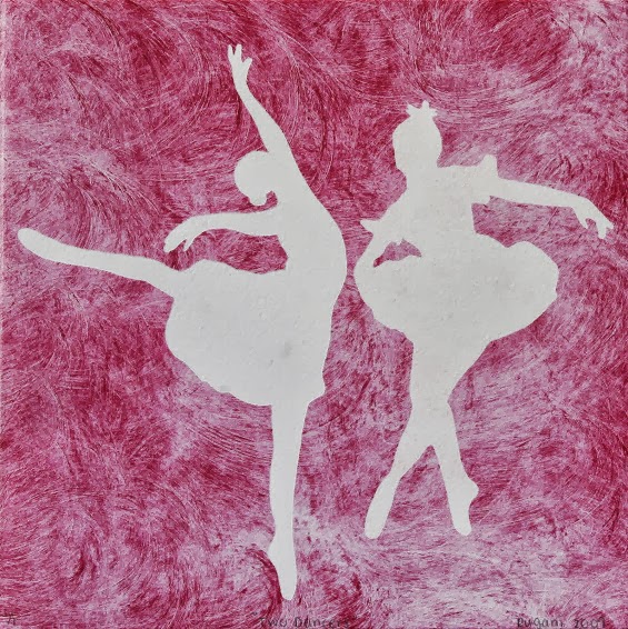
Joanna Rugani
This is a simple monoprint as the artist has used a stencil to achieve the white area, but what I liked was the texture of the ink. This will have been achieved by applying ink to the plate firstly, then rubbing in circular motions with a cloth to get the textured pattern.
I love this series of prints, but I don't know how the artist has achieved them, so I sent her a message asking if she could tell me what techniques she used.
Cards
This shows an example of how to use multiple colours in a monoprint, and also the blotted effect that is common with monoprinting. I think these are really colourful, and it isn't something you can recreate digitally.
Screen printing
How to
Screenprinting is probably the most commonly used process in the print rooms at college, but it can be quite difficult as there are a lot of steps for preparation.
Here are the steps that I do when screenprinting:
- I start of by printing the positive which will be exposed. I print it normally, not inverted, and if there are more than one colour I will print a positive for each part that will be in a different colour.
- Then I clean the screen I want as a previous person has used it, and I do this by using the powerful water hose, as it needs a lot of pressure to take the previous design of. You also need to rinse it and rub emulsion on it on both sides of the screen.
- Once it is rinsed it needs to be dried thoroughly by being placed in a warm room.
- It then needs a thin coating layer of emulsion. As it is light sensitive it needs to be done quickly and then put back in the drying room.
- Once it is dried, it is ready to be exposed. You place the positives in the vacum facing up, and put the screen on top.
- Then you turn the vacuum on and time it for a certain amount of exposure units.
- Once this is done, it needs to be washed again. This time I get the less powerful hose and put my finger over half of it so it creates a more powerful hose.
- You have to run the hose over everywhere that is exposed to make sure that the ink will go through. Once this is thoroughly done it needs to be dried again.
- Once it's dried it is ready to be printed!
- You need to put parcel tape over all the edges and corners to make sure no ink gets there.
- To prepare the table you need to securely place the screen in the bed and tighten it so that it doesn't move.
- To prepare the ink, you need to pick the colour you want and add a solution to it which will make the ink last longer and not dry out, but it also weakens the colour.
- You then put some tracing paper on the bed and secure it with tape and turn the vacuum on.
- You then get a squeegee and drag ink over the screen, which will print onto the paper.
- This will let you know where to put your paper as you can see the exact positioning. You then place your paper underneath the tracing paper and line it up with the design.
- Then you remove the tracing paper and turn the vacuum on again.
- Then you drag the squeegee through again and it will print onto your stock, and that is how to screenprint!
Examples
Privy
Not only can you print on paper, but if you use a fabric screen you can also print onto clothes and bags etc, which is very useful because you can't digital print on these in college. This is something that can be achieved in the college too, which I think is a good process and I might include this point in my project.
Fluorescent Ink
These are some good examples of fluorescent ink being used, as well as how a colour blend is made when you are in the printing process.
Multiple Colours
You can use more than one colour when screenprinting, but you need separate screens for each colour, so more than four colours gets more tricky and is harder to align the design. This print would have used three different screens.
Overlap
An interesting aesthetic to screenprinting is that when you print over an existing colour they mix together to create a colour overlap, which can be seen here.
Colour Blend
This is when you use two or more inks at once to produce a blended effect, which can have a really nice effect with simple prints and patterns. I have produced a colour blend monoprint which can be seen on my Design Practice blog.
Emboss
This is a relief type of printing, where it makes an impression on some stock. As I did this at the Vernon Street workshop here are the notes I took from that sessions:
Tips
- What is etched away becomes raised.
- If you want it raised, you print a normal positive, if you want an area dented it needs to be an inverted positive.
- Print the positive out the right way round - it is placed face down on copper so doesn't need to be reversed.
- If you have a small plate on a large area, the outline of the plate will show.
- Sans serif text is more successful than serif text, this is because it etches outwards and not completely straight down.
- The deeper you etch the better the emboss but you lose definition.
- 12pt or above is good
- 10pt you start to lose definiton, and anything under won't work
- For lasercut embossing, it does need to be printed reverse.
- Grayboard is a good material for lasercut embossing as it is thicker than mountboard, but not as thick as mdf.
- Screenprinting probably won't work because if you do it beforehand the pressure of the Press will take the ink off, and if you do it after you will lose some of the emboss due to the pressure of the squeegee.
Stock choice is important because some work better than others. If you choose too thin a material and apply too much pressure the stock will become too weak, but if you have a really heavy stock it will be hard to make a deep impression.
Here is a step by step process to the lasercutting version:
- Lasercut a design onto greyboard, and make sure it is inverted
- Place it on top of stock in between layers of packing on the Hydraulic Nipping Press
- Tighten the press
- Turn the lever until it won't turn anymore
- Then push the black button in
- Pump again to between 4000 and 6000 psi
- Pull the black button out
- The process is now complete!
This version is a lot quicker and simpler than the copper plate version, where you need to go through the etching process
Examples
Rice Creative
This isn't as prominent but you can still see the raised emboss, and the text has turned out quite nicely - it probably isn't as prominent because the more you emboss the more distorted small text becomes.
This is a very prominent emboss, and this can all depend on the stock used and how embossed the copper or card is.
Braille
Embossing is also a good way to make braille, as that is raised dots, so is a good process for that.
Black Stock
Embossing also works well on black stock, and I think it stands out a lot. Here small text is used, and this can work if its over 12pt, ans the fact it is a sans serif is also good because that works better than serif fonts.
Inkarnation
This is embossed onto leather or buckham which has a nice effect, and I think this works really well on bookcovers due to the high end, luxurious finish, especially paired with the gold foiling/screenprinting on the spine.
Collagraph
How to
This is a really simple print making process as all it involves is putting materials onto cardboard. You then roll ink over the cardboard and print onto paper. Various things can be added to the cardboard to make it more textured such as rubbing sandpaper over it, putting bubble wrap on top, leaves, lace and fabrics.
Here is a basic video of making a collagraph plate:
Examples
Tessa Parker
This will be the piece of cardboard with the materials stuck and inked up, which is being used as the art piece as opposed to the print itself.
Caroline Noir
She created this seahorse collagraph and it is 'Made from sand paper, patching plaster, paper and wood glue.' I think this has a brilliant textured effect, and definitely isn't something you can do digitally.
Landscape
Even though it is a very abstract process, you can still create pieces that resemble something quite clearly, like this landscape collagraph.
I much prefer this collagraph as I think although it is abstract, it is less experimental crafty art, and looks like it involved more skill and a bit of thought has gone into it. Collagraph is my least favourite technique that can be done because of it's childish and arty qualities which I don't think have a place in Graphic Design personally.
This collagraph has used a wooly material which has produced a nice patterned effect, and the artist used intaglio ink to print with.
Bookbinding
There are a variety of different book binding techniques which can be done at Vernon St, such as a perfect bind, coptic stitch and staple stitch. Here are a few of the techniques that can be done:
Perfect Bind
This is quite a simple process, although quite long as it involves glue which needs to try, and you have to create the buckham cover which can be quite time-consuming. It gives a professional finish though, like a normal book. As the cover is made of buckham, this can be screenprinted or foiled onto.
Coptic Stitch
This is an unusual type of binding because the spine is left exposed. It involves stitching sections of pages together.
Here is a good tutorial on how to make one:
Here is a a diagram of the kind of stitch that needs to be done:
Here is a finished coptic stitch bind:
Saddle Stitch
This is probably the most simple of binds, because it only involves punching three holes into the spine of the book and threading a piece of thread through in a really simple stitch. It can also be done with staples, and just punching some staples through the spine. This is a good bind to do if you want a notebook, or a low end style.
Here is a video explaining how to do it:
Here is an example of when staples are used:
Concertina
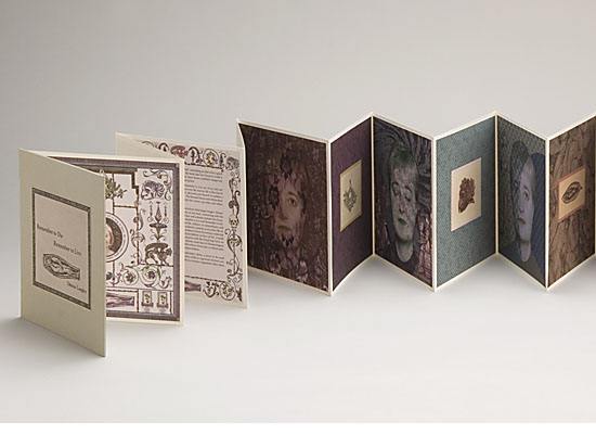
A concertina style book actually involves no binding as such, just the folding of pages, stuck onto more pages. This is really good to use if you don't want to stitch, if you want a leaflet, small book, or quite a short one. The more pages it has, the 'fatter' it becomes, which is then hard to lay flat. You can also add hard back covers to make it a more stable book.
Photo Etching
I had an induction of this at Vernon Street, and here are the notes I wrote from how to do it:
- Get a copper plate and choose the side with the least scratches on
- Sand it - turn the sander of once you've lifted it from the plate
- Then degrease - pour the solution on and move sponge over it
- Blot dry it with newsprint
- Coat with a thin layer of varnish
- Light sensitive film goes on copper for photo etching - there are three layers, clear, blue and frosting
- Need to remove the frosting layer as it makes film curl
- Lay it over the plate
- Then put a sheet of acetate on top
- Go over to the roller, put it down and cover with the blanket
- Roll it through steadily
- Turn 90 degrees and roll it back
- Cut off the excess film and place face down somewhere dark so it doesn't expose
- Put the copper in developer for 8 mins so that it thins
- Then expose the image onto it. The image must be laserprinted onto acetate and doesn't need to be reversed as it goes face down on the copper. Expose for 9 units.
- Then peel of the top layer and place in sodium bath for 3 mins. Sodium solution is 10g per litre and 18 degree water temp.
- Gently agitate and run sponge over it - if there are still granules on it, it still has film on it
- Rinse with cold water
- Blot dry with news print
- Wait for it to be completely dry
- Plate goes back under UV box - cover back with parcel tape, attach a hook and expose for 80 units
- Put in the etching box for 3 hours, then turn over and put in again for a further 3 hours
- Put in the rinsing box for ten mins
- When etched, can use the Hydraulic Nipping Press
- To put in the Press, you need to layer the etching in the following order:
- Copper plate
- Etching
- Stock
- Packing
26. Tighten it
27. Pump it slowly until it won't anymore
28. Push the black button in
29. Pump again to 4000-6000 psi
20. Pull the black button out
21. The process is now complete and the stock should have an embossed image of what is on the etching.
Examples
This shows one of the steps once the acetate has been exposed onto the copper, it is peeled off.
This etching shows it can be put onto different materials such as fabric, and the edges of the copper leaves an embossed outline.
This photo etch shows how varied the tones can be in a photo etch, and can provide a very detailed image.
Foiling
How To
Foiling is really simple, although a long process. You need to expose a fabric screen firstly, and instead of printing with ink, print with glue onto stock.
Once this is done, you can start the foiling process. You take the stock with glue on plus the foil to the heat press, and lay it on top facing upwards.
It needs to be 160 degrees and the foil needs to be sandwiched between layers of packing so that it doesn't actually touch the foil and stock. It needs to be pressed for 12 seconds.
Then once you take it out, leave it to cool for a couple of minutes and peel it back!
Impressions Foiling
I found this extract on a website which services include foiling:
'For security of tickets, gift vouchers certificates etc. foil blocking gives excellent protection. There are several methods used, talk to us about your requirements. A wide range of materials can be foiled including leather and plastic. Impressions have flat bed machines which can accommodate a range of made up items.'
This means it would be an appropriate process for my cards as they will be in the style of tickets.
Examples
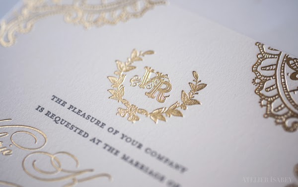
Wedding Invitation
This gold foiling makes the invitation have a very high end finish and appear very luxurious, reflecting the type of wedding it will be.
This silver really stands out against the black and grey, and as it is a small section it is quite subtle, and not tacky as metallic foiling can sometimes be.
Although I think the colour choices here are quite tacky, it shows foiling can also work on large areas of text. I think it depends on how well the glue is applied to the stock.
I think this works well on packaging, as it stands out against the dark label and bottle. It shows foiling can work across a wide range of different mediums, and it gives it a premium look and feel.
This subtle use of foiling works well on the logo, and I think it is a good idea to use it on the logo because it makes it stand out a lot more to the viewer and gives it a lot of significance.


