People's Divided Opinion on Flat Design
The topic is a huge debate between designers so is something that I should include on the website.
Web Designer Depot
This is an infographic on the advantages and disadvantages of flat/skeuomorphic.
Flat Design

Things associated with flat design:
- Simple
- Clean
- Colourful
- Modern
- Trendy

Disadvantages of flat design:
- Different from what people are used to
- Boring design
- Difficult to execute well
- Lacks personality
- Sometimes unclear what is clickable

Advantages of flat design:
- Ease of use
- Percieved as more honest
- Modern
- Fast loading times
- Efficient responsive design
Drawbacks:
- Action objects become unclear
- Conveying refinement of elegance becomes difficult
- Relationships between objects can only be achieved from colour, shape and proximity
Skeuomorphism

Associated with:
- Helps user identify purpose of app
- Puts a coat of polish on nearly everything
- Safe and familiar approach with designers
- Users can be attracted by its design

Disadvantages:
- Added illustrations can cause delays
- Takes longer to render
- Rely heavily on images than css
- May seem dated as trends change

I think this infographic is really subjective and doesn't contain many facts to be honest. To say a user is attracted to skeuomorphic design is ridiculous, as you can be attracted to flat design as well. I don't want my content to be full of fluff like this, I want statistics and reputable opinions. It has a couple of statistics, and what it says about loading time etc is true but it is really hypocritical.
This website is a story about flat design and skeuomorphism and a game at the end. It is a playful take on the debate. It doesn't necessarily pick a side - it lets the user do that. That is what I want to do with mine; get all of the information across, but let the user decide. There are too many people saying which is best and creating biased views, when really the answer is subjective.


Flat vs Skeuomorphism: Shut Up & Design
03/06/2013
An argument has been active for the past one to two years, primarily amongst designers but certainly extending into the realm of developers, debating which user-interface “style” is most appropriate to use in a given application: flat design or skeuomorphic design. While this argument has been novel, to say the least, few if any are touching on the most important decision a designer can make when choosing his interface philosophy: just shut up and do what’s right for the user.
The Argument for Flat Design
As of late, the most successful example of the flat design philosophy has been seen with Google’s products, all of which have undergone a major overhaul to focus on more visually-obvious paths between content and function. Right now, the showpiece for Google is their gmail app for the iPhone, which embodies the simplicity and elegance that flat design proponents claim is the future, and the “right” way to go about doing things.
There are certainly pros to choosing a flat design methodology at the onset of any UI project:
There is little or no need for illustration, as the flat design theme rarely feels appropriate when mixed with well-rendered imagery.
Stylesheets and load times tend to be somewhat smaller, due primarily to the lack of gradients (CSS or otherwise), textures, shadows, and more that would add small, but not insignificant size to download/load times.
Content is presented in a very straightforward fashion, which many believe leads to an improved sense of usability and clarity for the end user.
But flat design does not come without its share of drawbacks:
- Action objects, such as buttons, become slightly more unclear to the end users, who tend to be used to buttons that have gloss. This is especially true on iOS and OSX, where action buttons tend to be shiny.
- Conveying a sense of refinement or elegance becomes more difficult, as the notion of a “polished” app has long been associated with a “shiny” design. Flat design, while still an elegant solution, can appear to the average user as being unfinished in some way because of its focus on simplicity.
- Relationships between objects can only be achieved through color, shape, and proximity. Adopting a “non flat” sensibility would also allow objects to clarify their relationship through texture and illustration style. Some may find this limiting.
The Argument for Skeuomorphism
The term “skeuomorphism” didn’t really burst into the designer’s common vernacular until a few years ago, but since that time nearly every designer has over-used the term to accurately reflect his or her incredible sense of style and modernity. In a nutshell, skeuomorphism in UI is the process of creating an interface that mirrors how a real-world version of an application’s primary objective would look. So, for example, a skeuomorphic calendar app would look nearly identical to a paper-and-ink calendar sitting on a desk, or a calculator app would have tangible-looking buttons and a read-out resembling a quartz crystal display that one might see on a legitimate calculator.
The most prevalent examples of skeuomorphic design have come from Apple, in apps like iCal, Find Friends, and especially their recent Podcast app (which, when recording, has an animated illustration of an old-fashioned tape deck). Many contemporary designers lambast skeuomorphism for being unnecessary and misleading, but many proponents say that skeuomorphism is powerful for helping lay users understand the purpose and function of elements in an application that they otherwise may not be familiar with.
Indeed, just like flat design, skeuomorphism comes with pros:
- As mentioned, skeuomorphism helps users understand the purpose of an app almost immediately, by illustrating that app to resemble its real-world counterpart. This, in theory, helps reduce the sense of confusion that can come with being introduced to new hardware or software processes.
- Skeuomorphism can put a coat of perceived polish on nearly anything, if done well, such that the app feels “complete” because it’s beautiful-looking.
- It can also help convey a sense of whimsy and fun that flat design cannot.
- New users may be attracted to the app simply because of how it looks.
But, like flat design, skeuomorphism comes with drawbacks:
- The added illustrations can cost time: delays in illustration time, delays in development time, and delays in download time.
- Skeuomorphic design can tend to feel less serious and less utilitarian, leading some to question the craftsmanship of an app due to its heavy focus on prettiness at the possible expense of function.
- Contemporary sentiments are shifting against this style, and so a skeuomorphic app may seem dated as styles and trends change.
So What About Facts Instead of Opinion?
Just about every article, blog post, and write-up touching on the flat design argument has avoided factual evidence to support one side or another. It turns out, facts and statistics don’t really clear much up. Still, it’s important to understand that neither flat design nor skeuomorphism have an obvious statistical leg-up over one another. Take a gander at the following, which are a small selection of data points and conclusions which don’t solve the debate, perhaps even confusing it, but still are worth noting in the effort to understand all possible angles:
The Stats on Apple
Apple’s iOS, the most noteworthy “offender” in use of skeuomorphism, as of January 2013 has accompanied the sale of over 500 million iOS-capable devices (engadget).
It is certainly true that iPhones and iPads have sold like gangbusters, but not purely due to how shiny the software is. Still, there is definitely something to be said about the experience provided by iOS, and how it remains the most-admired and most developed-for mobile platform.
The Stats on Google
Google’s Android operating system, one of the more prevalent exemplars of the flat design philosophy, is expected to be on roughly 1 billion devices by the end of 2013.
Although this number is encompassing the whole of 2013, while Apple’s 500 million sales are only as of January 2013, it’s logical to assume that if iOS devices continue on their current sales pace, they won’t reach 1 billion total sales by the end of the year. This means that, despite the draw of iOS, Android is statistically dominant.
It’s also logical to assume that Androids ubiquity is not due to its interface sensibilities, but is primarily due to its openness, its adaptability, and its benefit of allowing hardware manufacturers to focus purely on hardware and let Google handle the software. There are also more than just one company distributing Android-capable devices, giving Android an edge Apple doesn’t have.
The Stats on Windows
Windows 8 and Windows Phone 8 have seen abysmally slow sales, and these are perhaps the most noteworthy examples of a purely flat interface sensibility.
Most who use Windows 8 have enjoyed the appearance of the software, but have found it to be confusing to use. Even an apparent “usability expert” found it to be confusing (NBC).
Is flat design to blame for Windows 8′s relatively slow adoption rate? Not likely. What’s more likely is less the style of the software, and more the decisions made with gestures, hidden functions, and drastic changes over previous software releases that are now requiring users to re-learn how to use the same software they enjoyed previously. In other words, they may have focused more on the form and less on the function.
The Stats on Apps
As of this writing, the top iPhone apps are: Minecraft, 4 Pics 1 Word, and Clash of Clans (in top paid, top free, and top grossing, respectively).
None of these apps make use of the Flat Design sensibility, but does that matter? They’re all games, and they’re all straightforward enough that users can easily pick them up, learn their control schemes, and have fun.
That said, Google Maps is close to the top of the “Free” chart, currently holding spot #7. But, quite honestly, people didn’t download it because it was so wonderfully flat, they downloaded it because Apple Maps is comically terrible. Had the Google Maps app been shiny, it still would have been downloaded en masse simply because it’s so much more usable.
But even with this data and this conjecture, we’re left without a clear answer. So where do we go from here? Easy:
Do What’s Right for The User
The flat vs skeuomorphism argument is taking designers’ attention away from what really matters: building clear, usable interfaces—interfaces which are good for the users, not for the designers’ dribbble profiles. It’s time to shut up and design, and to stop obsessing about style vs substance. If the purpose of design is “form follows function,” then this entire argument really shouldn’t be taking place, as it isn’t one based upon facts but is instead based upon personal tastes, industry styles, and the latest trends. If an application is clear and easy to use, then its stylistic sensibilities are moot, since the whole point of an application is to serve a functional purpose, and the whole point of application design is to support that purpose.
So, to put it bluntly, shut up and do what’s right.
Flat Design and Forms
Flat UI and Forms
Though some decry flat user interfaces as pure fashion, or the obvious response to skeuomorphic trends, many designers have embraced the flat approach because the reduction in visual styling (such as gradients, drop shadows, and borders) creates interfaces that seem simpler and cleaner.
The problem is that most flat UIs are built with a focus on the provision of content, with transactional components (i.e., forms) receiving very little attention. What happens when flat and forms collide? User experiences can, and often do, suffer.
Forms matter
When I say forms, I mean any interaction in which information is exchanged to receive a product or a service. This includes everything from internet banking to mobile commerce, from signing up to use a new tablet app to running a web search.
User needs for the design of forms can differ greatly from user needs for the design of content, as summarized in the table below.
| Forms | Content |
|---|---|
| Task completion | Exploration and task completion |
| Users are “field focused” | Users are not “field focused” |
| Often only one entry and exit point | Many possible entry and exit points |
| Concepts of “success” and “failure” are strictly defined | Concepts of “success” and “failure” vary |
| Often used only once | Often visited many times |
Foremost, forms are about task completion. I’m sure I’m one of only a handful of people in the world who actually check out forms for fun; every other (reasonable) person just wants to fill out the form to get their car registered or buy those shiny new shoes. With content, however, finishing a task isn’t always a priority. Sometimes, we just want to browse without a specific end point in mind. (Wikipedia, I’m looking at you.)
People approach task completion in ways that differ from such exploration. Observe a person filling out a form, and you’ll see they “zoom in” on the fields, referring to instructions, tips, and even the field labels or questions only as a need arises. There’s an order: a place to start and a place to finish, and at the finish point they (usually) know whether they have succeeded or failed.
Content, on the other hand, can often be accessed via any range of paths and sources, and people move around and focus on that content in various ways. The idea of success is still relevant, but it shifts because of the diversity of use cases.
A focus on task completion also means that a user is likely to fill out your form only once, whereas the related content may be visited many times. Consequently, there is scant opportunity for a user to learn a form’s visual language (e.g., that there are no buttons, only links).
Flat equals less information
So forms and content are distinct. What does that have to do with flat UIs?
The problem is that in the push for simplicity, flat UIs may have gone too far. With content, things like drop shadows, gradients, and borders may well be no more than useless “embellishments.” When we read a multi-page news article, it doesn’t matter much whether the mechanism to move to the next page is a button or a link. With forms, however, distinguishing between a button and a link matters far more.
Take the example of a form’s “submit” and “cancel” actions. Clearly these two actions have very different results, and we want users to quickly and easily use the one that meets their needs. This is why I and others—including respected designer Luke Wroblewski—recommend presenting the primary action (submit) as a button and secondary actions (cancel) as links. The visual design doesn’t just provide aesthetics, it communicates the difference in functionality and relative priority.
The Klout form below, on the other hand, demonstrates the loss of information that often happens with flat UIs. Placing “cancel” before “submit” is a pretty nasty dark pattern, but let’s put that aside for now. The flat UI approach styles both the primary and secondary actions as links—with the same text color and background—which slows users down, as they have to pay more attention before acting.

Imagine how much more usable this form would be if the difference in actions was communicated through the visual design (again, putting aside the dark pattern):

The three biggest ways flat forms fail
The Klout example above nicely demonstrates the three largest ways in which flat UI forms often fail to deliver user-friendly experiences:
- Lack of affordance (affordance is how much the design of an object—physical or digital—suggests use, like a chair inviting you to sit)
- Insufficient distinction between form elements (e.g., fields versus labels versus instructions versus buttons)
- Insufficient hierarchy within categories of form elements (e.g., primary versus secondary buttons)
The Klout “cancel” and “submit” actions lack affordance because their designs don’t invite the appropriate interaction. They would look clickable if they had the shape of a button (they are actions, after all) or were at least underlined (the conventional affordance for links on the web).
Form elements are also not well-differentiated: the only thing visually separating clickable links from non-clickable text is the text color.
When it comes to hierarchy within links, the Klout example is particularly interesting. Appearing first, “cancel” has some prominence over “submit” (hence the dark pattern—there’s an established convention and inherent psychological association that people expect what comes first to be the most common option). But other than this subtle distinction, the two links have exactly the same style. Yet they are not equivalent (regardless of whether you view the form from Klout’s or the user’s side).
So how do you avoid these pitfalls while maintaining a flat UI? The trick is to add just enough visual treatment to convey affordance, form elements, and hierarchy. You can do this by focusing on the most important elements on your form: fields andbuttons, which are the core of form interactivity.
Tweaking the design of your fields and buttons
You’ll go a long way to making your flat form usable if you make your fields look hollow and make your buttons look raised. Such design provides affordance and differentiates form elements.
The screenshot below, of the Lowdi speaker purchase process, shows what happens if you fail to do this. The design of both the quantity field and the buy button are so flat, they don’t invite the appropriate interactions. Without careful inspection, users won’t realize that they can change the quantity, and will struggle to find what to click to proceed to the next step.

Here’s how to distinguish and give affordance to fields and buttons:
| What to do | How to do it |
|---|---|
| Make fields lookhollow |
|
| Make buttons lookraised |
|
FIXING FIELDS
Let’s look at a before and after, focusing first on fields. The mobile sign-up form for Hipstamatic’s Oggl starts with the first screen below. Finding the place to tap in your email address is like an Easter egg hunt (but not as fun). Compare this to the alternative designs I mocked up, shown second and third. The second design simply adds a border around the field, setting it as a distinct element. The third design includes the border and removes the page background from the field. Using the form is now seamless. Both alternatives have a flat UI, but significantly better affordance—especially the third version.


When Facebook released graph search, it discovered the hard way how important it is to have fields that appear hollow. Originally, the search field had no background color (i.e., it was the same blue as the header bar). The result? Rafts of users unable to find the feature. After testing four different versions of the graph search field, Facebook found that a white background and a slight inset shadow—i.e., a field that looked hollow—was the most effective approach.

BALANCING BUTTONS
Here’s another before and after, now with buttons.
In the real estate mobile search example below, we have the original version on the left and an alternative—and I suspect, more usable—version on the right.


In the original design, the button was so flat it could easily be confused with a heading, footer, or other content block. Reducing the button’s width from full screen and adding rounded corners gives it greater affordance (while still having plenty of area for touch).
PRIMARY VERSUS SECONDARY ACTIONS
Finally, don’t forget to style primary actions differently from secondary actions. There are two ways to do this:
- Use buttons for the primary action and links for secondary actions
- Use more prominent styling on the primary action button, relative to secondary action buttons
As an example of best practices, Fiverr uses links for secondary actions on its sign-up form.

And for further improvement, Riki Tanone demonstrates how to distinguish primary and secondary buttons in his blog UI template on Dribbble.

More information equals better accessibility
You may have noticed that a more usable, intuitive flat UI form involves some degree of redundancy. It’s often not just one visual design component (e.g., color) that communicates difference. Instead, it might be color and shape, or color and size.
This redundancy makes the interface accessible to a wider range of users, as the design doesn’t rely on the user being able to perceive or understand the one visual distinction that informs the type of interactivity.
Color is a great example. Approximately 12 percent of the population has vision with some color deficiency. If color is the only thing distinguishing non-clickable text from clickable links, as the Klout example showed, you’re immediately making things difficult for approximately 12 percent of your users.
Compare this with the recommendation that I, Luke Wroblewski, and many others make, that required questions should be marked with a red asterisk (as shown on the left). Here, both color and shape communicate to the user, so that the form is still usable by those with color-deficient vision (who might see it as shown on right).


Best of all worlds
As designers, we want to create great user experiences through simplicity and clarity.
What is simplicity and clarity? It’s the user knowing exactly what to do, and how to do it, with a minimum of effort. Achieving this kind of user experience means finding the right balance—not just going flat for flatness’s sake.
When it comes to forms—frustrating experiences even at the best of times—it means knowing that less isn’t always simpler.
Quotes
We believe that elegant interfaces are ones that have the most impact with the fewest elements. - Layervault
Pros and Cons
Pros and Cons of Flat Design
• Design • August 20, 2013 • 28 Comments
There’s not denying that flat design is the big thing in design these days.
It’s everywhere. And not just flat design, but now with almost flat design as well.
The arguments about the validity and application of the style are raging. The super-trendy design style elicits an opinion from almost everyone. So let’s take a step back and look at both sides of the issue and some pros and cons of flat design.
Pro: Flat Design is Trendy
Flat design is very trendy , but how long will it last?
If you are an on-trend designer this is the time to jump on the flat design ship if you have not already. Projects using the style – and using it well – are getting a ton of recognition from blogs, including this one, that can help you promote your design.
And it’s a lot of fun to design with the times.
Con: It’s Trendy
On the flip side of the trend equation is that you never know how long a trend will last.
Already we are beginning to see more of a move from purely flat design to almost flat design or flat design using long shadows.
If you reinvent your website or app frequently, trendy design may be for you. If you want a website that has a long shelf life, consider something a little less “in the moment.”
Pro: Simple Mobile Interface
One of the best applications for flat design really is in simple mobile design.
Some of the most impressive flat interfaces and designs are for mobile apps that function simply. Big bold buttons are east to tap on mobile devices, eliminating the need for zooming to find links.
Con: Usability Concerns
When it comes to more complex user experiences, flat design can sometimes, well, fall flat.
Not all users are comfortable with the style of interface and don’t always know what and were to click or tap.
An analysis by the Norman Nielsen Group found that flat design styles can hinder usability because users don’t always know what is clickable. Further, flat design projects tend to include less “information density” in an effort to keep it simple.
Pro: Bright Color Sets a Mood
Maybe it’s just me but flat design just seems happy. All the bright, bold color is engaging and sets a tone of engagement and positivity.
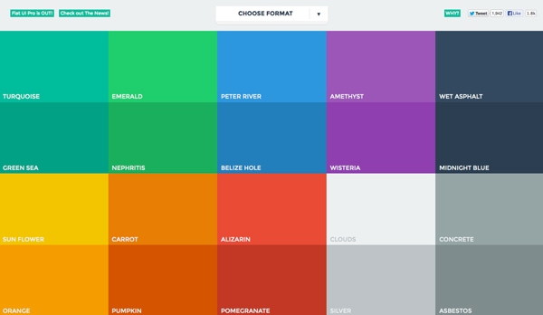
Flat UI Colors, a website designed to showcase and help designers create and use flat colors, is a great mood-booster.
Take a look at the hues, they are all warm and inviting. Even the darker colors are based in warmer tones.
Because flat design often includes a lot of color, that increases the positive associations. Who ever looked at a rainbow and called it sad?
Con: Color Palettes Can be Tough to Match
The more colors you use in a project, the tougher it can be to match them properly.
Creating a harmonious color palette is a challenge on its own, and can be even more challenging when you add four, five or more colors. Designers who create the most successful flat color palettes tend to stick to a uniform look in terms of saturation and brightness so color choices look intentional.
Pro: Focus on Great Typography
One of the great things about flat design is the true focus on beautiful type.
With no decoration, typography really has blossomed in flat design projects. From beautiful decorative lettering to simple sans serifs, great type is one of the key components to a great flat design outline.
And personally, drop shadows on type kind of ruin great lettering. The sharp contrast between interesting typefaces and bold color is impressive and refreshing.
Con: Weak Typography Becomes More Obvious
Just as flat design helps create a focus on good typography, it can really make bad typography stand out as well. (Just look at all the flack Apple received after previewing iOS 7 with an ultra-thin primary typeface, a design decision that has since been revised.)
Flat design is very unforgiving when it comes to boldness. Every choice has some degree of drama, making it hard to hide less-than-ideal typography.
If you are not comfortable pairing or selecting fonts, flat design may not be the best option for you.
Pro: Visuals are Sharp and Clean
The nature of flat design is sharp and clean. That’s one of the features that makes it beautiful.
The style uses a lot of high-contrast features including color, type and an overall boldness that make lines clean and easy to follow. Buttons and other user interface elements are often design using basic geometric shapes with shapes, although basic rounding may also be used for some corners or edges.
Con: It Can Look Too Simple
Depending on the use, flat design has been called “too simple” by some.
It can be difficult to convey a complicated visual message in flat design.
The other argument against flat design is the simplicity of user-interface tools. Proponents of skeuomorphic design say embellishments that add a sense of realism make tools easy to use. Frankly, it depends on the context.
Visual hierarchy can also be a concern with super-simple interface designs. What is most important? How do you emphasis it visually?
Pro: Flat Design Discourages Boredom Decoration
There’s nothing worse than looking at a design and knowing the designer was bored with the project.
The tell-tale signs include too many shadows, odd animations or just a smattering of random effects that don’t seem to have a place.
Because of the simple nature of flat design, constraints help keep designers “honest” if they want to complete a project in the true nature of the style.
Con: Some Decoration Can be Good
Not all decoration is bad.
Flat design truly limits the number of tricks you can use if you want the project to be truly flat.
Conclusion
No design outlines is perfect. Tailor your design for each project so that the look matches the feel and tone of the message.
Design is about more than how something looks. It is also about usability and function. Good design is easy to use.
Are there pros and cons to flat design not mentioned here? Discuss in the comments.
Definition
What is Flat Design?
Is this the future of user interface design? Designer Luke Clum examines the emerging trend for flat design and what you can learn from it.
In the past, web designers put a particular focus on showing off their skills by packing sites with flashy illustrations and animations that supposedly wowed their visitors. Then came a shift toward skeuomorphic design, which attempted to bring real life to the screen, with faux-realistic textures, drop shadows and real object characteristics.
Today all that's now giving way to the flat design trend, which opposes all of these 'artificial' design techniques, in favour of a more simplified, classically digital aesthetic. If you’re looking for a user-centric web design style, this trend might be just what you need...
What is flat design?

Flat design is a minimalistic design approach that emphasizes usability. It features clean, open space, crisp edges, bright colours and two-dimensional/flat illustrations.
Microsoft was one of the first to apply this design style to its interface, seen by some as a backlash against the popular skeuomorphic design that Apple kicked off with its iOS interface. Instead of converting a real-life object, such as a calendar, into a tiny realistic illustration, advocates of flat design identify apps with simple, icon-like images.
Rather than bringing aspects of real life to an interface, this illustrates a clear separation between technology and tactile objects.
Minimalist doesn't mean boring
In flat design, ornamental elements are viewed as unnecessary clutter. If an aspect serves no functional purpose, it's a distraction from user experience. This is the reason for the minimalistic nature of flat design.
However, just because it lacks any flashy design doesn’t mean this style is boring. Bright, contrasting colours make illustrations and buttons pop from backgrounds, easily grab attention, and guide the user’s eye. The purpose of minimalistic imagery also contributes to flat design’s functional character.
Quick to grasp
Simple images convey messages more quickly than detailed illustrations. Images like icons can indicate universal actions or purposes so that everyone can easily understand them.
It’s easy to see an immediate difference between a skeuomorphic and a flat design. Notice how the bigger, solid colour blocks are more attention-grabbing and the meaning of the icons can quickly be perceived.

This cloud computing guide from online accounting service Xero uses a combination of flat illustration and iconography to demonstrate different benefits of working with the cloud. The simplicity of the imagery makes it easy to understand the message, which takes away any need for excessive copy.
What you can learn from it
Flat design reverts back to the basics of design as a functional tool. A website is designed and judged by how well it works, as opposed to what it looks like.
This raw functionality forces a site’s focus to be on user experience, so websites that employ this design style successfully are likely to receive positive feedback as being user-friendly.
How to do it
To design an effective flat site, all design elements must be centered on this idea of simplicity.
Solid, vivid colours give aspects the emphasis needed to set them apart in place of illustrative detail; sans serif typography provides a clean, crisp supplement to illustrations; text is concise and to-the-point; UI elements like buttons and links are clear and noticeable.
Everything should be designed with the same goal in mind to create a cohesive visual and functional web design.
Examples of flat design

This trip planning app design by Indonesian user interface designer Bady makes it extremely easy to book a flight based on packages and budgets. Everything is clear and understandable, and the design relies mostly on colours and icons to give meaning. The copy is concise, and the UI aspect of searching for an ideal flight is obvious.

LayerVault is a site dedicated to providing a user-friendly means for designing and storing files. The entire design and workings of the site reflect this purpose. All illustrations, colours, type and UI elements reflect flat design, which emphasizes its commitment to being easy to use. It even features simple animation, which shows that flat design can still take advantage of different design mediums without becoming distracting.

This weather app UI design shows that flat design can be successful even without the use of bright colour. The crisp iconography and large typography draw attention to the most important aspects of the weather, which is what the user is looking for.
When exploring flat design in your work, make sure to design every aspect with a minimalistic and user-centric perspective to ensure a unified interface. Once you’ve successfully done this, your users will appreciate the functional nature of your website.
Illustration
Although the year draws to a close, the flat style is still at the peak of its popularity, and is unlikely to leave us the next year. We have featured numerous informative articles regarding to this topic starting from Flat Design and Color Trends and ending up withhelpful tutorials of how to master it, yet there is still a small loophole that we have missed – website designs featuring flat illustrations that have become extremely popular lately. So let’s delve into this issue a bit deeper.
Today we have considered not only websites that are based on polished vector drawings but also those that leverage plane graphics, and of course, modern icons with long shadow or convexity effect.
All these examples can boast of its harmonious outward, since the flat style manifests itself not only by means of accustomed flat subtle color scheme, neat elegant typography, solid color backgrounds and flat integral user interface components but also with a help of a decorative aspect that is presented by flat illustrations.
Let’s explore some characteristic examples of flat design illustrations
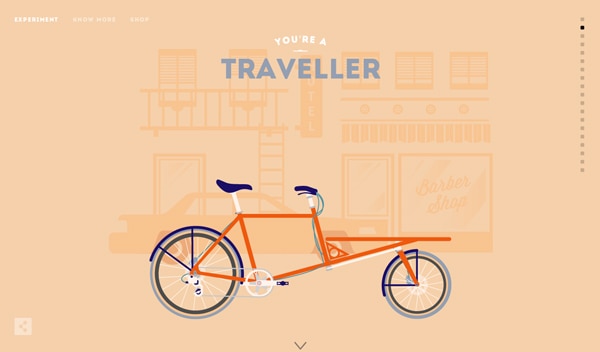
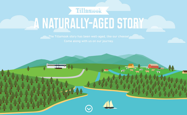
A Naturally-Aged Story is a fantastic website that is based on a visual storytelling. The company quite creatively and skillfully familiarizes regular users with its history, grabbing their attention by means of captivating vibrant illustrations.
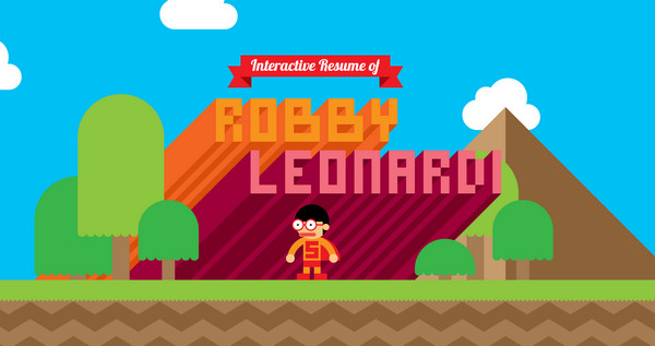
Robby Leonardi has a magnificent, truly extraordinary online resume that has an old-school game vibe. It is fully based on vivid flat illustrations, where even “fake” 3d elements are created by means of simple plane shapes. The adventure of a small funny character is simply intriguing.
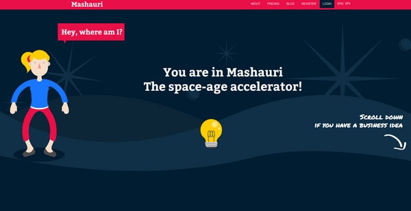
Mashauri is an intricate corporate website that also adopts approach of visual storytelling. The web developer makes use of vertical parallax in order to bring it to life. The website comprises flat essential components throughout a whole design.
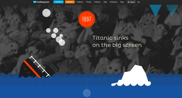
GetResponse resorts to an optimal solution of a perfect combination between image background and plane garish pictures on a foreground in order to create a spectacular scene that is ably populated by interesting facts. This is a great example of how to effectively acquaint users with results of its intensive 15-years work.
TeamGeek is a clean and open portfolio that leverages lots of flat icons and graphics. Thus the “What We Do” section comprises a nice eye-catching grid with intelligible icons made in a saucy flat style while other subpages are complemented by modern graphics with elegant long 5 O’Clock shadows.

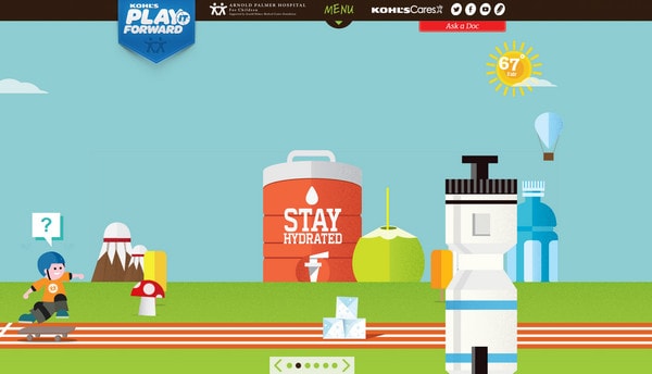
Play It Forward is a non-profit website that is aimed to reveal benefits of sport to children via small captivating game. The flat illustrated background along with a positive vibrant color palette creates a healthy atmosphere, and easily conveys a cheerful mood.
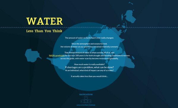
Less than you think – The website is intended to raise awareness of water supplies, presenting a sophisticated attention-grabbing design. The website is an interactive infographic that displays statistical data in a pleasant manner, which are supplemented by splendid flat illustrations.
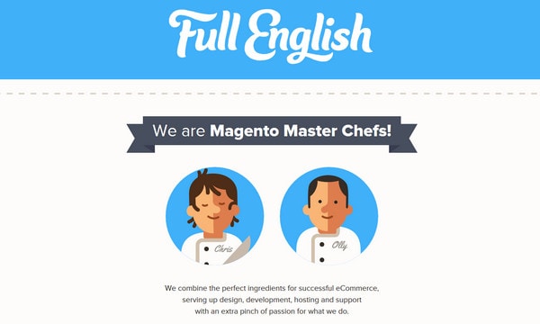
Full English is a clean and neat online portfolio of two Magento gurus. The developers choose to adopt a kind of cartoonish approach in order to create a friendly atmosphere. The website effectively balances of bags of plane graphics with dynamic components, giving the website a lovely advanced appeal.
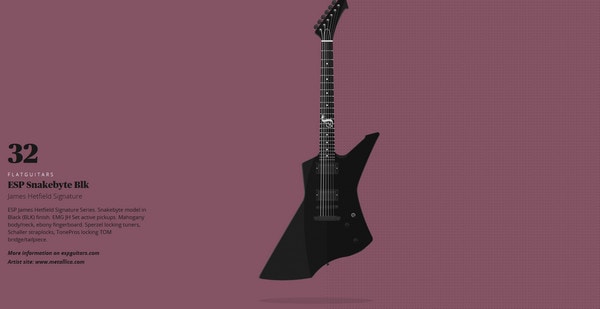
Flat Guitars is a specific website that is dedicated to rock, and to be more precise, it showcases various popular guitar models. It highly resembles the website about New York windows that also makes use of flat illustrations in order to effectively bring attention to regular things.
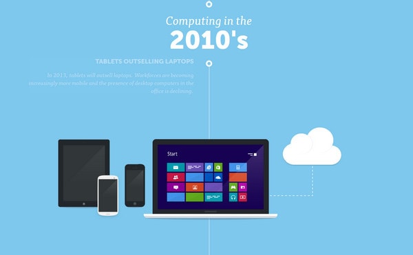
Visual History of Computing – As the nameplate implies, you will be able to briefly explore a history of computing, which traces its story from distant 50s. Each era is supplied with an amazing flat illustration of a corresponding to this time device and of course, a short note. The flat illustrations help to abstract from shapes and exterior design and take a closer look at what actually was happening.
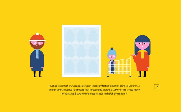
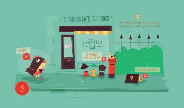
Let’s talk Turkey is a juicy website that leverages an approach of interactive journey in order to notify online audience about the meat market. The story is also presented by means of a set of colorful flat illustrations that adds to the website a positive feeling.
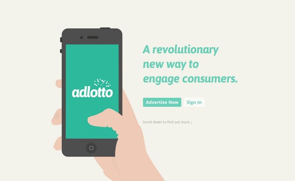
Adlotto – The website welcomes its readers with a pleasant cartoonish flat illustration. In sum, the website looks neat and elegant mainly because of soft pastel coloring and clean flat graphics that is dispersed throughout the entire design.
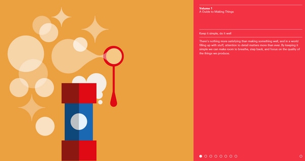
Volume 1 is an interactive eye-popping website that leverages fantastic flat drawings with lovely dynamic effects in order to get the readers’ attention, and make the guide appealing.
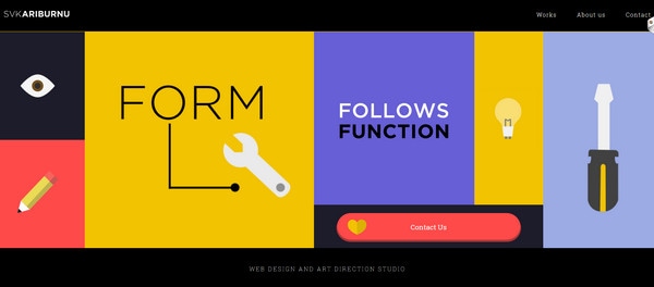
SVKARIBURNU has a crisp website that employs a powerful combination of content and illustrations. Thus, the website utilizes only these 2 components in order to make the website look sophisticated, modern and clutter-free. Flat illustrations perfectly co-work with a sharp type and solid color backgrounds.
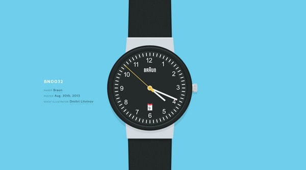
Wrist – Much like the example number 9, this website also graphically displays various models, and in this case, it shows off different wrists. The designer has chosen flat style, since it doesn’t clutter up the design and quite effectively demonstrates tiny details. Moreover, plane graphics laconically collaborate with background and content.
Gjenfodt is an advanced website that is based on top-notch vector illustrations. Flat drawings and characters, even polygonal style graphics can be found on this spectacular website.
Adcade is a subtle website that is made with flat style in mind. There are lots of contour style figures, plane illustrations and smooth typography. The developer ably mixes graphics and dynamic effects, making the website look interactive.
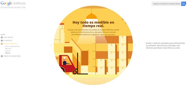
Google Adwords always goes with the times, so it’s not surprising that its website also employs bright flat illustrations for explanations.
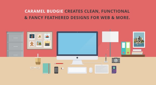
Caramel Budgie – The designer efficiently leverages a set of flat colors, giving the website a soft and modern appearance. All icons and graphics are also made in flat style in order to effectively contribute to the theme.
Cuisines Schmidt – A set of garish flat illustrations is the centerpiece of this website. Moreover, every interactive picture is provided with enthralling dynamic elements and widgets in order to grab as much attention as possible.
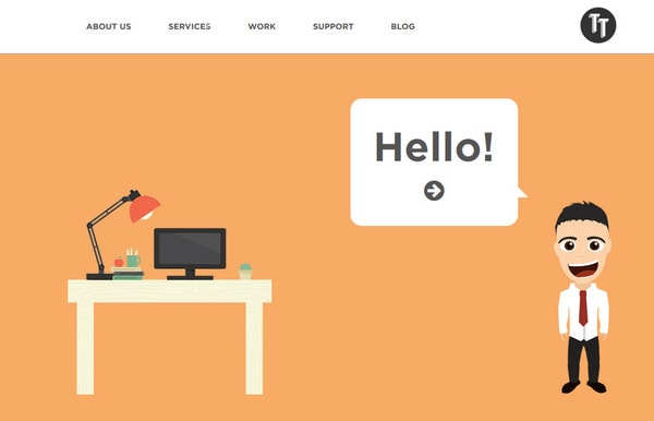
Tiga Tech is a small yet productive online portfolio that is constructed via flat exciting drawings. Every section includes its own cartoonish picture.
Reflection
Use of flat illustrations and flat graphics in website design is quite a predictable outcome, all the more so the flat style websites look more harmonious and completed with an appropriate graphics. Icons with long shadow, plane graphics and dramatic flat illustrations are essential components of such type designs.
Flat Design: In Depth Look
Flat Design or Flat UI has been one of the most talked about trends in web and user interface design this year. It has frequently been compared with skeuomorphic design, because of its completely opposite principles and style.
Designers have voiced questions over whether this is a lasting trend or just another passing fad. Regardless of the future and the voices against flat, most designers have been tempted to try implementing this trend in some of their work. Here we’ll delve a little deeper into the style, its historical roots and how to start designing in the flat style right away.
A warning before we begin: flat design can be used to create really beautiful, simple interfaces, but it’s not necessarily appropriate for every project. Be mindful of what you’re trying to achieve visually and what you want to communicate.
So, what is Flat Design?
As the name indicates, flat design is defined by flatness of style: simplifying an interface by removing extra elements such as shadows, bevels, textures and gradients that create a 3D look.
The idea is to create a finished design that lives in only two dimensions, without losing any of the functionality that a “regular” interface provides. This creates a new challenge for the designer, because by stripping an interface of its decorations and effects, it becomes harder to define the main actions and elements in a design.
Flat design comes from the wish to create more digital interfaces, and an open canvas for interface innovation in digital devices. A good example of flat design is this icon design collection for Mac OSX, where some of the most famous Mac icons are re-imagined as flat versions of themselves. You can easily see how the icons maintain their style and form even though they’re stripped of details, shadows and textures.
Weather Apps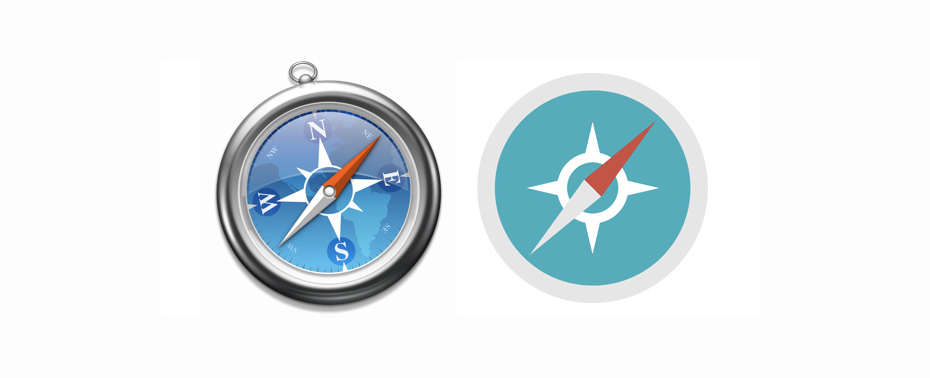


I looked at flat weather apps, as these are a great way to see flat design in use, it is EVERYWHERE on these apps.
This has a left flow out navigation menu as it is on mobile. The space between the text helps show a clear separation rather than having lines between.

This app uses gradients behind the white text to show the kind of sky it is.

This is less flat, using realistic images of the sun and types of weather.

This has a clear hierarchy with the use of colour and sections. It is easy to see how to use the app with the use of arrows.

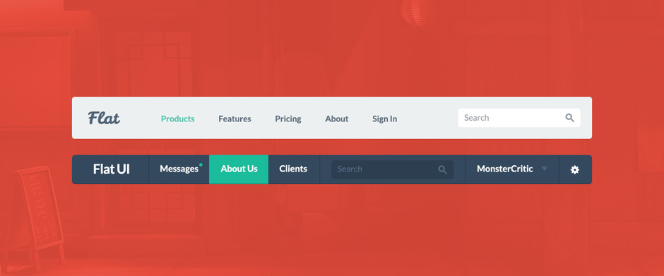
Flat Examples
This is how flat interface has been used across programs.
I like how pie charts and a simple layout have been used to convey intellectual information as it makes it easy to digest.

Calendar
This is the perfect example of a flat calendar and forms. I like the effect because I think it is easy to read and use.

This is a good example of how a flat colour scheme is used.

This report is an all round flat design, with the navigation, colours, text and shape of photographs all characteristics of the trend.

Another app showing money related content, this interface makes it easy to digest the info.

An example of how flat design can be used in list format. I think it is clear to use because the icons that are included are easily spotted because there is a reduction in other elements.

Flat Icons
A collection of how icons have been transformed into flat design.

Leave your comment