What is Responsive Web Design?
The longest standing trend, this is now seen by many as the solution to adaptive screens. It is the adaption of a site layout that changes depending on the screen size it is being viewed on so that it fits accordingly.
Animated image showing a desktop screen adapting to a mobile screen.
What is Everyone Else Saying?
Responsive web design offers us a way forward, finally allowing us to “design for the ebb and flow of things.” - Ethan Marcotte
We started designing responsive websites so we could be more future-friendly, and with a shared goal of better optimised experiences, accessibility should be at the core of responsive web design. - Laura Kalbag
Designing adaptable pages is designing accessible pages. - John Allsop
So, How Does Designing for Adaptable Pages Improve Accessibility and Usability?
42 percent of smartphone owners between the ages of 18 and 29 consider their phone as their primary way of accessing the internet (from Pew Internet).
Having one site, as opposed to an extra mobile site, means only one set of changes needs to be made.
Tablet sales grew 33% in 2013 to 227m.
Navigaton Examples
I looked for some examples of websites with different navigation. I wanted to find some that weren't already included on an article so that I had found them myself.. this took a while testing different sites.
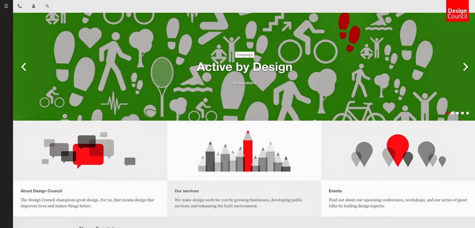
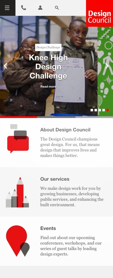
Design Council
The Design Council website utilises a side navigation that slides out when you click on the menu icon. This is also used when using the desktop version - infact, when you first view the site it is already open for the user. With it already being open, it helps the user know it exists. The site is responsive around it, making it an advanced and smooth piece of code.
Lush
The navigation on the Lush website resorts to symbols to identify the navigation to the user once they are viewing it on a smaller screen. The use of the menu icon indicates a drop down menu will be opened and provide the links there. This doesn’t disrupt the content, shrink the navigation and scales well.


Osvaldas
This approach involves adding a bit of padding to optimise the experience for touching the screen with accuracy, but ultimately it just squishes the nav into the space. This is good if you don’t have many pages in your navigation, as it can obstruct content if there are too many.


Leave your comment