I changed the hero banner to the colours of the trend colour scheme and changed the icons. I also added the intro for the flat design.

I then added the icon for flat design, with a button underneath it saying skeuomorphism - this would change the icon to show what it looks like skeuomorphic.

Here is what the quote section looks like.

I then started working on the illustrations for how it improves accessibility and usability.


Here is the page for this section.

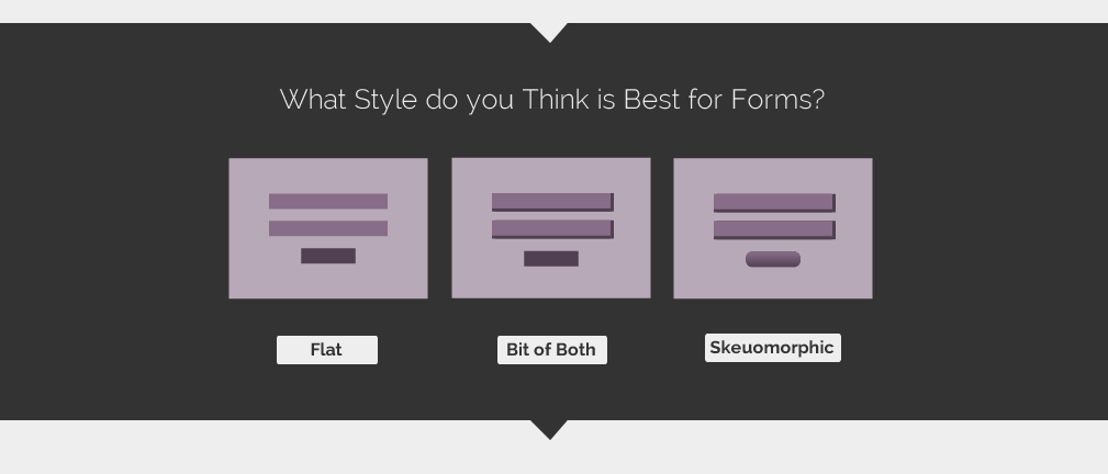
The topic up for debate is forms, and how flat design may not be the best solution.

I thought of three areas to do with forms that I could compare flat with skeuomorphism.


I found two examples for the field section that use both flat and skeuo.

I then mentioned in the description which uses flat and skeuo.

Here shows primary and secondary elements.

Here the examples discuss button shape.

Users can then vote which style they think is best for when using forms.
The debate section is still the same.

Here is the end of the page, where the user has a choice of what to do next.

Here is the final page:

Leave your comment