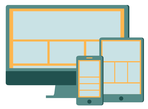
RWD
I started designing for the home page and RWD based on the drawings I had done.
Phone
I didn't have any limitations on how many colours I could use because I was working for screen, just the fact it had to be RGB. I started playing around with different colours.

I liked these shades of green, and decided to go with it. It is a characteristic of flat design to have bright colours, so I thought it was appropriate for my project. I added drop shadows to add some interest, and not make it entirely flat - something a lot of people have said is a better answer to pure flatness, a mixture of flat and skeuomorphism.

I made the drop shadows on the screen and button thinner.

I added a layout in the screen, as I want to show how the same layout will be shared across different screens.

I added an ear piece at the top to make it more realistic.

I made the screen square rather than have rounded corners because this is more realistic too.

I got rid of the drop shadow on the screen because it's not 3D - duh!

I elongated the phone to make it look more in proportion.

Then I removed the drop shadow from the button as that also isn't 3D.. I need to bare this in mind when adding them! This is the finished phone icon.

I tried it with a shadow on the screen too.

Tablet
For the tablet I used the same shape, and just made the phone bigger. I also changed the layout on the screens.

I rearranged them to overlap just to see what it would look like because I want them to work as a set.

Desktop
I then started doing the desktop version.

I then widened the bottom of the stand.

I then added another part onto the stand, and tried them all together. I didn't like the tablet on its side.

I tried reversing it but I still don't like it. The proportions don't seem right.

I then moved made it portrait which worked better.

I prefer the arrangement like this.

I also tried a landscape tablet version but I didn't like this.

Outlines
I then wanted to make these into outlines, to act as a pattern on the home page.
Here is the phone, but I felt there were too many outlines.

So I filled a couple of things in to balance it out.

I did the same for the tablet and desktop, but I wasn't too keen on the desktop.

I added the line back in, but I didn't like this either.

So I just kept it without.

Without Layout
I also did a version without the layout

I then arranged them into place.

Background
I wanted to add another element of colour in it to make it brighter and fit in with the flat aesthetics, so I tried it within the design at first but it didn't really go. I chose a mustard yellow as this a popular choice with flat design and it contrasts well with the teal.
I then tried it as a background, which works a lot better.

I then tried making the desktop stand a darker colour, as the phone blended in with the mac. This looks too much though I think.

I then got rid of the bottom dark area, and made the screen bigger.

I also altered the illustration for the desktop, as I want this to shrink to physically show the changes of the responsive design. I'll show this through animation.


Typography Led
I then started working on the illustrations for the typography led section of the site. I needed an icon for the home page as well as a pattern for the header on the flat design page.
The reason type led designs are a trend at the moment is because of screen resolution, and how well they can be rendered, allowing thin typefaces to be produced better on screen. Also, with the likes of @font-face and google web fonts, more fonts designed for the screen are becoming readily available on every computer - before, only fonts people had installed on their computers could be used.
So, I decided to make a magnifying glass on a letter to show when zoomed in, it is still crisp. I also used a font that was a specifically designed web font, to fit in with the fact there are so many fonts now.

I kept with the flat aesthetic to that everything fit in, and added a drop shadow to the magnifier.

I added the holder part to it to complete it.

I then started playing with background colours.

I felt this looked too lopsided because of the angle of the holder.

So I moved it down more to look more central. I like this colour as it contrasts well.

For the pattern of the Type Led page I wanted to only use fonts specifically designed for websites so that it related to why type led designs is a trend. I used:
Exo
Titilum Web
Open Sans
Roboto
Kreon
Droid Serif Bold
Kameron
Josefin Sans
Museo Sans
Oxygen
Raleway
Oulipo
Domine
Merriweather
Alegreya Sans
Inconsolata
PT Serif
I used a variety of thicknesses. I need to arrange them properly to the space available, but at least the design is done for the moment.


Menu Icon
I wanted a menu icon for the navigation of the site, so I created the symbol using the Pen and stroke tool.

Quotes
As I am including quotes throughout the site, I thought about how I can lay them out.
I picked two quotation marks that I liked, and decided to go for the one on the right, as it is Raleway - a web font.

I changed the colour of them to fit the topic, and put them around the quote.

I then moved these around.

I added the person who said the quote. I used the Align tool to make sure everything was aligned properly.

I altered the weights.

Then I altered the spacing.

Then I added three buttons to allow the user to choose different quotes.

I then tried arrows..

And circles as buttons.

Flat
For the flat design icon, I had a couple ideas. I could do a half skeuomorphic, half flat logo, have a hammer flattening and icon or do a symbol which is iconic with flat design. I decided to go with the latter, and do a weather symbol - I thought this would work well with the pattern, because I could do lots of different weather icons.

I started doing a calendar at first, as this is popular with flat design, but then I thought it couldn't be used as a pattern.

So I started doing a weather icon. Weather apps are everywhere with flat designs now, so I thought this would be appropriate, and I have researched them.

I added a drop shadow, rain drops and highlights.

I took one highlight off and added drop shadows to the rain drops.

Then I played around with the colours.


This is the preferred colour that I chose.

I then made more weather icons that would work on the pattern.

As I went through the website, I created icons to go with the content and ideas that I thought of.


Leave your comment