As I now know what I am going to do for my project, create a website for Hotel Kakslauttanen, I need to do some research. I'm going to look at websites for hotels.
Gansevoort
This is a website for a luxury hotel chain, and when you first go onto the website there is a landing page which automatically fades into the home page. I think this is quite tacky, as it looks as though you're about to watch a video which I think would put some users of.
However, it is full of high quality images which immediately engages the viewer. Although I think this can be very busy, I love the hover effect when you move your mouse. A dark box covers the image with the title and an arrow indicating to click on it. When you switch over the images, the dark box seamlessly moves around with you which I think is really professional and futuristic in terms of technology.
The only non image on the home page is the booking feature, which most hotel websites have on their home page. I think this is really useful and something that users want to check the prices and availability. However, when you 'check availability' it opens another window on your browser which I do not like. I think it should be part of the same website.
It then loses its elegance, and does not look like part of the same website. It is a very different style, and looks quite cheap, although the prices are definitely not. I think it needs a sense of continuity. I also think it's quite hard to navigate as it is such a different layout and users are not used to it.
When you click on one of the links from the navigation bar, the page changes without loading which is very smooth, unlike the booking feature. I think it is easy to understand, and I like how there is a text section over the main image, which can be minimised and maximised. It uses the same grid as all the other pages which works well too.
Here is another page, using the same grid. I think the muted colour scheme works well with the bright images, and also gives it a professional tone.
The George
This is a similar layout to before in the sense that a full width image is used, with the left hand side being used for small text and the logo. It also features a box next to that with more text on like the previous site.
A cool feature of this site is that when you click on the image it removes all the text and distractions, and when you click it again they come back, so you can focus on the information or image.
The booking feature on the right could be more substantial though I think, as it only has the dates you want to book, not the amount of people, room etc.
I like the rooms and rates page, as initially you can choose what room you want to look at which is laid out to understand easily. As it gives you information, prices and large images about the room, then gives you the option to click a further link to book it.
Luxury Hotels and Resorts
I think this is a really professional and luxury web design, and I also think it is aimed at an older audience. I think this because of the mature, luxury colours used as well as the fact it is very easy to use and yet doesn't compromise on how it looks. The use of script font and specific language also suggests this.
I think the big navigation bar and slider are very functional and let the user see everything they need to know as soon as they load the page without scrolling.
There are three ways to find a hotel, and these are clearly labelled with text and image which I think is a very functional way to portray it, and I haven't seen anything like this on a website before.
I think this works well because there is so many hotels globally, so there is enough hotels to look via these three ways. When you browse by map, you can visually see where the hotels are and this is good if you don't have a specific destination in mind because you can see your options. I think this is very good design.
It tells you statistically how many results you have as well as visually, and you can narrow your search down further with these check boxes. The good thing about this check box is that it doesn't refresh the page and is a very smooth transition.
You can also search this way, and when you start typing a destination it tells you where you can and how many hotels are there for that little bit extra information which I think is very useful.
It also works if you are looking for a specific hotel as you can search by list. This gives you all the contact information you need to know about it.
Wythe Hotel
I like how this website is laid out, because it has a hierarchy of what is important. It starts with the logo and navigation bar so people can search what they want straight away. It then has the booking feature, which is usually a main point of interest on a home page anyway, so this is useful. It then has an image of the hotel which engages users and lets them know what they could be staying in. Then you scroll down a bit and it has the contact information and a bit about it, which is all you need a home page. I think it has nailed the needs on this.

It also has a floor plan, which is a lot more sophisticated than the one on the Hotel Kakslauttanen website.
When you click on the rooms, the link is in a darker colour on the nav bar, and it follows the same layout as the home page. What I like about it is the large image engages you to look at that, then when you look further there is information on the room to show you exactly what you get, then there is a link to the book now area once you know all the information. The whole layout of the site is very linear which I like.
Schnweizerhof
There seems to be a theme in hotel websites at the minute of having a large background image and information on the left of the page. Like The George website you can click on the image to remove or add text. However, it is a good way of showing the hotel, especially when it is a luxury one.
This is how the site looks when you click on the image to remove the text.
When you click on the rooms link, you get a choice of the different rooms and images which I think is a good feature as it lets the user have an insight before they make their choice to click on a further link.
Once you've clicked on one, it follows the same layout of the home page which a slider of the room and information about it in a hovering box. You can also click on the book now feature once you've looked at the information.
However, a new window opens which I think is a flaw in the website. Although the layout is functional and gets the point across, I don't think it matches the rest of the website and is quite boring. It seems like hotel websites at the minute are good at looking pretty, but when it comes to booking a room it is hard to continue the same look as it needs to be functional and workable, and it gets forgotten about.
Swiss Diamond Hotel
I think this is a sophisticated design, and works well with all the information being shown on the front page without having to scroll for more information. Everything is there right in front of you. I think its aimed at an older audience, because of its ease to use and isn't as eccentric as some of the other luxury hotel websites I've seen.
What I love about the navigation bar is that no matter which link you click, the 'drop down box' is the same width and height, and doesn't alter. I also think it's good that it includes images rather than just text, this is something I've not seen before. I also like how the language choice is a drop down menu, as it can sometimes clutter the page with lots of different flags.
Menin Hotels
I like the home page because when you click on room links at the side they slide fluidly up without having to load a new page, and it is very sleek and professional. The home page itself includes the full size image and side nav bar, however this one is a bit different with it being on the right - I think the reason so many are on the left is because it works better, with the way you read etc. I also think having the booking feature shoved in the bottom corner is a bad move as users can't see it easily and this should be a main feature of a home page.
Again, when you try and book it refers you to a ihotelier page, and looks really unprofessional, predictable and nothing like the rest of the website. I assume this page is used for a lot of hotels because a couple I've looked at use this site, but I don't think it looks good or matches the rest of the tone.
I really love this website! Although it's not entirely finished because the hotel hasn't opened yet, I think it is really well made. Although it isn't conventional at all, it is still easy to navigate through and isn't confusing. I think it has pushed the boundaries of predictable web design. Yes, the navigation bar is on the left, but it doesn't take up any more space than it needs.
When you click on a link, a page fluidly pulls down without loading a new page. It is very smooth, and the information is very clear and the layout is functional. It uses the 'x' exit symbol in a new way - by clicking this in the corner the page disappears and the home page is revealed underneath again.
There is nothing outlandish or some crazy layout to grab attention, it just uses space wisely and is very easy to use.
Le Sirenuse
I think this is a good website because of the grid and layout. It works across all the pages and functions which is important. The last column is the booking feature which is thorough, as well as sister sites, which never changes. The next column is the navigation and footer in one, which works well, and also stays fixed. The biggest column is the image, which has arrows that become more prominent when you hover over them to change the images. This shows the hotel, area, and also the clientele that visit which are a maturer audience.
On some of the links a further column appears to match the rest of the layout to provide further information on the specific link. I think this works really well.
When you try and book, it refers you to another site with the results on. I think these websites are a good idea which host that part of your website because it is an expensive addition to have, but I feel they are too limited with layout and don't match the websites that use this kind of site.
Four Seasons
I love this website. It's so contemporary and sophisticated, and I think it is really appealing. On the home page you can select your destination by hovering on the part of the world you want to visit, and when you hover, it changes colour to show it has been selected.
The slider features images from hotels around the world, and when it changes so does the text on top which features local temperature, time and name which I think is a cool feature.
I think it's easy to navigate with clear headings and colours differentiating sections and actions.

When you click to make a reservation, this is highlighted more with the background opacity being changed darker so it is less noticeable, and more options being opened to make a booking. I think it is very clean and simple, and gives you all the options you need.
Golden Crown Igloo
This is a website for a hotel in Lapland which also has igloo hotels. I quite like the home page, as it has a full width image and a half opaque nav bar and information box. However, the images are low quality and the script font chosen looks quite handwritten and childish.
Another thing which I think is really bad and quite detrimental to the business, is that you can't book online. You have to contact the company and enquire about it. I think this would put a lot of users of because they want to know the prices, dates and rooms available beforehand.
Nellim
Another website that is in Lapland which offers unique hotels is a lot better than the Hotel Kakslauettnan one as it is more interactive and contemporary but it is still not the best designed website. I think the black background makes it look quite dark and dingy, and doesn't go well with the green of the Northern Lights which is this beautiful phenomenon. The rest of the colour scheme doesn't quite work either, with the logo and footer being a garish yellow, and the navigation bar being grey and blue. The layout is quite old fashioned, although functional.
When you look at the rooms there are a couple of unflattering images and a short description if that, but at least it does give you the prices for the rooms. When you click on the enquire button it takes you half way down the Contact page.
There you have to fill in this box. Although more detailed than a regular enquiry form with being able to pick dates, adults, activities etc you can't actually book online and you need to have it confirmed for you by sending it to the company. I think this would put people off who want to book it rather than waiting around.
This is how the calendar looks when you click on the date boxes.
A flaw in the website is that when you choose how many children are coming on the holiday there is no option to choose none.
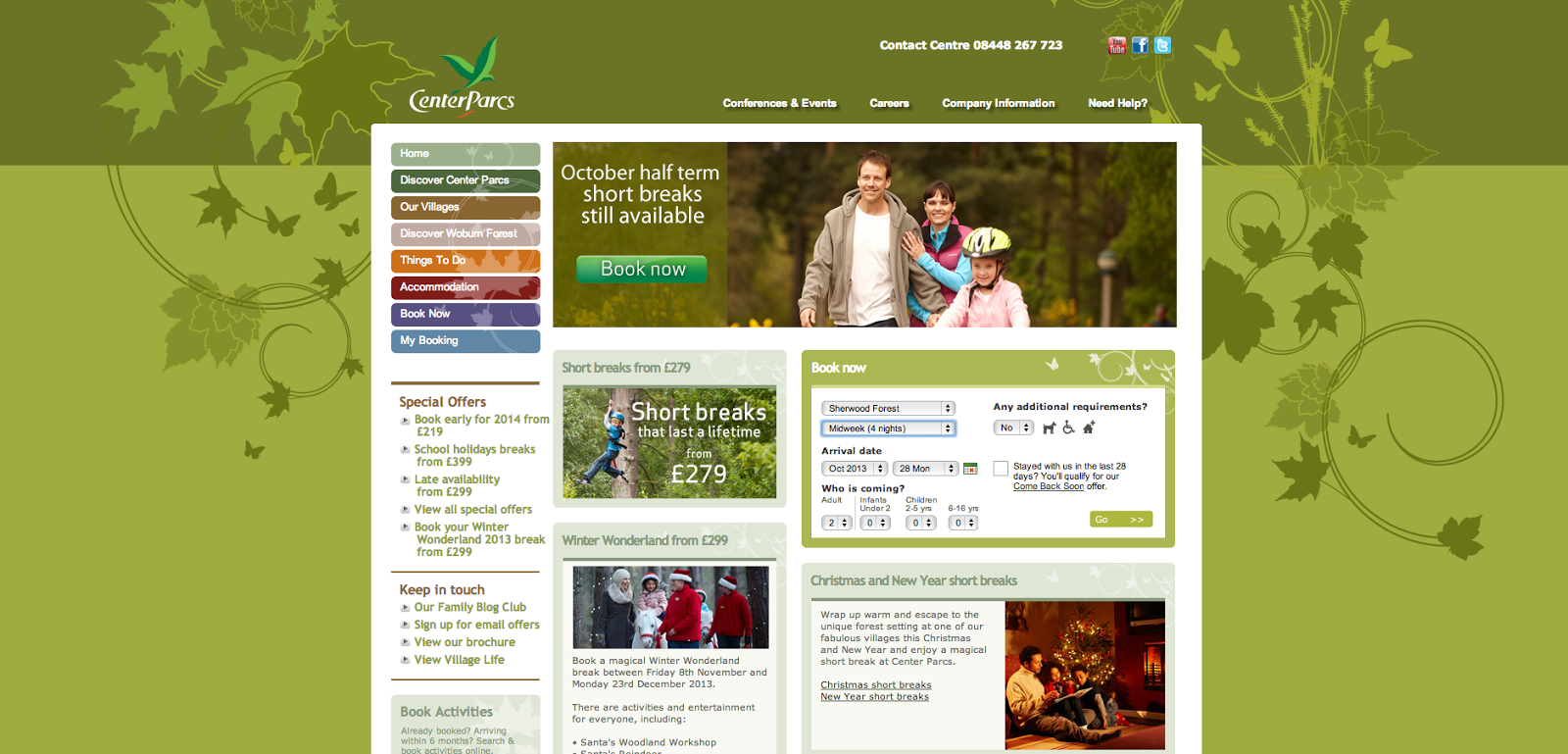
Centerparcs
I love the Centerparcs website because it is so easy to search for a holiday, and I think that's the main thing about a holiday website. Although the home page isn't very modern and is quite cluttered, there are several ways to 'book now' and these are clear. You can see it in the navigation bar where it is expected, in the slider which is where you expect promotions, and in the booking feature box which is something you also expect to see on a home page.
The options are clear and easy to select.
The best part of website though I think, is when you press search and your options come up. It shows you the cheapest room, how many are remaining, the dates and the hierarchy of rooms. If you're unsure on what room to choose you can also click on them and more images and information pops up without disrupting the search. And, if there are no suitable options, you can just click the arrows to see more dates without having to start your search again! I think its brilliant and so easy to use. This is definitely a format I want to incorporate in my website because of its ease of navigation.
Now that I've created my scamps and I know I want a full image background, I looked at a couple of websites that have done the same to see how they've done the background on their navigation bar.
I love this paralex scrolling website, it's very swift and professional and the layout and navigation of it is similar to how I want mine.


