Biggest 8 Responsive Problems
This article goes through the top problems with responsive design, and solutions to them.
He got his data from sending out a survey on RWD.
Survey

The first one affects accessibility to clients if you can't explain what it is to them. The solution is a different approach to wireframing, which lets the client see where the content would be once scaled down.
01. Explaining RWD to clients
The 'old' process of designing a website was a very linear one, which made it easy for clients to understand. They'd go through a briefing stage, then some sort of wireframing and structural planning stage, then they'd get a set of pixel-perfect visuals to pick apart. Only when were these signed off would the site itself be completed.
As I'm sure many of you have found, this process is simply not up to scratch any more. One of the things many designers are struggling with is how to explain to clients that there isn't really a 'visuals stage' any more.
Responsive design is a much more fluid process and wireframing, sketching and prototyping are typically more powerful tools.
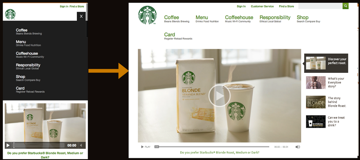
The solution: Demonstrate the power of responsive design
A better way to explain responsive design is to actually show a client what it can do. Don't just talk about breakpoints and media queries and multi-device functionality - it's easy to forget how meaningless these terms can be, even if some of them sound very obvious.

If you can't show a site on a range of devices, conside demoing one of the many sites that mimic typical responsive breakpoints, such as responsive.is or Responsive Layouts, Responsively Wireframed (pictured above).
Navigation
Here is a point on navigation, and how to make the design work, be consistent and have good usability on all platforms. This is a really valid point, and I think the most important one. It can be hard to know how to design for it when you are used to just designing for one size. It mentions a really good article on the solution as well which I'll post after this.
03. Navigation
In the past, navigation on sites tended to be horizontal along the top of the page, or sometimes down the left of a page. It now needs a more considered approach.
The number of responses to the survey that mention navigation reflect just what a tricky problem this is to solve – and not one that has a simple canned solution.
The solution: Use good, consistent design
Choice of navigation strategy is is a wide-reaching decision, and should be based on your site's content and information architecture, along with a number of design considerations.
Rather than simply downloading a script or demo, I'd encourage you first to evaluate how it works, why does what it does – and most importantly, how it works for the site you're building.

And remember: test how your navigation works on as many devices as possible, and in as many cases as possible. It's amazing how often I come across sites where the navigation just doesn't work in any sensible way. Don't be responsible for creating one of them.
This is another issue - images.
How to make sure they won't pixelate as this can create bad accessibility if someone can't tell what it is. It also makes the site look bad and doesn't look professional. SVGS are solution to some types of images, and although doesn't solve the whole problem, it is a step into the right direction.
04. Images
Much like navigation, the set of options available for handling images in responsive designs is incredibly fragmented. As yet, the W3C community group hasn't backed a specification, so we're left with what amounts to a personal choice of a wide range of scripts to fill in for this missing functionality, and deliver appropriate assets to devices.
To further complicate things, designers must also consider the next generation of devices with high-pixel-density displays such as the new iPad and Macbook Pro, along with a range of non-Apple hardware.
Like code, images and icons should be as flexible as possible to ensure that graphics on high-pixel-density devices don't look blurry because they've been scaled up poorly.
The solution: Scripts, SVG and icon fonts
While there may not be an 'official' solution for responsive images, there are some really great solutions out there that are good to use right now, and give us positive results without resorting to too many hacks or code workarounds.
Responsive Navigation Problems
From that article, here is another really good one on how to solve navigation.
Here are the approaches that he suggests:

This is how the 'Top nav or do nothing' approach looks like. The nav bar just squishes into the space, which can look quite unorderly and chaotic. It also means that the content is pushed down, so when you go onto a page you can't see what it is about. This is a problem, because users judge a page based on what they see first. However, it is an easy solution, and it is familiar to the user because they are used to seeing it at the top of a desktop version. It also means if you have big fingers it isn't easy to click what you want because it is squashed together, which can reduce usability.

Here is another example he provides:

The Select Menu
Here is one that I like (when done well) - rather than condense it all, have a button which will drop down the navigation. Usually this is represented with three lines - however, I think this can be confusing because not everyone know what it represents. I think that is something designers use and think everyone will know what it means, but they don't.
Here is an example of it on the article, which I don't actually think is very good. There is a drop down 'navigtion' button, but I couldn't even see where it was for about 5 minutes. When you go onto a site you need to be able to see it clearly as this is what you want. I would have gone of the website by the time it took me to find it.

The pros of it are that it saves space, so the user can see all of the content. It can be easily seen if it has a clear title like 'menu' or 'navigation'. It also means whether you use touch screen, a mouse or trackpad it is easy to use because you can drag or click it. By having a menu for it, people with big fingers or who don't have an accurate touch it doesn't matter because of the spacing around the words.
Problems with it in terms of usability are it might be confusing to people who are expecting it to be squished, and it involves the user clicking an extra time to get to the nav bar which slows them down. It also means sub navigation can look weird.
The Toggle
This is where the menu slides open, while not changing the place the user is in. This is easy to understand, the links aren't squished and by not jumping it doesn't confuse the user. It also looks good and scales well. The only problems are code related, not design, such as it is dependant on javascript and some devices don't handle animation very well.
Left Nav Flyout
I also love this option! It is what Facebook uses, so people who use Facebook on mobiles will already be used to it. The menu icon (three lines) is used, and when clicked the navigation slides in from the left. It looks good and provides space. One of the problems with this is that it doesn't scale well. This means you can have two different styles of navigation for mobile and deskstop which 1. can confuse users and 2. you'll have to maintain two separate navs.

Definition
These are some different introductions to RWD.
Creative Market
This focusses on how there has been a rise in mobile devices, so a rise in RWD, and how it looks great on all devices.


Awwwards
This talks about how people want unification between devices and responsive design will do that.

Quotes
I am now picking out quotes that people have said about responsive design, as I want to include these in my website.
Responsive Web Design
'Mobile browsing is expected to outpace desktop-based access within three to five years.' - Ethan Marcotte
Responsive web design offers us a way forward, finally allowing us to “design for the ebb and flow of things.” - Ethan Marcotte
Why Bother With Accessibility?
We started designing responsive websites so we could be more future-friendly, and with a shared goal of better optimised experiences, accessibility should be at the core of responsive web design. - Laura Kalbag
Dao
Designing adaptable pages is designing accessible pages. - John Allsop
42 percent of smartphone owners between the ages of 18 and 29 consider their phone as their primary way of accessing the internet (from Pew Internet).
Uncle Sam
To me, responsive design is more about a change in the browser and device landscape.
Responsive design is forward-thinking and means it will work on a phone, and that’s where things are headed’.
Creative Market
This focusses on how there has been a rise in mobile devices, so a rise in RWD, and how it looks great on all devices.
This focusses more on the coding aspect, and CMS's.
Awwwards
This talks about how people want unification between devices and responsive design will do that.
Quotes
I am now picking out quotes that people have said about responsive design, as I want to include these in my website.
Responsive Web Design
'Mobile browsing is expected to outpace desktop-based access within three to five years.' - Ethan Marcotte
Responsive web design offers us a way forward, finally allowing us to “design for the ebb and flow of things.” - Ethan Marcotte
Why Bother With Accessibility?
We started designing responsive websites so we could be more future-friendly, and with a shared goal of better optimised experiences, accessibility should be at the core of responsive web design. - Laura Kalbag
Dao
Designing adaptable pages is designing accessible pages. - John Allsop
42 percent of smartphone owners between the ages of 18 and 29 consider their phone as their primary way of accessing the internet (from Pew Internet).
Uncle Sam
Mobile was the final front in the access revolution. It has erased the digital divide. A mobile device is the internet for many people.
Mark BoultonTo me, responsive design is more about a change in the browser and device landscape.
Responsive design is forward-thinking and means it will work on a phone, and that’s where things are headed’.
Leave your comment