I looked at bathstore.com as it is related to plumbing to see how they have laid out their information. It's a bigger site than what I thought it would be, but it is straightforward and functional.
I then started looking at plumber's websites, and I didn't see a single well designed one.
But, it was useful for me to see what content was on the sites. This is because I got little content given to me, and I felt like I needed more to fill out space. So it was useful for me to see what plumbers had on their sites.
I think people expect plumbing sites to look like this as it isn't exactly a priority for them to look good, because this doesn't affect whether they use their service or not.
So I think that when designing mine I should keep it simple, functional and straightforward, but obviously well designed still.
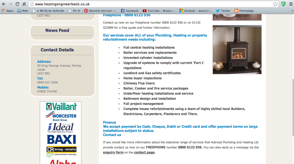
Another site for plumbing and heating, which is what my client labels himself as. They all seem to have a blue colour scheme with a hint of red to show the heating part of their job. I think this is quite tacky, and the colours chosen don't really go.
I don't like this website because it looks cheap. This is because of the tacky stock image, the images on the logo and just the overall layout of it.
But it does have here what services it uses, which is handy for me because I want to include a services section on the website, so I can look at the kind of content here for the sake of showing the client what I mean.
Another site shows the services and why you should choose them. I've taken note of this because I can get some ideas for the content.


Leave your comment