Archives

OUGD501 - Theory Into Practice: Mobile Scamps

I wanted to do a mobile version to show a responsive site - I think this is necessary because it is afterall a website on current web trends, with a big focus on responsive web design.

Home Page
On the desktop version, the three trend icons are placed next to each other, but I decided that for the mobile version they would be turned into a carousel slider with one icon being shown, and arrows to click through the rest. This takes up less space, and isn't necessary to have them stacked because the links are available in the navigation anyway. 


RWD (Flat/Type)


Here, rather than the navigation examples being stacked on top of each other, the images would turn into a slider to take up less space, with the information still being written underneath.
The links under What's Next would be stacked on top of each other rather than placed next to each other.

OUGD501 - Theory Into Practice: Designing the Type Led Page

I then started designing for the typography led design page.
As I have already done the first two, it was easy to put the content into the same layout.

I started with the hero banner.


I added the type pattern - using all different web fonts available to keep it relevant.


This would be the next section with a little intro. The idea is the magnifying glass would be CSS3 animated, and the user would be able to roll over all parts of the letter and see each bit magnified.


Here is what the quote section looks like.


I then went on Illustrator to make another illustration for the next section, and drew a speech bubble for one of the sections. I merged two shapes together and added a drop shadow.


Here is the next section, I reused two of the illustrations as they made sense with the content.


Now I need to think of the debate. I thought it could be to do with licensing, point size, what service is your favourite, or how to implement fonts onto your site. I thought licensing would be more apt on the debate page, point size is a bit basic, and how to implement web fonts is easily known if you are a developer/web designer.

In the end I decided to look how type has changed in different areas of a site - the hero banner, bodycopy and when being used in storytelling.

I decided to call the debate 'progression' as these are not necessarily new ways in which type is being used, but an improvement.


Then I asked what did people think had progressed more?


Here is what the 'or view more trends' section looks like, with the other two trends as links.


I decided to combine the two sections together, and have the simple heading 'What Next?'


This is what the last two sections look like together.


Here is the final design:


OUGD501 - Theory Into Practice: Designing RWD Page

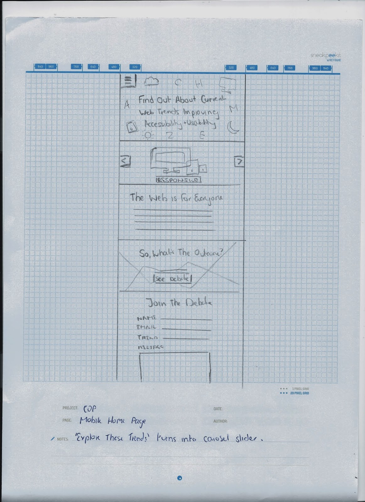
I then moved onto the Responsive Web Design page, with a contents of:
  • Hero Banner
  • What it is - animated scalable image
  • What everyone is saying
  • How does it improve in terms of accessibility and usability
  • Navigation 
  • Which navigation do you prefer? - Results
  • Want more debate? See what people are saying.
I then started designing.

I did the hero banner and this was just the same as the home page, with the trend colours and icons being used.


Then I gave an introduction to RWD and included the scalable vector.


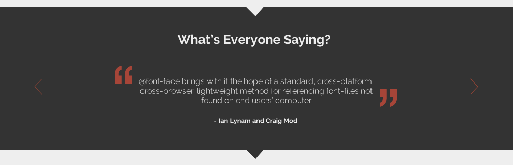
Then I started on the quotes section.

First I added two quotation marks and the quote.


I added the author in a box.


Then tried just one quotation mark.


Then I added three squares to let the user view more quotes.


Then I added arrows as it looked a bit busy.


I arranged all the spacing between everything and I was happy with this.


Then I started on how it improves accessibility and usability. I started by using a very gridded layout, and was going to include lots of statistics and images for that.


However, I decided that it wasn't working. So I picked the three key points, which were for tablet, desktop and mobile. Then I used the illustrations I had done, and arranged them like this. This is a more consistent layout since I did a similar thing for the trends on the home page.


I added headings.


I sorted out the spacing between the illustrations, and made the tablet portrait.


A zoomed in shot.


I made the text boxes longer as line length was too short.


I spaced them out more to make it more attractive.


Then I started working on how navigation is a debate with responsive design.
I resized the images in Illustrator first.


Then I took them into the Fireworks document, and resized them.


I added a bit of an intro to section. I then thought I should put each example in its own section as it's going to be pretty long, and this will be easier to digest.


Here is the first example in its own section, with a bit of a description to the navigation style.


Here is the second one.


I then decided to have this on a darker background so that the images stood out more.


Here is the third example.


Now the user can choose which style they prefer.


After that, you have a few options. You can choose to join the debate with your own opinion. This is also featured on the home page.


I tried the send button at the side, but I preferred it in the middle - more conistent.


I added another section, which would give you the option to view the debate.


I added a heading to it.


Then another one where you can view more trends. I don't know if this is over categorising - I could ask around.


I tried it with all three - I can ask for feedback on this.


Here is the final design:


Copyright 2010. All rights reserved.

RSS Feed. This blog is proudly powered by Blogger and uses Modern Clix, a theme by Rodrigo Galindez. Modern Clix blogger template by Introblogger.