Here is my dissertation presentation.
Context of Practice
Danielle Harrison
Archives
OUGD505 - Design Production 2: Studio Brief 2 - Visual Research
As I started designing the components for my cruise ship branding, I looked at visual references throughout.
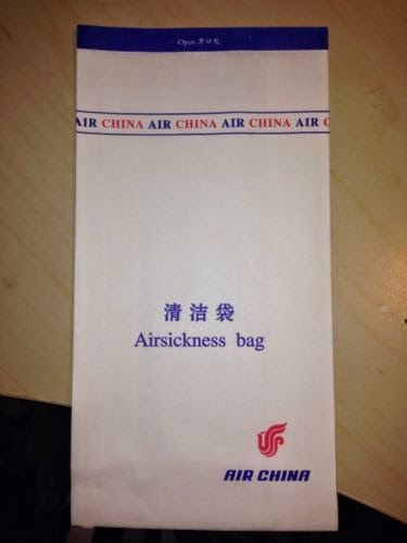
Sick Bags
As I was designing a sick bag, I looked at existing ones to see how they were designed/made.
Some just have the logo, some state what it is and some have extra designs on them as well. But they all follow the same dimensions and shape.
.JPG)
.JPG)

Existing Logos
At first I was having trouble thinking of a logo or name so I looked at how existing brands brand themself. Most cruises focus on being in the sea, the fact they are a cruise, where they go or a luxury word association.


Ship Stats
I wanted to know how big cruise ships are so I can advertise mine correctly, so I researched into mega, big, medium and small ships to see what best represented my audience and brand. I chose medium and big ships in the end, and found three sets of stats that would work well for my ships.


Web Banners
I always see these web banners now I have been searching for cruises, so thought I could do a couple.


Sick Bags
As I was designing a sick bag, I looked at existing ones to see how they were designed/made.
Some just have the logo, some state what it is and some have extra designs on them as well. But they all follow the same dimensions and shape.
Existing Logos
At first I was having trouble thinking of a logo or name so I looked at how existing brands brand themself. Most cruises focus on being in the sea, the fact they are a cruise, where they go or a luxury word association.
Ship Stats
I wanted to know how big cruise ships are so I can advertise mine correctly, so I researched into mega, big, medium and small ships to see what best represented my audience and brand. I chose medium and big ships in the end, and found three sets of stats that would work well for my ships.
Web Banners
I always see these web banners now I have been searching for cruises, so thought I could do a couple.
I found some dimensions.
Iconography
I wanted to see how cruise liners categorise their shore excursions, so I found a list of definitions and icons to go with them to get an idea of what content to do.
OUGD501 - Theory Into Practice: Module Evaluation
Here is my module evaluation. This module I learnt about different topics, improve on writing skills and I had to write an essay and produce a physical element for it, which was based on 'How Do the Current Web Trends (2014) Improve Accessibility and Usability?'
What Did I Enjoy?
I really enjoyed this module as I had the opportunity to explore web design, the industry and user experience as well as improve on my essay writing skills. I wanted to further my skills and understanding in these areas, so I was able to make the most of this module by doing so.
Web Design
Although I have designed, coded and taken live websites before this, I knew there was a lot more to learn and I had only touched the tip of the iceberg. By focusing my essay on accessibility and usability I learnt a lot more about how to improve it, which I really enjoyed. I wanted to be able to design websites that everyone can use and it is something that I am really interested in, so I tried to make the most of that by applying what I learn through reading articles and going to web talk events into the practical element of the module. I found it really beneficial going to talks from people in the industry, and it definitely influenced my essay and practical side.
After making informed decisions for my website, I also enjoyed the process of actually designing it - thinking how buttons would look when you hover over them, creating the iconography, picking the colours, designing the layout etc. I got stuck into it and was pleased with the outcome. I would have loved to have spent a long time on it, creating a bigger and more thorough site, which I'll do next year no doubt.
What Have I Learnt?
Essay Writing
Prior to this module I have always struggled with critical writing and found it hard to articulate and structure an essay. Reflecting on my first year when I didn't do very well in my essay, I wanted to try and improve this time so I went to an essay support session. I already had all the quotes and points that I wanted to include, and so the woman at support helped me figure out how to make a structure for it. This allowed me to get started with the writing, which is what I found difficult at first. I did actually start writing an essay on consumerism, but I found it difficult because I wasn't enjoying the topic so I also discussed changing this with her. With the tips on how to write the essay, I then had the confidence to change my essay title as I felt I could achieve it if I followed the structure. I did significantly better in this essay than last year's so I was happy that I had improved, and that I had changed to a topic I was happy with.
I think it was important that I changed to a topic I was more comfortable with and wanted to know more about, because it made the writing more enjoyable, worthwhile and easier. I also knew that it would lead into the practical side of the module, so I was able to do something that I enjoyed for it.
User Experience
As I was researching into accessibility and usability on the web for my essay and practical element, I learnt about how using web trends impacts user experience which has informed my design decisions when creating websites. This is important because I want to create designs that are functional, realistic and easy for the user to understand. I think this has helped me improve as a designer because I was able to have a better understanding and apply what I learnt to the practical side of the module. For example, I considered how the navigation would work on a mobile as well as desktop for a responsive design.
Lecture Topics
Previous to this year's lectures, I didn't have a lot of knowledge on important topics such as capitalism, consumerism and the gaze, therefore I didn't have any informed opinion on them. So these lectures definitely provided me with the opportunity to learn about different opinions, how things work and how they have affected different societies. I was worried before these lectures that I wouldn't be able to think of an articulate essay title or be able to understand any of the topics that were raised, but I learnt a lot from them. I think it was necessary for me to have a greater understanding of topics like consumerism because it will inform the kind of designer I am, as well as make me think about advertising and products before I buy them. I definitely feel more aware of what is happening in the world now, and have more informed opinions on these topics.
What skills have you developed through this module and how effectively do you think you have applied them?
Designing for the Web
I developed my web design skills further, which I really wanted to do because it is the area I am most interested in, and I want to continue improving and learning on what I already know.
I used Fireworks to design the website on, and I became more competent using that because I used it throughout the Theory Into Practice brief. I also discovered you can preview the design in a browser on Fireworks, which I didn't realise before.
I had the chance here to implement a lot of current web trends as it was relevant to my essay, so I was able to create an advanced and contemporary design. As I was researching a lot about trends, I understood more why they were used, where they should be used, and how they worked. I think this helped me create a coherent and realistic design with a thought process behind each design decision. I considered how things would look when the user hovers; what shape the buttons should be to make it easier for the user; how to keep the design consistent throughout each page. I have been wanting the opportunity to design a long paged website and it fit in with my content for this project, so I was able to try that out which I think was successful.
Responsive Design
Due to researching a lot into responsive web design and navigation through mobile, I was able to put into practice what I learnt. I used the hamburger icon for the first time as navigation, and this works particularly well with mobile because it doesn't obscure content, is attractive and contemporary, and easy to use.
I also learnt that you don't just create a mobile version by shrinking down the desktop layout and stack each element on top of each other. The design can alter to fit the screen size so that elements work and look differently. For example, on the desktop version of the home page, you view the trends next to each other, whereas on the mobile version they are transformed into a slider with arrows to scroll through. I think this is a really important development to make as a designer, as responsive design is the new way of designing for the web and it is important to understand it fully if you want to be a successful web designer.
I definitely have a better understanding of navigation now, and as there are a few options I feel I can now make a more informed decision when designing websites in the future about what is the most appropriate one to use for that project.
Having said that, there is still so much that I need to learn - there are even things that I would go back and change now on the mobile version I made for Theory Into Practice, but I know I will learn the more that I practice.
Having said that, there is still so much that I need to learn - there are even things that I would go back and change now on the mobile version I made for Theory Into Practice, but I know I will learn the more that I practice.
Iconography
I wanted to show my understanding of the web trends, as well as create a consistent, contemporary design throughout the website. An appropriate form of this was using illustrations and creating iconography, as I could depict exactly what I wanted as well as use one of the current web trends - flat design. I always want to continue working on my illustration skills because I feel it is the area I am weakest on when it comes to designing. I was pleased with the outcome of the illustrations and icons as I feel this is the first time I have designed something like that but I have wanted the opportunity to do so for a while.
Presentation
As I was designing a website, but I couldn't actually code it, I wanted a way to show how it works. My solution to this was to mock it up on screens to make it appear more realistic, as well as create a breakdown of the website that shows the viewer how it works, and the different elements to it. It is a combination of design boards and branding guidelines, highlighting how buttons change with interaction, navigation and how to interact with forms. It fits in with the aesthetic of the website, and is a professional finish to the project which was the aim. I am more aware of making final resolutions look professional by mocking them up onto appropriate material, as it demonstrates my intentions and works visually.
Essay Writing
Through doing the early tasks by critically analysing work and having an essay support session, I have applied what I learnt through these into my essay. I think I applied them effectively because I achieved a much better grade than last year and I was happier with what I wrote and my understanding of the topic.
What approaches to/methods of design production have you developed and how have they informed your design development process?
Scamps
When drawing up ideas for the website, I did this using wireframe templates. This was so I had a better idea of the dimensions and could draw a design more accurately. I think this is a more organised way of drawing wireframes because you can keep in mind how many pixels every element will be, making it easier for when you go to screen.
What strengths can you identify in your work and how have/will you capitalise on these?
Interest
As I am so interested in web design, I am pro active in learning about it. I think this was a huge strength because I really tried to make the most of it by learning about different viewpoints, from a variety of sources, on a range of topics. I speak to people from the industry on their ideas, as well as attend regular talks, read articles and look at websites all the time so I try to be as informed as I can. I think this helped me create a solution I was really happy with.
Software
By being competent in Illustrator, Photoshop and Fireworks, I was able to easily turn my ideas into a visual response which clearly resembled what I had drawn for my scamps. I think this is really useful and I can continue to further my skills by expanding the software I use by learning After Effects.
What weaknesses can you identify in your work and how will you address these in the future?
Coding/Animation
By designing a website, I wasn't able to truly convey its functionality by not being able to code or animate it. I did try animation, but it wasn't very successful. This is something that I want to improve on for next year. I think I will have the opportunity to do so because I am going on two placements at digital agencies as well as have time in Summer to learn on my own accord. I will be focusing on web again for my dissertation, so I will be able to put in practice what I learn then.
Writing
Although I have improved significantly this year on my essay writing, I know that my dissertation will be a struggle because it will be a much bigger essay which will need to be more articulate. To overcome this I will go to more essay support, including group as well as one on one sessions.
5. Identify five things that you will do differently next time and what do you expect to gain from doing these?
- Be confident on the essay question - I could have saved a lot of time by choosing an essay question that I really wanted to focus on at the beginning, rather than doing lots of work for it and changing it entirely a week before the deadline. Although, I am glad I followed my instinct to change it. I would have had a lot more time to focus on other things if I knew what I wanted to do earlier because I wasted a lot of time on my first essay.
- More support, earlier - I didn't actually realise how easy it was to sign up for essay support, and I will take advantage of that for when I am doing my dissertation. I will also make sure I go earlier to make the most of it. This will significantly help me with my dissertation writing and make it a less stressful, and more enjoyable experience.
- Animation - I really want to learn basic animation so I can show how websites work - just how they scroll, how CSS3 animations would appear or navigation and buttons. This will show the viewer my intentions, and be a more polished piece of work that would look good in a portfolio.
- Expand further - It would have been good to look at more trends to include in my website and go more in depth, but this is something that I can do next year. I would have learnt a lot more by doing so, become a more informed designer, as well as have a better project for it.
- Feedback - I think it would have been good for me to gain feedback from people in the industry to see how they think I could improve my design or content. I did actually show the site to a designer at a studio who I have got a placement with, but didn't have the opportunity for feedback.
OUGD501 - Theory Into Practice: Results
I handed out my tests to a few people and got their answers. These would be the results that would appear once the user answers the question on each page. It would be a percentage.


The slide out approach was the most popular, which is what sites such as Design Council and Facebook use. It is a cleaner approach which doesn't compromise on size or content.
It's a close second, but most people have chosen Hero banners for being the area that type led design has progressed the most in.
Only one person likes skeuomorphic design, and most prefer a flat design.


OUGD501 - Theory Into Practice: Website Mockup/Breakdown
As I am only handing in a proposal of a website, I wanted to show a more visual way of how it works as I can't code it. To do this i I thought I would do a breakdown of the site which details each aspect of the site.
Site Breakdown

As I wanted to show a professional finish, I decided to mock up the site on a mac screen.


Site Breakdown
- Mockup on Laptop Screen
- Sitemap
- Navigation
- Buttons
- Iconography
- Colour
- Typeface
- Quotations
- Question/Result
- Forms
- Mobile
I also drew out how it would look - it would follow the same aesthetics as the site itself to keep it relevant and easy to understand.
As I wanted to show a professional finish, I decided to mock up the site on a mac screen.
Site Breakdown
I then started making a document that shows how the site works, seen as I can't code it.
The top banner looks like the rest of the website, but without the navigation and a different title.
I then started to show the navigation, and how the buttons look like when the user interacts with them. I tried a few different layouts for this.
I then added the typography styles that I used. I didn't include pt size, as this would change depending how big the users screen was.
I then started adding in the iconography, I put it in the same style as I had inputted illustrations throughout the site.
For the results section I wanted to show what the buttons looked like as well as what happens when the user chooses an answer.
For the forms I wanted to show what it looks like when you type into it.
I then started working on the mobile site for it.
I started applying the home page to a mockup. I know that it needed to be on three slides so I designed according to that.
Here is the final home page on mobile.
I then changed the background colour to the two greys that I have been using.
I applied it on to the slide, but I felt it would be better if everything was grey.
Website Breakdown
Here is the final website breakdown:
OUGD501 - Theory Into Practice: After Effects Animation
CSS3 Animation
If my website was coded, I would want CSS3 animation to animate some of the trends. This is because it is a new trend and emerging on a lot of new websites, so it would relate to my content as it about the current web trends. It would show understanding of it and users would trust the content because it demonstrates new trends being used.
Type Led Design
I wanted the magnifying glass on the B to move around so that you can see where it highlights different areas of the letter.

RWD
I wanted the user to be able to resize the screen so they can see how it adapts for mobile and tablet.

Flat Design
I wanted to rain droplets to move so it appears that the cloud is animated. This is usually seen on weather apps which fits into the concept of it.

After Effects
However, it isn't coded and so I decided to show how I would want it to look by using After Effects to create animation. I have never used it before, so it is a new experience - but how hard can it be?...
Tutorial
I started by looking at a tutorial on Youtube on how to move a basic object.


If my website was coded, I would want CSS3 animation to animate some of the trends. This is because it is a new trend and emerging on a lot of new websites, so it would relate to my content as it about the current web trends. It would show understanding of it and users would trust the content because it demonstrates new trends being used.
Type Led Design
I wanted the magnifying glass on the B to move around so that you can see where it highlights different areas of the letter.
RWD
I wanted the user to be able to resize the screen so they can see how it adapts for mobile and tablet.
Flat Design
I wanted to rain droplets to move so it appears that the cloud is animated. This is usually seen on weather apps which fits into the concept of it.
After Effects
However, it isn't coded and so I decided to show how I would want it to look by using After Effects to create animation. I have never used it before, so it is a new experience - but how hard can it be?...
Tutorial
I started by looking at a tutorial on Youtube on how to move a basic object.
I started by making a new document and making it 5 seconds long, with the same background colour as my website.
Here is the document!
Then I realised that you need to add a solid colour as a background so I did that.
I followed the tutorial and made a star.
I then transformed it and moved it across the screen in the five seconds.
I played it and here it is! My very first After Effects animation.
Typography Led Design
So, I thought it would be relatively easy to start with the Typography Led Design animation, as I only want to move the magnifying glass up and down the B.
I then encountered my first problem - how do I place Illustrator files into After Effects. So I looked at another tutorial.
Then I made the video using the tutorials. Yes it's basic, but it gets the idea across what I would want it to do.
Subscribe to:
Comments (Atom)
Copyright 2010. All rights reserved.
RSS Feed. This blog is proudly powered by Blogger and uses Modern Clix, a theme by Rodrigo Galindez. Modern Clix blogger template by Introblogger.