Numiko
This website is just being shown while they redevelop their existing one. I have high hopes for that, as I really like this one at the moment. I think it is easy to use, and rather than having different pages, it is one long and wide webpage that you navigate through by clicking arrows and using the nav bar at the top. It's very contemporary as it uses this new way of scrolling onto new pages which is trending on a lot of websites right now.

Because the layout is quite minimalist, it just gives you the information you need and the instructional arrows you need to use the site which keeps it uncluttered, functional and easy to use.

EnjoyInspiration
I also love the layout of this website, I think it's very contemporary and fun to use. It shows you five images from the past five days from different areas such as buildings, quotes and graphics. It uses arrow functions sideways as well as up and down to allow you to search through dates and topics.
When you first go onto the website it comes up with a little notice for you, and once you clear that the home page because prominent.

It has a little window of information on about the image which you can minimise and maximise.

There is also a navigation bar you can use to find things quickly, and you can also hide or show this.

Admir Hadzic
This is a portfolio website for a web developer and designer, and the quality of it definitely reflects the skill of the designer/developer. The first page is a moving image which is interesting as it isn't something you usually see but it doesn't take a long loading time. It has a clear navigation bar and intro about what the designer is. It is a parallex scrolling website, which are a big trend in websites at the moment.

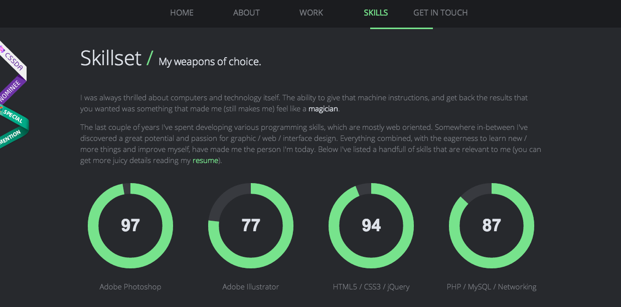
This is an interesting layout of showing his work, and when you hover on a hexagon it swivels around and changes to colour. It also shows the skillset he has, and the kind of thing he can achieve.

The language he uses is friendly and informative, which makes him seem approachable which is what you want when working with a designer/developer. The layout and illustration of his site is very clean and minimal, with stand out colours. The use of the nav bar is also interesting, as when you click on a new link the green bar underneath moves towards it in a swift motion.
Film Festival
I like how this website has a fixed column on the left with the logo and dates on, which is an important piece of information for the site. The layout is very clean and there are lots of different things to look at such as sliders, two nav bars, images, links and it shows these in different ways. Because it is simple, it allows the site to have lots of different features without being too busy.


Noma Authentic
I love this website as although it is heavily image based, it doesn't seem cluttered or too busy. By having text boxes next to images with small arrows indicating which image it is talking about, it is clear what the content is for. I think this would be good to include on my website because I could have images for the hotel, log cabin, activities etc which people would want to know about.

Leave your comment