As I had already looked at regular tickets, I decided to look at boarding passes as these are what you have when you go on a plane journey. These are bigger than train and bus tickets, so this format can fit more information on in a bigger, more readable font.
The numbers are a lot bigger compared to the letters on this boarding pass, which makes them more significant and will probably work better in processes such as embossing if I take this on board.
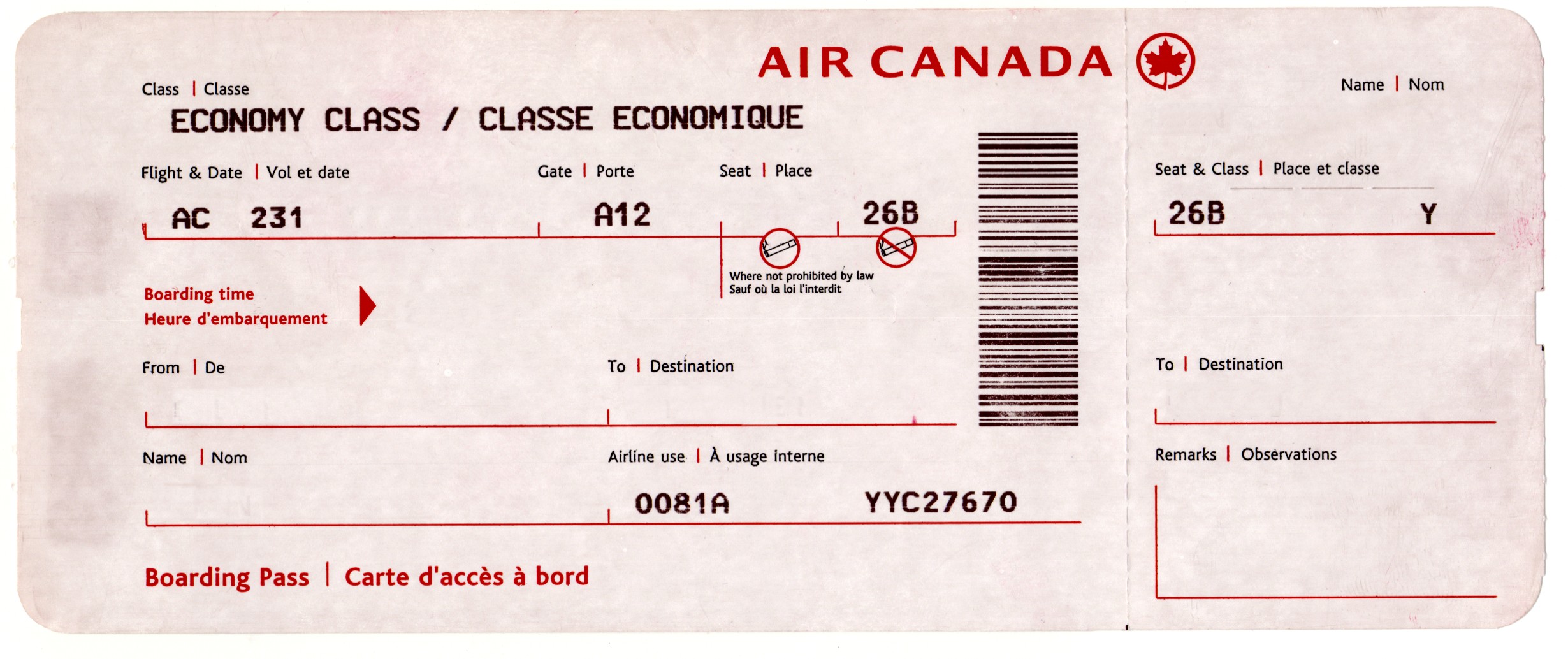
This one leaves a lot of blank to be filled in, and this could be a good idea to print a template of and hand draw the processes in to give a more hand produced look and feel.
This is a very simple layout and is very legible, which is something my tickets need to be because they are appealing to people who don't know a lot about the subject.
This boarding pass had little pictograms to make it more understandable, and this is something I wanted to incorporate with my tickets for things such as cost, and using £ signs to portray how expensive a process is. I think the layout is quite clean as well by using faint line to separate the information.
I really like the layout of this boarding pass, as it's clean, simple and has a bold use of colour and type.
I like how this boarding pass is very clean and minimalistic, so it's easy to read. It also shows the design works in a small space and a bigger one, with it being condensed on the tear off ticket on the right.
This is in the style of a boarding pass for a couples wedding. Again, it is very clean and uses a minimal layout to portray the information.

Leave your comment