Seniors as Web Users
This article explains a usability test the author did on people over 65 and people aged 21-55. It also discusses what makes it easier for older users to use a website and other statistics.
This first one shows how many more people aged 65-74 used the internet in 2012, as opposed to 2011 which is a lot more, proving that more older users are using websites. This means it's more important to design for seniors because they do use websites and you can't isolate them - especially when they are the audience for a website like the one I am making is.


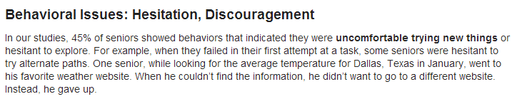
This paragraph says how seniors are uncomfortable trying new things, and give up if they can't work something. That's why I want to make my site quite predictable so when users expect something, it will be there. These are things such as navigation bar at the top with a logo and clear page links, as well as the same layout on each page.
This paragraph shows how seniors have trouble managing tabs.
On the current website, when you click on one of the portfolio links, it opens up a new tab which can be confusing for the user. This is why the website I have designed won't do that, and is all on the same website.


This paragraph shows how drastic design changes can confuse seniors because they are used to seeing something and don't like change. Although mine will be changed a lot, I will still be using all of the same images, text and links, so hopefully it shouldn't be too difficult for them to understand. This had to be done so that they can use the new site with ease.

Current navigation bar:

New navigation bar:
One of the issues older people have is readability, and find it hard to read small font sizes.

On the current website, as the content is an inserted PDF on the home page, the font size cannot be increased, and gets pixelated when it is zoomed in because it is an image. It is also in a handwritten font which is very hard to read.

That's why on the new design I will make sure I add text, not an image, so it can be changed and I have also chosen a serif font so that it is easy to read.

Another section of the article talks about hyperlinks. It says to use larger text for them, and the navigation links are quite large compared to the rest of the type on the website, and are very prominent because it is the first thing you see and is against a dark background. It also says to use a lot of white space between links which helps the user click the right button which I have also done.

On the current website the links are clustered together and so makes it harder for the user to click the right one.

On my design I have spaced them out a lot more.
Another section of the article says that pull down menus and moving elements of the website can be quite problematic as they are not steady with the mouse.
On the current website, the photo gallery is quite hard to use, because you do require pixel-perfect pointing for using the arrows, and it also has a scrollbar which is small and so could be hard to use.

That's why on my website, I have made it so that when you hover on any area of the left side of an image you can click to go previously, and on any area of the right hand side of the image you can click to go next. I also changed the margins on the arrows so that they wasn't too close to the picture edge. You can also click on the cross or anywhere on the page that isn't the picture to close it.

I also made the thumbnails quite big on the design so that the user can easily see them, and there is a lot of space for them to click on the one they want to look at.

I looked at some more areas of the current website to see how it can be improved. There is a list of the products the client sells but it is mixed around some images so it is hard to see it easily. On my own I have designed it so it stands out a lot.

It also has the client's home address and old website name on which I will remove on the new one. Having an old website name is confusing, and the home address is a bit too personal - the client can find this out through emailing the artist.

The home page is a pdf file of his printed brochure, therefore not suitable for a web page. The title is too big - I have moved this onto the navigation bar on my design, and I have used one of his images, but made it more contemporary by making it full width.

This is one of his pages which has three links on it, and I don't think this is needed as the user won't be looking for these, just the artist's work.

Leave your comment