Interiors
Expresso Hut
I like how this interior has a chalkboard wall, which would be handy for writing down the specials. However, I feel the rest of the interior is quite dull and very plain. The restaurant for my branding will be a lot busier - with bookshelves, comfy chairs etc.

I saw this wall decal and thought it would be quite fitting to do something similar because I want to incorporate my own dropcap with words/sentences. I already have a similar idea to this in the sense I want to create a bookpage using my dropcap for a pattern for the branding.

I picked this because I liked how there is a quote on the side of the building. I think it would be cool to do something like this for mine - either a manifesto for the cafe or some book quotes. I also thought if my cafe was in a small space, i.e. train station this is a interesting way of using the space.

I really like the format of the wall art here, and I think it gives a vintage feel to the place because of the hand drawn lettering and rough finish to it.

I like this interior because it looks very comfy with the warm colour scheme and big armchairs. I had in mind big armchairs like this for my own cafe because people will be going there to read books and this would add a lot of comfort to their experience.

I also wanted a lot of bookcases in the interior covering the walls, for people to pick up what they like and donate books as well.

I saw this and thought it was a really cool idea to upcycle old books and use them as decoration in an interior. I could incorporate books someway into my own branding, with wall art, placemats etc.

This is the kind of space I envisioned for my own cafe - comfy seating, a darker colour scheme and perhaps vintage decor pieces like the lamps in this space.

Here is a cafe space which does have a bookcase in it - the customers are also reading, and this is the kind of thing I would expect in the cafe I'm creating the branding for.

I like the use of comfy sofas and rugs in this interior, but I think it is too light (wall colour, ceiling, lamp etc) and so I don't think it works that well.

Now this is the kind of bookshelves I envisioned for the cafe - floor to ceiling and full of old, classic books. I feel like is still very contemporary, what with the furniture choices etc.

Although this is quite busy, I quite like the charming, ornate setting.

I chose this because of the flag they've stuck up - I thought this was a good way of showing their logo within the space.

I like how some of these places are putting wall decals/painting quotes onto the wall and I think it adds a personal touch to them. This would be a good idea to have in mine because it is typographically themed.

At first glance I thought the wall was a newspaper design (which would be really cool to have book pages in the branding for my cafe), but then I realised it was just white shutters. I think the wall art is great here as it is really typographical, but also seems like enlarged, old newspaper cuttings to me.

Library Cafe
After researching different interiors I liked, I then came across a term for what I want to create - a library cafe! Here are some examples that I found:
Cafe Library

Lamont Library Cafe

Bozeman

Menus
I then looked at a few menu ideas.
Founders Brewing Menu
This menu is an actual book - good for restaurants which have a large menu, and the format of it would work for mine as it is book themed, but I wouldn't need a book because the menu will be quite light.

I love the binding on this menu because it looks like it uses a buckram spine which is used on hardcover books and would relate well to using that in my own branding. I also think it is quite classy having that accent of black with the rest of the menu. I need to think about how to incorporate my own colour scheme across all platforms so that it is consistent.

This menu uses a clipboard which I think is quite boring as it is seen a lot, but it also works because it means you can easily change the menu if the food changes or it gets dirty.

I thought this was a cool idea to have it standing in a wooden stand, something I have thought about. At first I thought the flipcard menu was a cool idea, but I then thought it might be quite annoying having to keep flicking to get to the page you want.

I think this is a really cool idea because of the format the menus are on, but I then thought it is quite big and there isn't a lot of space on tables sometimes, plus flipping it could get annoying.

I love how this menu is stuck to the board by slotting into a band (probably nylon?) and this means that it is easy to change.

This uses the same idea as the previous example, but the band is horizontal which is probably better because it doesn't cover all of the menu and uses less material.

I thought these are quite typographically themed which is relevant to my own, and I like how the letters differentiate which menu you are looking at. Although I don't think the material is very durable because it could easily get ruined with peoples drinks, food etc.

I love the branding for this, and again uses the band to hold the menu in place which I think I am going to use on mine, as I have done some sketches of different menu ideas and this seems to work the best.

Again this menu is in the form of a book, which could be good if you have a lot of content you need to include. What I like about this book is the rounded edges of the paper, I think thats really good attention to detail. However, if I was looking at a menu I would want to get straight into the food not look at something irrelevant when I open it.

I think this is some really smart menu design, and you can immediately tell it is quite luxurious due to the pattern on the cover which looks hardback, and the design of the menu itself.

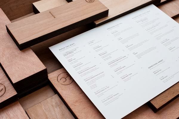
I love this menu design for Fat Cow, as the layout of the text is very clear and easy to read, and it matches the minimal aspect of the rest of the branding. To make my menu match my branding I could use a serif font (Didot) for the headings as this will match the academic theme and the logo.
Branding
I then looked at some more branding to see how they are consistent through a variety of material. It is important that I do this so that customers can recognise the material is part of the same brand.
People
I think this branding works well across print and web because you can easily tell it is part of the same brand. This is done through use of the logo, fonts and overall design aesthetic.

I like how they have thought about how the food would be packaged through transit as this also needs to be branded, and it matches the rest of the brand.

The menu is very simple and clear, and by dividing the sections with lines I think that it is clear to the user these are different parts of the menu.

I think the way all the of printed material is photographed together works really well with the brand as well because it is on a black background and the objects are laid out neatly which also match the layout of the design.

I love this branding because it creates material that is specific to the context, such as the seedbags and the markers you stick in the ground. I thought about this for my own branding, and want to create bookmarks to use as business cards. I think creating something that is specific to the project makes it stand out more because its something different which is why I like this branding.


I think this is one of my favourite restaurant brandings because I think it works so well together. I love the format of the menu and the overprint on the business cards. I think it is really visually engaging, and although it uses bright colours and illustrations I think it is still easy to understand.


This restaurant and take out branding have thought about the packaging of the food, and I thought about this for mine but then realised it isn't actually necessary because I want to create a sit down cafe, and not somewhere where you take the food out so it is made in the kitchen and therefore wouldn't need packaging for the consumer to see.


I love this sign for the shop, and I wanted to create one for my own with illuminated text so that it would stand out.

I like the branding for this cafe, and like how the logo has been used in the center of products but also on the top-left of some things - it shows me that you don't have to have it in the same place on everything to see that it fits in the same brand.


Another piece of printed material I want to create is the note pad that waitresses and waitors use to write down orders - these are an important part of the job and are needed. Having worked in restaurants before I know that these notepads are like gold dust and get left everywhere because they are just flimsy pads of paper. For my own I was thinking of having a hardback to the pad, and the slotting the paper in a band (like I want the menus to be like), as this will make more noticeable. They could be stored in the same place as the menus, and when the paper runs out you can just refill it because it slots easily out of the band. This is also handy for when you give the order to the chef because you just pull it from out of the band.

I love how these serving plates are also branded because it just adds to the exclusiveness of the brand and makes you remember that part. I know that when I've been to the restaurant Reds True BBQ, I've always remembered the plates they present the food on.

I think this is some really nice restaurant branding, but what stood out for me is the business cards - they are printed onto the cork. This is similar to my idea for having the business cards on the bookmark - creating something specific for that brand.

Although this isn't for a restaurant, I thought this Nescafe branding was really good because it shows how one brand can be applied to the product, range and distribution.

I definitely want to superimpose my logo onto some outdoor signage, and I think it is a good idea to have it on similar signs to this because it is a common thing to see cafes with these and I think they're more visually interesting than signs on the facade because they stand out more.


I think this is some really luxury branding and I noticed that it has a tote bag which could be a cool idea for my own so that people can put their books in it.

I think this is a really cool way of displaying the specials because it is easy to change and its a bit different - gives the customers something to talk about. I thought it could be a cool format for my own branding, because I could shape the boards similar to this so that the whole board would look like the shape of a book.

I thought this was a good idea to maybe have the logo printed in the bottom of a cup.

I love these chalkboard walls, and think it is a cool way to either add wall art to an interior, or the specials board. It could even be used to have the dropcap logo and then a page from a book in bodycopy on the rest of the wall.

Bookmarks
I want to make bookmarks for my branding which the customer can use, and also include the business card information on.
Bird
I like how this bookmark has a section of it cut so that you can slot it onto a page. I could do this so that the bowl of the G is cut and can slip into the page.

Band
I love this band idea, and I thought it would be good to incorporate that into my own because I want to use bands on the menu, notepad and placemat. However I then thought that I wouldn't be able to get any information on it so it isn't actually a good idea for my own.

Burning Bookmark
I liked this quirky bookmark because it adds a bit of humour. By having it so big, it won't get lost in the pages even though it is flat.

I thought a good way of being able to find your page again is by having thread at the top of the bookmark because that can hang out of the pages.

Shaped Top
I thought this would be a good idea for mine because I can add the G to the top which is what will stick out and people will always see the logo, and it adds a bit of difference to the bookmark.


