OUGD503 - Responsive: Air Up & Withers - Research

For The Air Up & Withers brief I'm doing, I decided to research album artwork and custom typography for some inspiration.

Ampersand

As I was having trouble designing an ampersand I thought I would look at some different styles to make it easier for me.

Ogaki Typeface
This one has a long stroke which is similar to what I want to use to match the rest of my typeface which has a long, thick stroke on each letter.


I love this one and how it combines incredibly wide and thin strokes. I also like the very thick 'drop shadow' on it.


This is very contemporary, and I love how curved the strokes are.


This is so simple and I think it is quite elegant just made up of two thin strokes. It is also different to the conventional ampersand so it shows the shape can be altered yet still understood.


I love how this one is in metal, and isn't completely connected together.


This is probably my favourite ampersand, as I love the shape of it, and how it doesn't use full strokes yet you can still tell what it is.


Album Artwork
 I started looking at album artwork for different covers that I liked and bands that I knew my client liked.

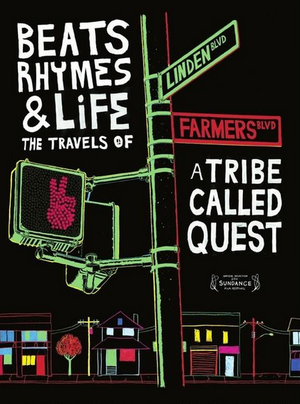
Tribe My client loves this A Tribe Called Quest, and they are also hip hop so I looked at an album cover and poster of theirs. They've stuck to a simple colour scheme and both use jagged edges rather than clean shapes for a more hand rendered effect. They've also used typography in an interesting way, in a circle and on street signs etc.


I like this album cover because of its use of clean shapes and texture. I also think it's clever how the O of the artist is also part of the image as a sun.


I love this album cover because the illustration matches the song title so much, which I think is very whimsical and clever.


I think this is great illustration, it has also interpreted the song title, and I think the colours reflect the 'iron' part. I love how the illustration has brought the cover to life, and love the clean style.


Although this is very old, I love it! I think it is very simple, yet effective and just think it is a colourful and quirky cover. I think it's great how both of the words are combined.


 I love how the elongated umbrellas contain the text at the bottom of the poster, and I think the illustration mixed with the texture mixes really well and suits the music. I also love the colour combination - blue and yellow is my favourite.


I love this kind of illustration - clean shapes which actually look quite abstract due to the overlapping and different colours.


I also like this poster because I think it is very clever how the designer has created the typeface in the same grid and I think it is still legible, although you do have to read it for a few seconds - this does engage the viewer though.


I also like these series of covers as they're very geometric and colourful which is engaging to look at. I think the patterns capture the viewer.


I also like the simplicity and how contemporary this cover this. I think the colours work well together. I like working with a limited colour palette, and think these two colours are an interesting combination.


I LOVE this marbled effect and think it's so interesting to look at, I love the colours and patterns. I researched how to do this, and you actually marble the paper. You drop paint into a tray of water, make patterns with cocktail sticks and lay the paper on top so that it transfers onto it. 


But then I also like the simplicity of this album cover. I like the photographs, the colours and the simple typography laid over it.


Reflections
As part of the song title is reflections I decided to look at some to see what they look like.


I love this photograph, as usually you see reflections in the floor, but this is from the sky and I think the high contrast makes it stand out a lot.


I love the colours used in this image, it reminds me of Autumn. Even though its just leaves and the reflection of trees in a puddle I think it's a good photograph. I think trees in puddles/lakes are what I think about when I think of reflections.


Light and colour seems to be reflected here, showing it doesn't always have to be objects. 


I love the colours here and think it makes urban life look pretty as it very often isn't.


I like how strong this reflection is, and the line of perspective going through the image.


I think this photograph is an amazing landscape image. It is so strong, it's like the image has been flipped as the water is so clear.


I know the colours here aren't realistic, but I love the combination of them anyway. The viewer can still see what it is.


I love this reflection in a window - it almost looks like a multiple exposure. 


This reflection is so vivid and I think it is very dramatic because the colours are so strong.


Illustration
I love this style of illustration, which is clean and almost has a vintage effect to it through choice of colour.


I think this is so simple but clever by combining the title of the song in one illustration.


I love this concept and think the texture helps to complete the illustration.


I love how simple this poster is, yet I love the layout of it and the small illustration. I think it makes it stand out more so than if it was all horizontal.


OUGD503 - Responsive: Keith Baldock Artist - Portfolio Websites

I started looking at some portfolio websites as well to see how they lay out the images and if it would be appropriate for my audience. 

Longton
This website features a very image based page to show off work, and I personally like how they are all different sizes to fit within the grid and add a bit of interest, but I don't think it would work for my audience. This is because, according to that article I read, seniors don't like change on a website, and it would probably confuse them because everything is a different size therefore hard to know it is part of the same thing.


This portfolio website is quite long, and so although it is aimed at a younger audience I don't think it would be appropriate for an older one. This is because seniors don't have as good of a memory, with that article I read saying it is 43% compared to 69% of 21-55yr olds when looking at a website. So by the time they get to the bottom, they will have forgotten what is on the rest of the page and what the navigation is etc. So I need to make sure that mine is a lot shorter with separate pages for different bits of content and only necessary information on.

Yin and Yang
I really like this portfolio template, but there a few issues with it if it was aimed at an older audience. Firstly, the navigation at the top of the website is in a very small font size, and doesn't stand out a lot against the light grey background which would make it hard for the user to see and read. They also might not understand its a navigation bar because it is above the title, and there is another one further down the page. 
However, it has highlighted and underlined a hyperlink which will make it easier for older users to see. And by using same sized boxes it is easier to navigate and know that they are part of the same thing.


This is a different approach to a portfolio website, and makes the image full sized on a page. This is good because you can see it, but it also requires a lot of clicking. I need to make sure my design allows the user to see the painting enlarged, but isn't hard to see all the thumbnails and make sure they don't get lost.
I also noticed all of these websites more or less have a monochrome website, and I want to introduce a colour to mine which will show the more traditional tone of the work rather than contemporary. 

Paul Cooper Photography
Another monochrome, contemporary portfolio website. What I like about this one is how it has '1/13' in the corner so you know how many are in the set, and I find this really helpful. However, it is very small in the corner and so you can't see it. You also can't see the other images and would be nice to have a thumbnail view for the older user so they know there are more images to look at.


This is an amazing javascript library which allows you to have a selection of thumbnail images which when you click, overlays an enlarged image of that on the current page. This could be very useful for my website, because it is simple for the user to click on it, and the picture enlarges, as well as go next/previous and click off it to see the thumbnails again. This would be good for a portfolio website because you can add many pictures and is easy to navigate.


Although this website is very skeoumorphic, I actually think that quite suits an older audience because they will be familiar with it and would be able to understand it. However, I don't want to compromise on the aesthetics still and think they could still understand a non skeoumorphic design as well. I think the layout is good, because the navigation is big and clear at the top of the page, and the layout of the thumbnails is also good because they are big and clear to see. This layout could also work well for a portfolio website for my client because it is easy to see the images, and if you could click on them so they enlarge it would be good as well so the user can see the full quality of the image.

Oskar Kullander
I actually really like the layout of this portfolio website, and think it works really well. For an older audience, I think the thumbnails should be made larger so they can see them more easily, but I like how they are on the same page as the enlarged image, and you can change them easily.

I also like this layout because you can scroll easily and the main image will change to full opacity, but I don't think it would be appropriate for an older audience.


I looked at an older painter's website that is probably more aimed at an older audience, and I found that it wasn't very user friendly. This is because when you look at the paintings, they are all different sizes with lots of text underneath which makes it look messy and a bit chaotic. And when you click on a painting, it creates a new window, which that article I looked at said a lot of seniors find that confusing and don't cope well with multiple tabs.


It also had this above the enlarged painting, which isn't very clear that they are buttons and the text is very small.


Monet
I looked at another historical painter, and found that it wasn't much better than the previous example. I think it's quite dated with the grey background and the gradients on the numbers and default drop down menus. When you click on them, an enlarged picture comes up, but it also adds a lot more picture options on either side which can be very confusing. 


OUGD503 - Responsive: Keith Baldock Artist - Senior Users on the Web

I decided to research an article on designing for older users so I knew how to improve the current website.

Seniors as Web Users
This article explains a usability test the author did on people over 65 and people aged 21-55. It also discusses what makes it easier for older users to use a website and other statistics.

This first one shows how many more people aged 65-74 used the internet in 2012, as opposed to 2011 which is a lot more, proving that more older users are using websites. This means it's more important to design for seniors because they do use websites and you can't isolate them - especially when they are the audience for a website like the one I am making is.


This paragraph says how seniors are uncomfortable trying new things, and give up if they can't work something. That's why I want to make my site quite predictable so when users expect something, it will be there. These are things such as navigation bar at the top with a logo and clear page links, as well as the same layout on each page.


This paragraph shows how seniors have trouble managing tabs.


On the current website, when you click on one of the portfolio links, it opens up a new tab which can be confusing for the user. This is why the website I have designed won't do that, and is all on the same website.


This paragraph shows how drastic design changes can confuse seniors because they are used to seeing something and don't like change. Although mine will be changed a lot, I will still be using all of the same images, text and links, so hopefully it shouldn't be too difficult for them to understand. This had to be done so that they can use the new site with ease.


Current navigation bar:


New navigation bar:


One of the issues older people have is readability, and find it hard to read small font sizes.


On the current website, as the content is an inserted PDF on the home page, the font size cannot be increased, and gets pixelated when it is zoomed in because it is an image. It is also in a handwritten font which is very hard to read.


That's why on the new design I will make sure I add text, not an image, so it can be changed and I have also chosen a serif font so that it is easy to read.


Another section of the article talks about hyperlinks. It says to use larger text for them, and the navigation links are quite large compared to the rest of the type on the website, and are very prominent because it is the first thing you see and is against a dark background. It also says to use a lot of white space between links which helps the user click the right button which I have also done. 


On the current website the links are clustered together and so makes it harder for the user to click the right one.


On my design I have spaced them out a lot more.


Another section of the article says that pull down menus and moving elements of the website can be quite problematic as they are not steady with the mouse. 


On the current website, the photo gallery is quite hard to use, because you do require pixel-perfect pointing for using the arrows, and it also has a scrollbar which is small and so could be hard to use.


That's why on my website, I have made it so that when you hover on any area of the left side of an image you can click to go previously, and on any area of the right hand side of the image you can click to go next. I also changed the margins on the arrows so that they wasn't too close to the picture edge. You can also click on the cross or anywhere on the page that isn't the picture to close it. 


I also made the thumbnails quite big on the design so that the user can easily see them, and there is a lot of space for them to click on the one they want to look at.


I looked at some more areas of the current website to see how it can be improved. There is a list of the products the client sells but it is mixed around some images so it is hard to see it easily. On my own I have designed it so it stands out a lot.


It also has the client's home address and old website name on which I will remove on the new one. Having an old website name is confusing, and the home address is a bit too personal - the client can find this out through emailing the artist.


The home page is a pdf file of his printed brochure, therefore not suitable for a web page. The title is too big - I have moved this onto the navigation bar on my design, and I have used one of his images, but made it more contemporary by making it full width.


This is one of his pages which has three links on it, and I don't think this is needed as the user won't be looking for these, just the artist's work.


Copyright 2010. All rights reserved.

RSS Feed. This blog is proudly powered by Blogger and uses Modern Clix, a theme by Rodrigo Galindez. Modern Clix blogger template by Introblogger.