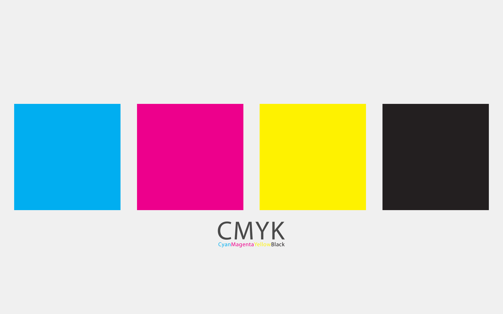
OUGD504 - Design for Print: Colour

Colour is an important part of both digital printing and traditional printing. There are lots of different things to consider when using colour, as it can affect cost, the outcome and quality.

Print

CMYK
CMYK is the colour format we use with printed material. It is the ink we have in computers, and stands for Cyan, Magenta, Yellow and Key.
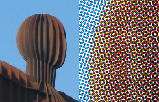
By using CMYK, you are printing with spot colours, as text and image are made up of lots of little dots which can only be seen through a linen tester. By using spot colours, the printer uses four plates to create the document, and this can be more expensive if you are working with a limited colour palette.


Spot colour seen through a linen tester:


Pantone also have formula colours - these are pre mixed colours that you otherwise wouldn't be able to get through CMYK, such as metallic and fluorescent inks. These are very useful if you want a specialist colour. They also include a wide range of normal colours, and can prove cheaper if you are printing less than four colours because they only use one plate.

So if a Cyan was C = 100 M = 10 Y = 20 K = 0, it would be a lot cheaper, and not noticeably different to choose C = 100 M = 0 Y = 0 K = 0 instead.

Screen
The colour system for screen is RGB - Red, Green, Blue. This colour mode is perceived through light, and is how we perceive colour through the rods and cones of our eyes. It is important to work with RGB when working with screen, and CMYK for print so that the correct colours are being seen. This is where the Pantone Matching System helps, so when using CMYK on screen you can make sure you know what it will look like when printed using the swatches.

Pantone
The Pantone Matching System allows designers and printers to get the exact colour you want for your designs, and make it the exact same across formats, materials and mediums. When you find a colour that you want to use, you send the pantone chip to the printers so that they also have the information and can check any issues with you. The printer finds the colour in the formula guide which is then sent to the press. The formula on the pantone chip is then mixed with other colours to get the desired swatch. It is so important to use when working with branding and identity because of the range of products.

Here is a photo I took of the different Pantone swatches:


Special Inks

Metallic Inks

Pantone also do a range of metallic inks for digital printing and include metallic coppers, silver, gold, pink and blue. I've seen the Pantone swatches and they are very smooth to feel, and are like coated colours.

Here is a picture I took of the metallic swatches:


Here are two examples of metallic design:


UV Ink
UV varnish is used for the spot varnishing finish, which gives a design a glossy look and a smooth feel. This ink is particularly good because it is the thickest, and so gives a prominent finish. It looks like this:


And you can also get UV ink for glow in the dark effects! You can use them in screenprinting, which is another benefit of creating screenprinted designs.


Fluorescent Inks
(take pic of options in blenheim)

I found this extract in an article on using fluorescent inks in digital printing:

'The pigments in fluorescent inks work by absorbing ultraviolet energy (invisible to the human eye), and transmitting it as longer waves in the visible spectrum.

Cyan, Magenta, and Yellow process inks can be replaced with their fluorescent equivalents for a strange, while at the same time, semi-natural look. Novelty effects in four color process printing can also be achieved by mixing 50% Pantone 803 fluorescent Yellow with 50% process Yellow and 50% Pantone 807 fluorescent Magenta with 50% process Magenta. Alternatively, using one fluorescent ink, usually Yellow or Magenta, in combination with process colors can add impact to the result or help compensate for a poor substrate. This is most often seen in newspaper work where fluorescent Yellow is sometimes used in place of process Yellow.'


Digital:


Screenprint:


OUGD504 - Design for Print: Format

To me format is the scale and size of what you are printing on to. This is really important because as a designer you need to make sure your design is to the correct scale and size - this can include font sizes, making something a high resolution and creating a design which will fit across a range of formats.

Here is an example of how the same design works across a range of formats, which is important for creating consistency in a range of products. It is branding and identity for PBC by Darkoo.


Paper Size

Paper size has a lot to do with format, and there are some different variations. The International Organisation for Standardization (ISO) is the international standard of the format for paper. This is a chart for the A series.
File:A size illustration2 with letter and legal.svg

B series
This is less common than the A series, and is usually used for books and posters.
File:B size illustration2.svg

C Series
This is used for envelopes. An A4 piece of paper fits inside a C4 envelope.


File:C size illustration2.svg

Hornig Branding
This is the identity for Hornig, and it has successfully carried its brand across a range of formats. It has had to work on fabric, ceramic and paper stocks, and it is important for it to all look the same so that people can identify with it and make the connection that they are part of the same brand. By Pantone matching colours, using the same layout, colours, tone of voice and feel across the identity a range can be achieved. It is something I need to consider within my own project, as I will be using three different formats and I need all of them to look part of the same resolution.


OOUGD501 - Consumerism - Persuasion, Brand, Society, Culture

Looking at Western Capitalism through a Freudian view.

Aims

  • Analyse rise of US consumerism
  • Discuss links between consumerism and our unconscious desires
  • Sigmund Freud
  • Edward Bernays
  • Consumerism as social control
Film
  • Century of Self (2002)
Book
  • No Logo (1999)
Freud
  • New theory of human nature
  • Psychoanalysis
  • The Interpretation of Dreams (1899)
  • Hidden primitive sexual forces and animal instincts that need controlling
  • The Unconscious (1915)
  • The Ego and the Id (1923)
  • Beyond the Pleasure Principle (1920)
He argued people aren't rational and are instinct based.

Conscious: Contact with outside world is tip of the iceberg
Preconscious: Material just beneath surface of awareness
Unconscious: Difficult to retrieve material well below the surface of awareness

1930 (book)
  • Civilisation and Its Discontents
  • Fundamental tension between civilisation and individual
  • Human instincts incompatible with the wellbeing of community
  • Says we have sexual and violent instincts and society keeps world in order with laws
  • However, this means we are unsatisfied. If our pleasures are satiated we are docile and civilisation will make us happy
Freud said of WW1 we should expect is as we are instinctive human beings and are dangerous and have morbid desires. He thought it was inevitable, but wasn't happy with this and became depressed.

Edward Bernays
After the War the West developed considerably and became wealthy due to a number of treatys. During the war, Freud's nephew Edward Bernays was employed by Public Informations and he learnt a lot about propaganda. After the war he set up his own company and thus came the birth of PR. 
He said any business will succeed if the product is linked to our repressed, unconscious instincts.

Smoking
In 1920s smoking was a taboo for women, and this was bad for tobacco companies as they could only target half the audience. So a tobacco company employed Bernays to get rid of this prejudice. He did this by employing beautiful debutonts to go to a parade and start smoking when the photographers where about. He then sold a story to the press that these women were suffragettes and were fighting against male oppression. He called them 'torches of freedom' and it was seen as a sexy thing because of the beautiful women. This removed the prejudice.

He came up with:
  • Celebrity endorsements
  • Product placement
  • Use of pseudoscienfitic reports
Things are bought not because they are things but because of the illusion of them satisfying our conscious.

Fordism
  • Moving assembly line
  • Productivity increased, so profits increased as there were more products to sell, so wages increased because companies could afford it
Aunt Jemima's Pancake Flour
At first this product was very unpopular, and after a series of focus groups it was revealed why. Women didn't want to buy this product as it made them feel less of a housewife for cheating and choosing the easy route. So they changed their recipe so that you had to add an egg to the mixture, and then it became very popular. Psychologically women's needs of wanting to provide and feed were satisfied and they felt they could buy the product without being less of a mother or wife.

Emergence of consumerism brings shift in why we buy products.

The Hidden Persuaders - book
  • Selling emotional security
  • Selling reassurance of worth
  • Selling ego-gratification
  • Selling love objects
  • Selling creative outlets
  • Selling sense of roots
When we buy these products our illusions are satisfied and we are happy, but our status isn't necessarily getting higher.

Great Depression
Government thought after the stock markets fell that gaining more profit is not a stable way to run a country as businesses had previously been giving advice to the government that society should be spending more. Roosevelt came in and introduced the New Deal.

Conclusion
  • Consumerism is an idealogical project. 
  • We believe that through consumption our desires can be met.
  • The Consumer Self
  • The conflicts between alternative models of social organisation.

OUGD504 - Design for Print: Ticket Research

As I want to design my cards in the style of tickets or something you would use in a journey, I thought I would research them.

Here are some ticket designs that I found:

Event Ticket Design
These monochrome tickets have a good contrast of image and type, and is something to bear in mind when doing my own tickets because I want to show of the process and having an image would be a good way of doing so. The type is simple, and has just enough information on to be clear on what it is.

Event Ticket Design @?? ?? Koninckx Sorenson

This is an unconventional ticket with the guitar strings, and I think it definitely makes you look twice. The tickets I produce will also be unconventional as they would use traditional printing methods, and I think this is important so that they stand out in the print room and are appealing to students who perhaps aren't interested in print yet.


Clever ticket design for a Music & Arts Festival in London.

I like this infographic style ticket, and I think it works well with the type of information as it's short and sweet. I think it's quite a contemporary style, but still looks traditional with the shape and colours.


I really like the design of these tickets, as they have the perforated line and seem to be heavily influenced by real boarding passes. I like the layout and infographic style of it, as it is very clear and easy to read.


These vintage style tickets look good because of their simplicity and I think the stock choice makes them stand out to the viewer, whereas I don't think they would if they were white. This is something I need to consider, because the stock will affect the tone of voice and overall finish.


I like the simplicity of these tickets, and how the 'SAT' and 'VOGUE' are printed by what looks like a stamp as it gives a hand produced feel to it. 


Type Factory
I love the stock these tickets are printed on, and I think the black stands out really well on it. I also like how there is a perforated section to rip off, and I think this is a good way of imitating a ticket style. Maybe I could incorporate this into my own work, and have perforated examples so people can take them away from the room? I also think this would be a good layout for my own tickets as it is quite simple and easy to understand. I don't think I want to go into great detail on the actual ticket with information, just enough so that the student knows what the process is, what it does, how long it takes and where to go to achieve it, as they can then ask the tutors more specific questions.


I like the idea of creating a boarding pass rather than a ticket, as they are a bit bigger so I could fit more information on them and they are seen as more of a exotic journey as it takes you further than a train ticket.

graphic-exchange - a selection of graphic projects

Wanderlust Hotel
I love the branding for this hotel, and think that they have been really clever with the concept of travel across the branding. I love the attention to detail on the envelope lining, the shape of the tags to look like luggage tags and the tickets which have the room rates.


By Invite Only
I love these tickets because they all use different processes and stocks - wood, foiling, different shapes etc, but they still seem to work together as a pack due to the same logo being used and the overall aesthetics. I think this is something I need to think about with my own work as some processes might work better than others on different stocks and in different styles.


I like the shape of this one, and how along the perforated line there are indentations to make this more prominent. I like the infographic style, and to me the colour looks like a subtle colour blend, and this is a technique that I want to try somewhere along the project as I have already experimented with it through monoprinting.


I like how the brand is consistent across a range of mediums, as I think that I will have a couple of different formats such as cards, location icons and maybe a zine, and my designs will have to work on all formats. This is an important thing to consider as I want people to recognise that the formats are connected to each other and relate. However, I think the actual design of this branding is a bit too simple for me, and I don't think that the tickets here stand out. Even though I want simplicity, I think I would add more information to my own tickets.


These tickets are packaged in a simple card holder, and this is something I'm going to think about because I will need to think of a way to keep the cards stored and protected while people aren't using them. Creating a envelope package like this would be relevant because it is what tickets arrive in, but it might not be suitable for a wide range of them which need to be packaged together.


I love the simplicity and minimalist design of these tickets, and I think this is a similar approach I am going to take for my own designs and let the finish of the processes stand out, as this is what I want the students to notice.


OUGD504 - Design for Print: Own Ticket Research

Although I am researching different ticket designs, I found these set of tickets that I own and thought it would be useful to look at these too, to see what is included on them and how layout is used, as they are for a different purpose than the ones I've been looking at.

These are a collection of the tickets I had, and I think if I want to make my cards mimick real tickets then I should consider the back of them, where the barcode is etc.


This is a ticket for the Metro in Barcelona.


This is part of a bigger ticket which can be seen on the main scan, and shows that image can also be used on tickets to help the viewer identify with it. It would be good for my project if I included images because it would show the student the process I am talking about. 


This is a cypriot ticket, and I think the layout is quite informal, and even though it's in a different language I can tell that the bold type is something important, and its a priced ticket for a journey. I want my tickets to also be clear and simple, because print is like another language when you don't know anything about it with all the terminology and long proccesses, so it needs to be clear.


This train ticket includes:
  • Destination
  • Route
  • Class
  • Ticket Type
  • Date it's valid
  • Price
  • Number
In my own work I could stick to this style, using headings such as 
  • Destination (equipment)
  • Route (Vernon/Blenheim)
  • Class (Difficulty)
  • Ticket Type - (Process name)
  • Date it's valid (How long it takes - short/long process)
  • Price (Cost of production)
  • Number (Blenheim/Vernon print room details)


OUGD504 - Design for Web: Analyse Websites

In preparation for next weeks introduction to web, we have been asked to look at some websites and see what makes them good or bad for a number of reasons. These could be because of their ease of navigation, whether their minimal or overcrowded and if they're appropriate for their target audience.

Good Examples

I think this is a good example of a website because
  • The white background keeps it clean and minimal, while allowing the images to stand out but not appear cluttered.
  • The full width image gives something the viewer to look at, as well as interact with which is appropriate as it gives an insight to the viewer what the product is.
  • By having the white text on all the images, it allows them to stand out against the photographs as well as be consistent with each other and the background. 
  • The different colour for the footer allows the different kind of information to be separated in a contemporary way without using a header.


This is a website for baby products and I think that it's successful because
  • It is aimed at parents and not children, which is a common mistake when designing for children's products
  • The colour scheme is simple and neutral, and although it uses pink and blue, they haven't been used to be gender specific
  • The photographs also help with the viewer to see the kind of company it is, and exactly what products they sell
  • The sans serif font used is also very friendly, and gives a trustworthy impression of the company.


BabyGroup | South African parenting community by Lisa McColl, via Behance

I think this is a really good layout for a website because
  • The full width slider is a focal point so engages the viewer, and the circle buttons which change image when you click on them are also clear as they are in the center of the image and change colour when selected
  • I also like how when there is a different section to the page, the background colour changes to represent this transition
  • The three columns also work really well here as the space is filled up, and is unlike the University of Alaska three columns
  • I also think the green works well on the navigation bar and logo as the white background allows them to stand out.


Restaurant Website by Diana NB, via Behance

Urban Organic
This website has a really simple, functional layout and I think it is successful because
  • Although some websites work well when they have a long layout, this layout manages to fit a lot of information in meaning you don't have to scroll down far and this is really functional
  • The colours used are also bright, but this doesn't make the website tacky or overcrowded because of the neutral background
  • The colours also correspond to the images used and the company as they are related to fruit and vegetables
  • I think the type hierarchy also works well on this website because you know what information to take in first and exactly where to look for things like the navigation bar and the headings.


Urban Organics - Web Design

I think this is a really good website for usability because of how easy it is to search for a holiday and then edit it to find one thats available. 
  • The search bar at the top is more complex than most holiday websites, as you can click on the link underneath the search box, for example Airport List, and it gives you all the airport names you can choose from, as well as being able to click multiple airports rather than a standard drop down menu
  • The search box also changes to how many you have selected for example if you choose nine destinations it will say 'Spain.. +8 more'
  • When you have pressed search it allows you to refine your search further by changing the duration of the stay, the dates you fly and the budget. By changing any of these options the page doesn't refresh, and so you don't have to wait for a page to load which makes the user more likely to stay on the page
  • The colour scheme is also neutral with a few block colours which doesn't create a busy page, but one where you can easily see where the focal points are.


Bad Examples

Vancouver Traveller Bed & Breakfast
I think this website is bad for several reasons:

  • There is no logo or proper name, which makes it hard for the viewer to trust and associate with a legitimate brand
  • The background has an aeroplane pattern on which has nothing to do with the content, and is very distracting with the text placed on top
  • The choice of colour contrast with each other harshly, and doesn't create a warm, inviting appeal
  • The two images on the page are the same which is pointless because you can already see it, and it makes it seem as though that's all there is to see - that it is the best part of the b+b. 
  • The links on the side navigation bar are in the default colours, which makes it seem as though they're not bothered about the site.
  • The bodycopy is all one paragraph which doesn't make it obvious that there are actually different sections to the bodycopy. This means the viewer might not read all of it and realise there is more to offer.


This website is already an improved version of a website which was considerably worse than this. I don't think this is a very good website for the following reasons:
  • Even though the university has a logo, it isn't on the website which makes it seem as though it isn't an official site. This is important for a university website because prospective students would want to inquire about courses, or arrange a visit with the proper institute. 
  • The colours and font choice make the site seem very drab and dull. As Alaska is known for being outdoorsy and cold, the dark colours and image don't seem to dispute this and make it seem inviting, which would put me off from wanting to go there.
  • The navigation bar looks very dated with the gradient background, and it doesn't stand out at all between a thick header and slider. The text doesn't stand out to the viewer which might make them look elsewhere as they can't find what they need.
  • The overall background gradient is very dated and this reflects on the university as to me I would think their courses and facilities were also dated.
  • If I was interesting in doing a creative course I would definitely think twice about applying here due to the lack of good design on the home page.
  • When you get to the actual content, the layout is very poor. There are three columns but the content doesn't fit well in these, leaving gaps in the middle column and too much information in the other two. 
  • The actual content also isn't something that I would want to see on a university page at first glance - I would want to see the courses, students work etc.


This website has a sterotypically roadside american diner feel to it, and this is why
  • The candy striped pattern at the top is quite distracting, especially with text over it, but it also creates a cheap, american diner impression which isn't appetising.
  • The designer also should have used better stock photos or took more appealing images of their own food to make the viewer want to try it.
  • Although the navigation bar has clear links, the striped background and italic serif is tacky and this reflects on what the menu could be like. 
  • The 'Est 1984' text on the header seems out of place and a space filler, and is barely readable against the background.
  • The social network icons are right on the corner of the page which makes them quite hard to notice as well.


I don't think website reflects the product and here's why:
  • The quote 'Bali voted "Best Island" in the world' is written in Comic Sans, which seems ironic considering Comic Sans is known to be childish, informal and it is an inappropriate choice of font. 
  • The design doesn't fit the width of the screen, which is poor design and unresponsive.
  • The pictures on the right are so small they can't be seen by the viewer, which isn't good as it doesn't allow the viewer to gain a visual insight to what the website is about. 
  • The text next to the images is actually a navigation bar - I thought this was a paragraph with short sentence lines, as it does nothing to stand out as anything different, but when I hovered over it, a house icon appeared.
  • There are so many different fonts and colours on the website it is hard to know what links and text are important and where your eye should go, which results in no information being taken in at all.
  • I also feel the website is too long, as space could be utilised on the right half of the page where there is nothing at all.
  • The header font looks like word art, and the clip art style of Bali also helps to make the website appear unprofessional and untrustworthy.  


This is a website for a disabled chrilden's organisation, and I think the design could be a lot better
  • The grass at the top of the page has no correlation to the content of the website
  • There is a lot of text to digest on the home page, but no headings as to what they are about or images to support it and make it easier to read
  • When I actually started to read the content I realised that they were paragraphs with headings, but the headings are the same point size and style so you can't distinguish them.


Copyright 2010. All rights reserved.

RSS Feed. This blog is proudly powered by Blogger and uses Modern Clix, a theme by Rodrigo Galindez. Modern Clix blogger template by Introblogger.