I looked at Laura Marling and Haim's album artwork as they are the two that I am interested in designing a sleeve for.
This is Haim's debut album artwork:


I got out a book called 12" sleeves and started looking through designs that I liked.

Lime - Gold Digger
What I like about this design is that it features aspects of both the title and the song, as it has a glass of lime juice, and the setting could represent 'gold digger'. As it is by a poolside, and there is a pink towel, it could suggest a woman is laying on it as pink is often associated with femininity, and pools are seen to be owned by rich people if they are private.

The Silencers - Bulletproof Heart
I like the rough hand drawn style of this illustration, and how the illustration is fitted within a heart shape, to coincide with the title.

The Brat Pack - So Many Ways
I really like the simple shapes used here, and how an instrument is included, suggesting the type of music inside the sleeve.

Bob Sinclar - Eu So Quero Um Xodo
I just like the simple shapes and colour scheme of this sleeve.

Paul Johnson - Get Get Down
This is similar to the Lime sleeve in the sense that the illustration depicts the song title, by showing a man going down some stairs. Even though this is simple, I like the literal connotation.

Amber - This Is Your Night
The colour scheme of the sleeve relates to the artist's name as it is different shades of yellow/orange, and I like the pattern on the cover as it looks as though there are different dimensions to it.

Third World - Now That We've Found Love 290
I just love the simplicity in this design, and how the blue figures stand out against the background, as it makes it really vibrant.
Then I went on the internet and started researching illustration and album artwork that I liked.
I liked how this vinyl sleeve doesn't contain any type as that's what I have to be aware of when designing my own.


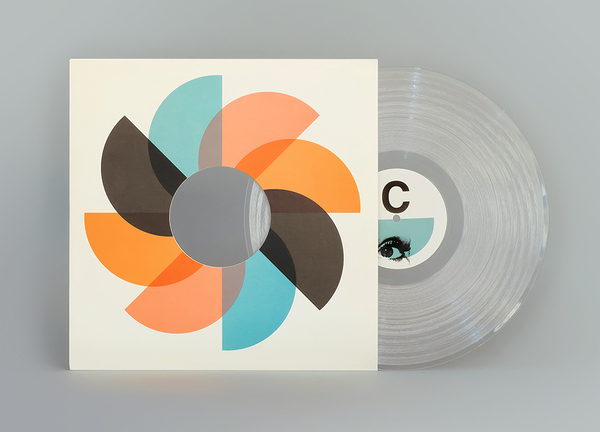
I like the repetition of the patterns here, and want to use the repetition in one of my own designs.

I want to do the previous style of repetition with icons that have a pictogram style such as this, to keep it simple as it will be a busy design.


I discovered these illustrations by Fernando Volken Togni and wanted to work in the style of him to achieve something different from how I usually work. I thought the song Better Off might work well with it because it has a theme of confusion running through it with her feelings, and these abstract pieces could represent that.

I really like the clean style of Sanna Annuka, and will probably incorporate this into some of the designs to keep it clean and it would work well with the previous idea of having an abstract style of illustration.

I really love Mike Lemanski's work, and the grain he adds to the clean illustrations he creates.
Leave your comment