I looked at some alternative movie posters.
I love the colour scheme used here, the blue and purple really stand out against the grey. I just love the use of flat imagey with textures and colour to create depth and layers.

One from Saul Bass, such a simple poster using abstract imagery.

I just like the imagery used here with the boxes behind them. I was thinking I could do a montage of key pieces of imagery from the movie similar to this.

I love how texture has been used here, and even though it has used two colours + stock, it looks a lot more interesting because of this.

Rear Window
A classic movie has been done here with really simple imagery made out of shapes that convey exactly what it is about.

This is a movie poster, but I just love the flat imagery and textures used.

I love how they have taken the words from the title here and used that to create a really simple but clever piece of design. They have just combined the two words really well.

Saul Bass
This book cover is similar to what I had in mind - key pieces from the movie turned into flat imagery shown as a sort of montage.

Saul Bass
I love the layout of the typography in this poster, as it is all combined through the white strokes. Although it looks chaotic, it follows a grid.

Saul Bass
This again uses really simple imagery to portray the main characters through their bold characteristics. In my film Nicholson's main characteristics are that he has a moustache, hat, uniform and sunglasses. The use of colour has been used well too, and I think it looks good how 'The' is in orange.

There are so many posters for The Usual Suspects like this, with footprints. I picked this one because I think it has been done the rest.

I love the bright use of colour here and think they contrast well together to make it really striking.

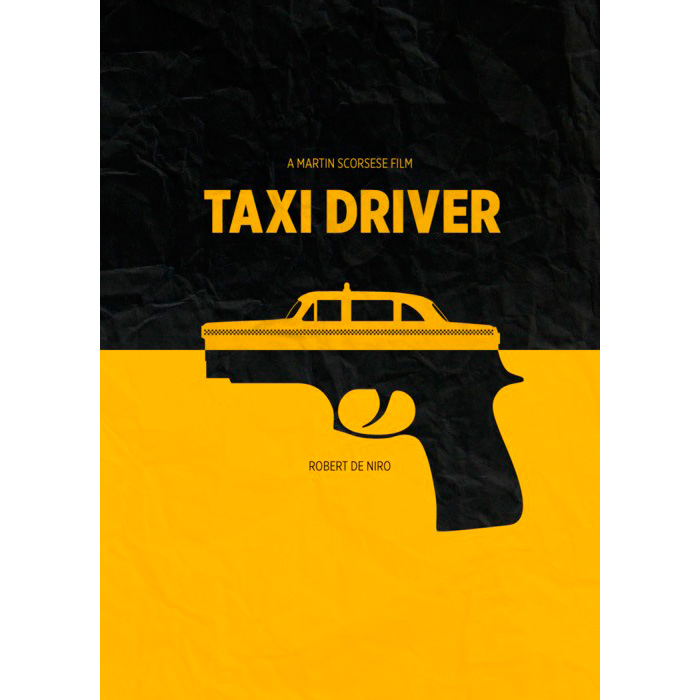
I LOVE how the gun and taxi has been combined, it is really clever. At the same time the poster is so simple, using two colours, minimal type and just that image. But it is so bold it doesn't need anything else.

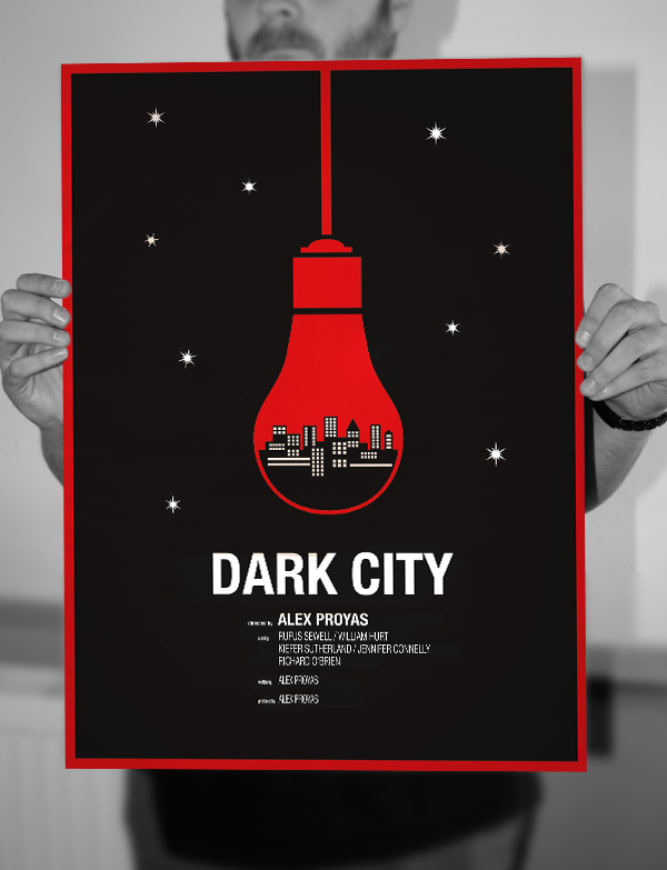
I love the colour combinations in this illustration, and think it captures a city really well. I just chose this because I like the style of illustration.

I love how you can see a faint photograph in the background of this poster, and again the combination of two completely different objects is so clever. It doesn't look out of place that a bridge and keyboard have been combined to create one piece of illustration, and works so well. It has also used a limited colour palette which I have to do, and shows how it doesn't need anymore.

This music poster for Tame Impala combines all different natural imagery within the profile of a face which is clever, because although there is so much going on, by using flat imagery it doesn't look chaotic or confusing.

This shows how you can use overprints to create more interest.

This is one of my favourite posters, it is for the TV show Dexter. I just love how it has combined all key imagery from the show into a montage that just works together and doesn't look confusing. It is done so well, and there is always something to look at.

I just like how the type is placed inside the ice lolly here. I think because it has different fonts and sizes etc it is really interesting.

I love this illustrator, and his style. I think it is great how he has managed to make an illustrative scene out of it as well as be really information based through typography.

Here type has been placed creatively by combining it with the lllustration, rather than being two separate things.

I just love the simplicity of the imagery here, but how it allows for many things to be shown.

This is a really great piece of illustration for a new film, and shows really good hand drawn skills. It also has the same colour limitations I will be working with.

This is one of my favourite movie posters, for the new film The Grand Budapest Hotel. I just think it is so clever how it is almost two different posters that are combined together to create one. The use of shape is really creative to create one image from two different objects.

Another new film, the Dallas Buyers Club has been depicted a lot, but here is one poster that I really like. I really like how the typography is used here, and the use of the stars underneath the title.

I love how the typography here depicts fastness with the use of strokes, as well as the motorcycle illustration and the arrow curving round the bottom of the poster. Really great use of typography and layout.

Godzilla
Even though this is just a vector illustration, it is really quite scary with the darkness surrounding it, and how it is a close up of an eye.

Jaws
This is such a clever poster for Jaws. There is so much going on everywhere - the peoples faces in the tux, the shark and swimmer as the tie, the boat below.. really captured everything in the movie.

Toy Story 3
This is an almost scary version of Toy Story 3 I think, with the typography and colour. The way Andy is scratched in Woody's show and elongated descenders of the title reminds me of a horror movie.

The Shining
The poster for The Shining, just so iconic.

I think this is so clever how just from the title a whole conceptual and captivating poster has been created. The maze is such a great depiction of escape.

A great example of negative space here.

I love the colour scheme here and the simplicity of it. I love how the texture helps the desk fade out.

I just love the depth created in this poster due to drop shadows - it looks like paper has been cut out and stuck on in different levels.

I love this take on Inception. For a movie that is so complex and confusing to be summed up in a simple poster like this is really clever.

Bold, limited colour and strong imagery make this really stand out and stick in your head.

Another Nicholson movie, The Shining. The original yellow poster is so iconic, so it is refreshing to see this done differently.

I just love the illustration style here. Batman has been done so many times, but this just seems to be something different due to the completely different style - yet you can still tell who it is because of the iconic characteristics used.

I love how photography and illustration are combined here. By using a harmonious colour scheme and white space, it doesn't distract you from the busy content.

This is a different take on a movie poster, as it is presented like a magazine cover or something. I think it is well done because the layout shows clear hierarchy, and the photograph works well in a duotone colour.

.jpeg)


