Ampersand
As I was having trouble designing an ampersand I thought I would look at some different styles to make it easier for me.
Ogaki Typeface
This one has a long stroke which is similar to what I want to use to match the rest of my typeface which has a long, thick stroke on each letter.
I love this one and how it combines incredibly wide and thin strokes. I also like the very thick 'drop shadow' on it.
This is very contemporary, and I love how curved the strokes are.
This is so simple and I think it is quite elegant just made up of two thin strokes. It is also different to the conventional ampersand so it shows the shape can be altered yet still understood.
I love how this one is in metal, and isn't completely connected together.
This is probably my favourite ampersand, as I love the shape of it, and how it doesn't use full strokes yet you can still tell what it is.
Album Artwork
I started looking at album artwork for different covers that I liked and bands that I knew my client liked.
Tribe My client loves this A Tribe Called Quest, and they are also hip hop so I looked at an album cover and poster of theirs. They've stuck to a simple colour scheme and both use jagged edges rather than clean shapes for a more hand rendered effect. They've also used typography in an interesting way, in a circle and on street signs etc.
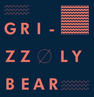
I like this album cover because of its use of clean shapes and texture. I also think it's clever how the O of the artist is also part of the image as a sun.
I love this album cover because the illustration matches the song title so much, which I think is very whimsical and clever.
I think this is great illustration, it has also interpreted the song title, and I think the colours reflect the 'iron' part. I love how the illustration has brought the cover to life, and love the clean style.
Although this is very old, I love it! I think it is very simple, yet effective and just think it is a colourful and quirky cover. I think it's great how both of the words are combined.
I love how the elongated umbrellas contain the text at the bottom of the poster, and I think the illustration mixed with the texture mixes really well and suits the music. I also love the colour combination - blue and yellow is my favourite.
I love this kind of illustration - clean shapes which actually look quite abstract due to the overlapping and different colours.
I also like this poster because I think it is very clever how the designer has created the typeface in the same grid and I think it is still legible, although you do have to read it for a few seconds - this does engage the viewer though.
I also like these series of covers as they're very geometric and colourful which is engaging to look at. I think the patterns capture the viewer.
I also like the simplicity and how contemporary this cover this. I think the colours work well together. I like working with a limited colour palette, and think these two colours are an interesting combination.
I LOVE this marbled effect and think it's so interesting to look at, I love the colours and patterns. I researched how to do this, and you actually marble the paper. You drop paint into a tray of water, make patterns with cocktail sticks and lay the paper on top so that it transfers onto it.
But then I also like the simplicity of this album cover. I like the photographs, the colours and the simple typography laid over it.
Reflections
As part of the song title is reflections I decided to look at some to see what they look like.
I love this photograph, as usually you see reflections in the floor, but this is from the sky and I think the high contrast makes it stand out a lot.
I love the colours used in this image, it reminds me of Autumn. Even though its just leaves and the reflection of trees in a puddle I think it's a good photograph. I think trees in puddles/lakes are what I think about when I think of reflections.
Light and colour seems to be reflected here, showing it doesn't always have to be objects.
I love the colours here and think it makes urban life look pretty as it very often isn't.
I like how strong this reflection is, and the line of perspective going through the image.
I think this photograph is an amazing landscape image. It is so strong, it's like the image has been flipped as the water is so clear.
I know the colours here aren't realistic, but I love the combination of them anyway. The viewer can still see what it is.
I love this reflection in a window - it almost looks like a multiple exposure.
This reflection is so vivid and I think it is very dramatic because the colours are so strong.
Illustration
I love this style of illustration, which is clean and almost has a vintage effect to it through choice of colour.
I think this is so simple but clever by combining the title of the song in one illustration.
I love this concept and think the texture helps to complete the illustration.
I love how simple this poster is, yet I love the layout of it and the small illustration. I think it makes it stand out more so than if it was all horizontal.


Leave your comment