Here is an example of how the same design works across a range of formats, which is important for creating consistency in a range of products. It is branding and identity for PBC by Darkoo.
Paper Size
Paper size has a lot to do with format, and there are some different variations. The International Organisation for Standardization (ISO) is the international standard of the format for paper. This is a chart for the A series.
B series
This is less common than the A series, and is usually used for books and posters.
C Series
This is used for envelopes. An A4 piece of paper fits inside a C4 envelope.Hornig Branding
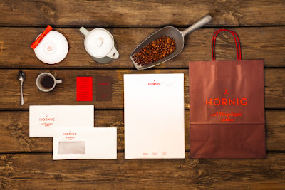
This is the identity for Hornig, and it has successfully carried its brand across a range of formats. It has had to work on fabric, ceramic and paper stocks, and it is important for it to all look the same so that people can identify with it and make the connection that they are part of the same brand. By Pantone matching colours, using the same layout, colours, tone of voice and feel across the identity a range can be achieved. It is something I need to consider within my own project, as I will be using three different formats and I need all of them to look part of the same resolution.


Leave your comment