Responsive Web Design
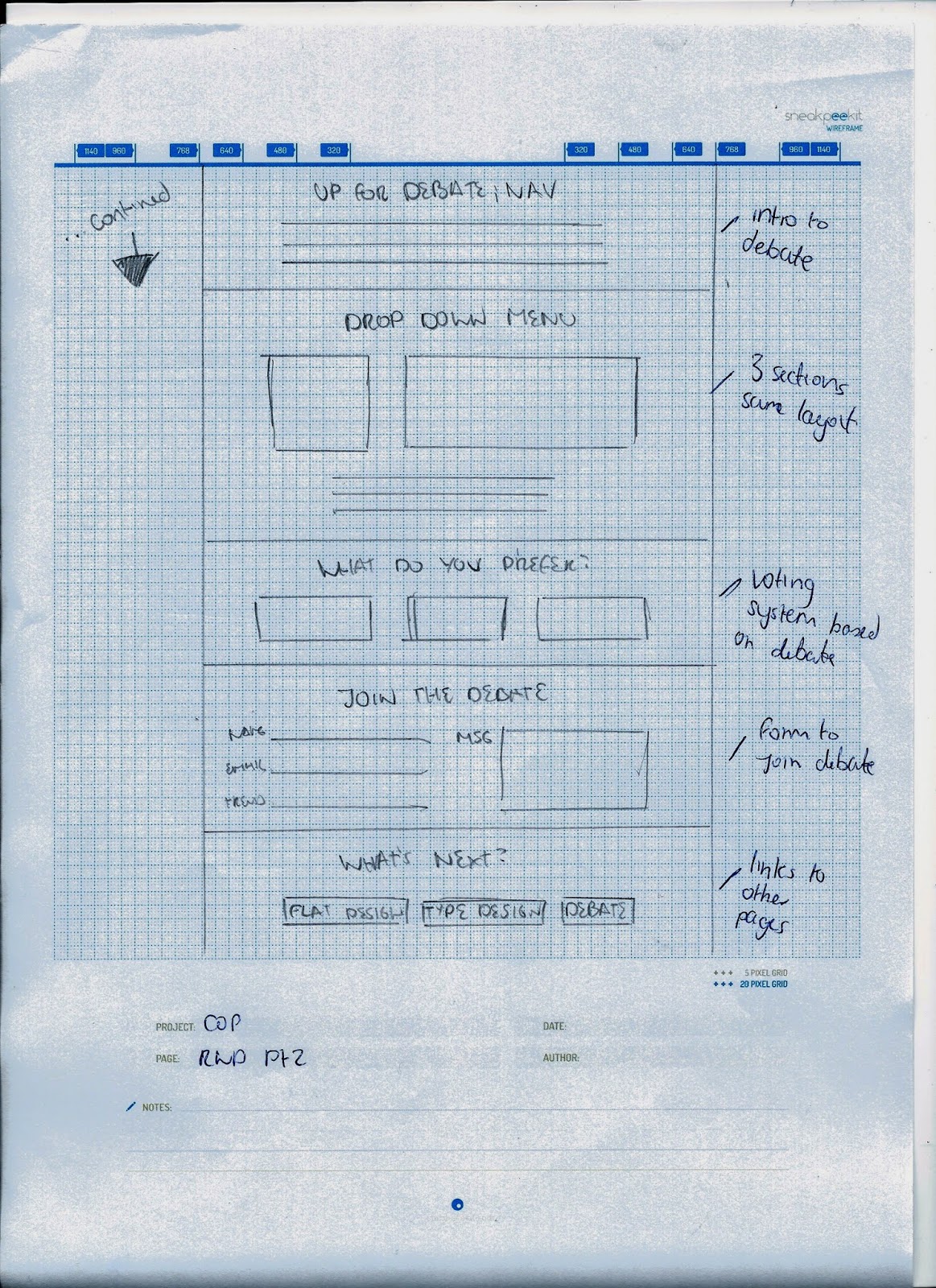
I had a clear idea in my mind of what I wanted it to look like, so I drew down the order of the content and how it would look.
Pt1
Pt2
Home Page
I did a few different sketches for the home page.
This shows two ideas for the home page, as well as mobile versions for them.
These are two ideas of how navigation would look like. I chose the second one in the end.
Here is what the results page would have looked like - I didn't include this in the end as I felt it would be too many steps for the user. It is easier for them to see the results as soon as they vote on the page.


Leave your comment