Minimal Brochure
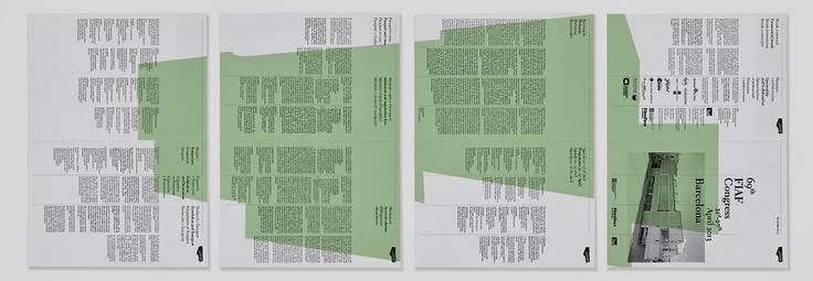
I like the layout of this brochure because it is clear and easy to see the hierarchy. I think this is important when reading something important because you want your eye to focus on the headings, then the bodycopy afterwards. I feel that with some busy layouts you don't know where to look first.
I think the second page of this spread could be something I take inspiration from because I want to include layouts which have photographs to show off the cruise and destinations.
I think these blue boxes with the points in are really good because they can highlight different parts of information.
I also thought this was a good layout to show, say an excursion or city, and I could label the photos in the bottom corner of them. This would let the viewer know where it is, but not obstruct from the layout.
This is very symmetrical, but also places the content in different places on each page to make it more interesting.
Again, using the box of text highlights it.
Menu
I thought this could be a good layout to show the itinerary of a cruise, saying where you are going and what that place is like, with a few pictures to get you excited and show off the cities.
I thought this was a cool contents page, and perhaps having something like this and filling the spaces with images could be cool. Using a grid keeps it organised.
I think this could work well by having a photo as a focal point, perhaps being a title page for a certain kind of cruise, and the information could be what that kind of cruise entails and the destinations it goes to.
Similar to the last layout, it uses an image that takes up 3/4 of the space again, but this time uses it as a content page, which could be an idea.
Another idea for a contents page. I think it's good to include images, because you might not know what the page means, so by having an image you can tell the context it is and the kind of page it will be.
I like how these four separate publications can all fit together through the illustration on top, making them into a set.
I think this is a really practical layout, but it also looks really good. This would be good for an introduction to something, or information on the ship.
Although heavily text based, I really like this layout, and think it could be good as the page which has all the information on FAQS, information about before you board and booking conditions.
I really love this layout, and think it would be a good way to display the interior of the ship.
This could be good to show amenities of the ship, such as different restaurants and bars or entertainment, because the text can be quite short and sweet, but also really informative along with pictures.
I also really like this layout and think it could be good to do for introducing an area of the ship.
I also think this is a really cool layout, and has packed in a lot of visual information. I think it is important for a brochure to be visual, otherwise people aren't going to trust it, get excited or be persuaded to go.


Leave your comment