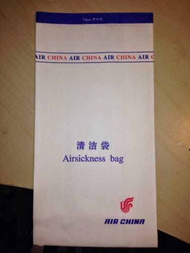
Sick Bags
As I was designing a sick bag, I looked at existing ones to see how they were designed/made.
Some just have the logo, some state what it is and some have extra designs on them as well. But they all follow the same dimensions and shape.
Existing Logos
At first I was having trouble thinking of a logo or name so I looked at how existing brands brand themself. Most cruises focus on being in the sea, the fact they are a cruise, where they go or a luxury word association.
Ship Stats
I wanted to know how big cruise ships are so I can advertise mine correctly, so I researched into mega, big, medium and small ships to see what best represented my audience and brand. I chose medium and big ships in the end, and found three sets of stats that would work well for my ships.
Web Banners
I always see these web banners now I have been searching for cruises, so thought I could do a couple.
I found some dimensions.
Iconography
I wanted to see how cruise liners categorise their shore excursions, so I found a list of definitions and icons to go with them to get an idea of what content to do.

.JPG)
.JPG)


Leave your comment