- Very detailed, I can see where you plan to take it next. Will you be producing the imagery?
- Straightforward
- I prefer the second version because I feel it is the most user-friendly
- 1 + 3 are the best - more clear and better structure. Others seem to have a bit too much going on
- Detailed scamps which will be useful when converting to digital - well structured layouts and imagery
Dreamweaver Session
When you find the root folder for your site, it comes up in the right column. I double clicked on Index to open it.
I then opened a new site, which was a CSS file.
The comment is actually called a CSS Note
This is how lay out variables in CSS:
Then I saved it as a stylesheet. As I've already told Dreamweaver where the folder is, I don't need to select a new place.
To link a stylesheet to a html file, you need to click the chain icon on the right:
Then you find the css file and attach it:
Fixed Sizes
We're going to start designing with fixed sizes rather than responsive. Going to look at 1024x768 firstly.
Wrapper and Container are the two names used to call a box in the body where all the content goes.
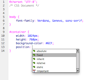
This is setting the width and height of the container:
This is how to add the container to the html:
This is what it looks like in preview:
This how to change the position of the box, as there is a margin by default. Adding a fixed position, and changing the margins of this using top and left.
To change the left side of the position to the middle, we need to make the 'left' 50%.
To make the whole site center aligned we then need to add 'margin-left' and choose -512px because this is half of the width of the site (1024px)
Navigation Bar
We are now going to make a top navigation bar. We made a div id tag in the css file which looks like this:
We then went to create a logo on Illustrator for the bar.
To save a logo in Illustrator, you need to select Save for Web and choose PNG 24
We save it in the root folder
This is the logo settings in CSS
It looks like this
Rollover button
We then used Illustrator to create a button for the navigation bar, which is 231px by 100px. This is because the nav bar height is 100px, and as there is going to be 4 buttons, 231 is 924/4.
I created two versions - one that will be a normal button, and one which when the user hovers over will go bold. Then I saved these for web in the images folder.
This is the html so far:
To create the rollover button we go to Insert > Image Objects > Rollover image.
Then we fill in the two pictures that we want to change. Alternate text is when you have to have a name for the image - this is because by law websites have to be acessible by everyone, including blind people. They have software which will read out the alternate text of images to them.
The html now looks like this, as Dreameweaver has added the javascript


Leave your comment